Showing posts with label Coursework Exercises Part 1. Show all posts

Tuesday, 19 February 2013

Project: Enlarging an Image

Page 72-75: Sketchbook 1

Exercise: Enlarging an Existing Drawing


This  exercise made me nervous. I was aware that inaccuracies in the first drawing would be exaggerated in the larger version. The more nervous I am, the more difficult I find it to draw accurately because slow and careful hand movements seem to result in less fluid lines. In the first drawing, the cup is slightly skewed and this has translated over to the larger drawing.  there is also inaccuracy in redrawing the bottom part of the handle on the second drawing- giving it a more bulbous appearance than the original.

Exercise: Enlarging a Simple Flat Image.


Check and Log

How successful were you in copying the lines from the smaller squares to the larger squares?

The larger drawing looks quite similar to the smaller one but there are a few inaccurate areas. The handle on the cup is more angular in the larger drawing than the original. The knob on the top of the sugar pot is relatively smaller compared to the pot on the larger drawing than the original. There is also an issue with the rim of the teapot on the right side where the inner line is wobbly compared to the soother ellipse of the original.

Are you satisfied with your larger replica of the image? What would you do differently another time?

I'm generally happy with it but there are some issues which I hadn't noticed until I stood back when I had finished. Another time I would mark the lines in faintly in pencil then stand back and compare the two pictures at a distance before drawing definitively in pen.

Friday, 1 February 2013

Drawing With Texture

Pages 61-63: Sketchbook 1 (larger drawing not submitted)

For the first thumbnail I chose a rock, a shell, a pine cone, a shiny toy gecko and a particularly fluffy toy sheep. There were too many objects which meant I was too far away to see the textural detail if I wanted to fit them all on my sheet. Also I felt the toys were a bit repetitive as I had already included teddies in one piece.
In the next I tried an elongated horizontal composition using two logs to enclose other natural objects. The log on the leg form a diagonal which seems to take the eye up and out of top of the picture. Also the rock and pine cone are just about dead centre which I would like to avoid. The two logs also have very similar textures which means one dominant texture. 
The bottom thumbnail is an open composition with the objects spilling off the edge of the page but viewed very close up for textural detail. However, there are four objects in the foreground which means that the composition is too symmetrical.


I then hit on the idea of treating the composition a bit like a landscape with the bark of a log in the background forming a sort of horizon and sky and a knitted fabric in the foreground a bit like a pebbled beach. I arranged the objects deliberately so that reading from the bottom left hand corner the shell leads the eye into this picture. In retrospect the rock tends  to lead  the eye out of the other side of the frame but the whole page is used effectively. 

I tried out some mark making in my sketchbook. Scraping gouache roughly across the page and rubbing in graphite powder for the texture of parts of the rock. I used a combination of graphite stick and dip pen  for the bark.


In the final drawing (A2 size) I have used graphite stick and India ink for the log. For the deep fissures in the bark I scraped large drops of ink across the page with a chopstick. I used dip pen for the smaller fissures and also for the squiggly pattern of the lichen. The knitted fabric was drawn with 8b pencil. The shell is depicted using fineliners of varying nib size. The pine cone has dip pen outlining the tips which are given rough texture with charcoal pencil. The smoother inner parts are represented with conte' crayon in black and grey. The rock was first blocked in by gently rubbing the graphite stick across the paper on its side thus picking up the texture of the board underneath (frottage). I then worked into this with scraped gouache and graphite scrapings in several areas where the texture was slightly different from the main body of the rock. 

I really enjoyed this exercise as I was able to experiment and work freely because this was all about texture rather than my weak point of accurately representing form. I particularly enjoyed the bark. However, I do think that because of this I've allowed the bark texture to become a bit too dominant for a background pattern.


Wednesday, 30 January 2013

Experimenting with Frottage

Page 54-60: Sketchbook 1


I loved this. I didn't know it was called frottage. (having been advised to watch out for Les frotteurs on the Metro in Paris when travelling alone as a young woman - I was only familiar with a less respectable meaning- the two obviously coming from the fact that the processes involve rubbing)

It reminded me of doing brass rubbings as a child in the '70s.  When I started to look around me there were so many textured surfaces that I got carried away. I produced a large pile of textures and had to be quite selective about putting examples in the sketchbook.

One thing that I found amusing was that my frottage of a plastic suitcase looked more like the skin of a citrus fruit than my frottage of an actual grapefruit !- I might use this when I do my homage to Ernst. 

Experimenting With Texture

Pages 54-60: Sketchbook 1


Completed 6th January 2013

I thoroughly enjoyed this exercise. I collected lots of different items and tried to represent their textures in various way. I found the instruction to use pencil and pen a bit too restrictive. I also used soft pastel. Coloured pencil. Collage (kitchen roll) . and coloured inks/watercolour.

Exercises: Observing negative space and perspective


Pages 65-67: Sketchbook 1

This exercise involved following first the upper silhouettes of a group of objects and then the lower parts of the objects using the edge of  a table as a baseline from which to start. The negative spaces were, therefore the first to appear on the paper and the 'object spaces' were only filled in subsequently.

I found this exercise extremely difficult. It really brought home to me how inaccurate my drawing really is. On the first two attempts I noticed that I thought I had returned to base/table level much too far up the page. I had drawn whet I thought I was seeing the table to would have had a big step in it behind the objects. Obviously I was not observing properly. I tried drawing more slowly. The negative effect of this, however was that my lines became even more wobbly than usual.

Below is my best attempt from the first time I tried it on A2 paper with graphite stick.


I made another attempt at this on 13th January in my sketchbook. I still found it very difficult and some of the objects are still out of proportion but this time I found it a bit easier to identify the important negative shapes. I've taken a small step forwards but still need much more practice.


The baby oil bottle was a complex shape and I just couldn't master it


Here the body of the large marmite pot is out of proportion to the lid and the square chutney jar is off centre.


Sunday, 27 January 2013

Composition of Natural Forms

Pages 47-50: Sketchbook 1

Exercise: Composition of Natural Objects

I completed this between 13th and 14th December 2012

The instructions were to make a selection of natural objects and explore different viewpoints and arrangements. and to make quick sketches before moving the objects again.

I chose the ingredients for a pasta sauce which we always have in our kitchen. I started by piling the vegetables randomly on a table and sketching them in pencil. I soon found that pencil sketching was taking too long for these rapid thumbnail sketches so i switched to pen and wash. I had not used this much in the past but found it quite satisfying as I was able to give a suggestion of form and colour very rapidly.
Next I tried a square format with the vegetables arranged on a square plate on the floor. I was looking down on them from above. The objects were also lit from above. This made the arrangement quite flat and there was little overlapping of the forms. It looked more like a design project than a still life with depth. However, I do quite like the strong diagonal of the aubergine and courgette here.


I continued with the square format and tried piling the veg up on top of each other. The idea here was to create more depth by having more overlapping forms. It doesn't work as a composition. It is too cluttered and doesn't have an obvious focal point. Also because it is viewed from above and theses are organic objects which can vary in shape, I couldn't convey the fact that the aubergine and the top courgette are coming upwards away from the plate. Despite trying to capture the foreshortening they still look like they are flat on the plate.


I abandoned the square format and tried changing both the viewpoint and the format. Placing the subjects almost at eye level and overlapping the subjects made it easier to give a sense of depth. I tried an elongated horizontal format which I have never used before.


I liked this arrangement and the marks that I'd made with the pen and the watercolours. These techniques worked well for a quick sketch. However the lack of colour intensity especially on the lustrous surfaces such as the aubergine and pepper don't really reflect the surfaces of the actual subject. 
The format and subject matter make it more difficult to know where to put a focal point. The veg themselves don't provide such an obvious focal point as the Teds' eyes did in the previous exercise. Despite seeming to break all the rules by having the garlic in the centre of the page it doesn't immediately strike me as looking 'wrong'.Maybe that is because there is an odd number of items and there is more weight towards the left side of the page Although I really like the colour and texture of the aubergine and wanted it as more of a central part of my composition, I think being such a large, dark shape it would tend to dominate too much and it actually works better in the background.


Next I tried working into a pen and wash sketch with my new pencil crayons. There were so many colours that I made myself a little reference page to try them out. The pencil crayon allowed me to build up more intense colour but seemed to kill the spontaneity and vitality of the original pen and wash sketch. I tried to remedy this by instead experimenting with cross hatching with marker pens but this didn't give the glossy texture I was aiming for.


I decided to go back to the elongated horizontal arrangement but the garlic was moved slightly to the left. I sketched it in pen and wash on Bockingford watercolour paper. I experimented with using masking fluid to leave some white highlights on the pepper and aubergine. This was a mistake as removing it lifted off the top layer of paper leaving a rough surface. 
Despite my previous discouraging results with the coloured pencils I tried again on this different surface. I was more selective about where I put the colour and built it up judiciously in layers. I was careful not to completely obliterate all the areas of wash. I did not work into the garlic with crayon  but chose to use india ink and dip pen which worked quite well for the hairy root area here and on the onions.
I had forgotten to mask out the stalks of the tomatoes so ended up scraping away colour with a scalpel blade to be able to work back in here.


Although I gave myself some major problems here and this is certainly not at the standard of a finished piece of work with all the rough bits of scraped and torn surface of paper. I actually find this quite pleasing to look at from a distance.

Still life sketches: Made Forms

Pages 42-46: Sketchbook 1

Exercise: Still Life Sketches of Made objects

I completed this on 12th December 2012

The instructions for this exercise were to make a small themed collection of objects and to draw a  few thumbnail sketches from different viewpoints and of different arrangements. 

I chose the option of using objects which describe someone I love. Namely my son Luca.He is going through an awkward transition between childhood and adolescence at 12 years old. He was bullied at school last year so to toughen himself up he took up Judo and Rugby. I included rugby boots, a rugby ball and a Judo Kimono in the arrangement. He, in common with most boys his age is obsessed with computer games hence the inclusion of the PlayStation. I also included a tube of spot cream! Despite all the outward signs of growing up he still sometimes sleeps with the teddies he's had since birth- hanging on to his childhood for a little while longer.

The first arrangement was of objects strewn about as this is how I usually find his things, generally on the floor of his bedroom. There is too much clutter in the first set-up and the boots tend to lead the eye out of the picture. The smaller square which I have picked out seems to work better.


Underneath the first arrangement I tried to remedy the eye being encouraged to leave the picture by making a circular arrangement. The scene feels like the objects are toppling over. It's like they are in a vortex. This might be entirely appropriate for the nauseatingly unpleasant experience of being an adolescent but it isn't aesthetically pleasing.
I wanted the Teds to be the focal point of the composition- they draw the eye naturally much like a human figure. I therefore tried a vertical arrangement with other objects pointing towards the Teds perched on a platform. It doesn't work because the Teds become too small and the composition is dominated by the rugby boots. The boot with the studs facing towards us slants in such a way as to form a barrier in front of the Teds and leads the eye out of the picture to the right.
I decided I needed to simplify things radically so I just included the PlayStation controller and the Teds. This was better but there seemed to be no logical reason why these objects should link together.


I finally settled on including the whole PlayStation with the Teds perched on top of it and the Judo Kimono as base and background. I thought there would be a good contrast of colour and texture between the fabric of the Kimono, the plastic of the PlayStation and the plush of the Teddies. 

I still found it difficult to decide where to place the composition on the page. I read some articles on composition on the Internet and in the book 'Drawing for Dummies'. I also looked at 'Experimental Drawing' by Robert Kaupelis which confused me even further. 

I tried the 'rule of thirds' -placing the Teds' eyes in the upper third of the paper so they wouldn't be too central.  I also found a technique which involved drawing triangles and diamonds on the page and placing objects at the intersections of lines. I must have misunderstood this technique because when I applied it the composition was even worse with a big gap down the left hand side of the page. From this I have learnt that trying to follow academic 'rules' will not necessarily result in a better composition. Better to relax and draw lots of thumbnail sketches bearing the known 'rules' in mind but not employing them slavishly.


I decided to do a final sketch in colour.
What went well:
I like the colours and the contrast in texture of the Teds and the shiny plastic PlayStation controller.
I think the placement of the objects is not too bad and I have tried to lead the eye from the lower left corner towards my intended focus using the lapels of the Kimono.
I think that I have captured the reputed personalities of these two Teds quite well. Roger the Reindeer is known to be an irascible and rather bossy toy. He is dominating Yellow Ted by being slightly forward in the frame and placing his arm over Yellow Ted's leg. Yellow Ted, despite being bigger is rather timid and retiring. He looks suitably nervous whereas Roger looks suitably miserable.

What needs work:
The most problematic area is the PlayStation box itself. Not only does it not appear to be truly rectangular but it also is not well bedded down on the kimono. The  box appears like a flying carpet on which the Teds are flying over a mountainous terrain! More work on form and relationships between objects is needed.
I also wanted to capture the waffle texture of the Kimono and I don't feel I successfully achieved this.

Drawing in the Style of Patrick Caulfield

page 36-39: Sketchbook 1

Exercise: Drawing in the Style of Patrick Caulfield

I completed this on 16th November 2012

I looked at two reference images from the 'white ware ' series for this exercise. They are very simplified images. In the first image the black negative shape is dominant. I initially read the black dots on the edge of the white shape as the edge of a spiral-bound notebook. It is actually the decorative edge of a lampshade and the white shape is the light from the bulb which illuminates the positive shape of the vase. In the second example, the negative shapes of the background and the shadows by their presence indicate the shape and position of the Jug. In this screen print the positive and negative shapes assume equal importance.


I went on to make some preliminary sketches. I had limited objects to choose from as I was away from home staying in a small and simply equipped locum flat. I settled on an anglepoise-type desk lamp illuminating various objects. Ultimately I decided that the simplest image was the most appropriate.


I traced the two simple sketches onto tracing paper and used marker pen to block in the negative shapes and add detail in one other colour. I liked the simpler image of the illuminated apple best. However, one of the main features of Caulfield's work in general is the flatness of his colours. I did not have access to screen-printing materials and decided that I could not achieve a flat enough tone with the marker pens or other drawing materials I has available. I  therefore decided to re-create the image as a collage of cut out black and red cardboard.


I am reasonably happy with the final image. I think it does have impact and does have an obvious reference to the style of the Artist. However, I am not sure whether collage can be defined as drawing. I had a search on the Internet. I found this definition on the V&A website:


"The term drawing is applied to works that vary greatly in technique. It has been understood in different ways at different times and is difficult to define. During the Renaissance the term 'disegno' implied drawing both as a technique to be distinguished from colouring and also as the creative idea made visible in the preliminary sketch.

The current 'Shorter Oxford Dictionary' defines drawing as:

'the formation of a line by drawing some tracing instrument from point to point of a surface; representation by lines; delineation as distinguished from painting...the arrangement of lines which determine form.'

Despite this insistence on the formation of line and the implied lack of colour, few would deny that a work formed by dots or shading or wholly in line but in a range of colours is a drawing."

This seems to rather a restrictive definition. Looking at the Jerwood Drawing prize and at some of the recommended reading for the course such as 'Drawing Now: eight Propositions'; Laura Hoptman and 'Vitamin D: New Perspectives in Drawing' it seems that Drawing encompasses a lot more than that definition would suggest. I certainly think that Collage and Frottage would be included under a broad definition of Drawing. I'm interested to explore this further.


Final Drawing: Collage in the Style of Patrick Caulfield.


Friday, 11 January 2013

Exercise: Shadows and Reflected Light and Shade

Annotated photograph, page 32: Sketchbook 1 (larger drawing not submitted)


I completed this exercise on 11th November. I went for simpler shapes this time but have still struggled. In particular with the handles on the saucepan which are not symmetrical. I also found the ladle very difficult to draw. The handle always looked rotated. Using charcoal on white paper made it even more difficult to keep the highlights from direct illumination bright enough. I tried to keep the major highlights as the white of the paper and represent the reflected highlights by lifting out charcoal with the putty rubber. This helped distinguish between them to a certain extent. Unfortunately the smudginess of the medium meant that maintaining pristine white highlights was challenging. I wanted to stop before it got overworked and smudged into oblivion. I think I may have stopped too soon though as there were many more reflections than are represented here.

I revisited reflective surfaces on 6th December in my sketch book. Drawing a reflective tea pot and that reflective milk jug again once in pen and wash and then again in compressed charcoal. This time I was so absorbed with the myriad of reflections that I didn't notice until I'd finished that both the objects were leaning across the page at a jaunty angle. This brought home to me the importance of stepping back and assessing the initial drawing for accuracy before proceeding with a lot of detail. (images not included here through embarrassment).

Thursday, 10 January 2013

Project: Reflected Light

Annotated Photograph Page 32: Sketchbook 1 (larger drawing not submitted)

Exercise: Study of light reflected from one object to another


Completed this exercise on 4th November. I tackled it using conte' crayon on A3 ingres pastel paper as I thought the coloured paper could serve as a useful mid-tone.  There are still some major issues with form here. The ellipse leading to the spout on the stainless-steel milk jug is  not symmetrical and looks somehow tilted towards the viewer. I also made life very difficult for myself by choosing the two coffee pots. I imagined these would help me with identifying light and shade because they are divided into planes. I failed to take into account the fact that these are complex shapes to draw and therefore beyond my current level of skill. 

I found it difficult  to maintain a difference between the very bright highlights produced by direct illumination and the more muted tones of reflected light. These objects were under bright illumination and the drawing does not show the degree of  contrast that there actually was. I think perhaps this may be because my cast shadows are not dark enough.

The milk jug had a much more reflective surface than the coffee pots. The reflections in this surface are rendered more subtly than the direct illumination in an attempt to denote the difference.

Friday, 9 November 2012

Exercise: Tonal Studies

Page 27 and 29: Sketchbook 1

Exercise: Tonal Studies


I completed this exercise on 18th October

The purpose here was to create an illusion of three dimensions on the flat paper using a hatching technique. The instructions for the value scale construction were not really clear but since it asked for four distinct grades of tone using four different drawing implements I constructed 4x4 square value scales in biro, dip pen, graphite and fineliner.

I then chose four crops from the garden- lemon, apple, onion and a small squash and attempted to draw them using hatching and cross hatching with a fine drawing pen to describe the tonal variations. This was very difficult. I forgot about observing the reflected light on the edges of the fruit and veg (apart from the apple and onion). I kept going building up more and more layers of cross hatching  in the shadows. I then built up hatching in the background to try to make the highlights on the subjects stand out better. It didn't really help. I almost hatched the study into oblivion. There's a distinct lack of subtlety in the tonal graduations here. I plan to do multiple sketches using pen/dip pen and biro to experiment with this and hopefully get more confident and competent. 

Following this I referred back to the mark making exercises at the beginning of the course and realised it would have been helpful to to that before starting this exercise. I also referred back to the Van Gogh pen and ink drawings in my sketchbook. I then searched for hatching in work by other artists work. I found some illustrations by Zak Smith, a contemporary artist who's style has a lot in common with graphic novels and comics. He uses fine hatching extensively to build tone and form. I then found more formal examples of the use of pen and ink hatching and also hatching in etching in works by Michelangelo and in a detail from "Melancholia" by Albrecht Durer. I put these examples in my sketchbook for reference.


Tone and form - sketchbook

Page 31 and 33: Sketchbook 1


I wanted to improve my handling of the drawing pencils so did some practice in my sketchbook. I first tried to establish a value scale in graphite building up the tone gradually layer on layer so as to avoid embossing the paper. This gave a better tone than  had achieved in the previous drawing. I used the full range of pencils available whereas previously my habit had been to always use very soft pencils. This allowed me to create a wide range of mid tones and darks. There was quite a tooth to the paper which meant that several layers of graphite had to be applied before a smooth tone appeared. This means that the dark tones do not show even jumps in value as they get very dark very quickly and are thereafter quite similar. The lighter and mid tones show a grainy texture as building them up more would have resulted in them getting too dark. This might work better on a smoother paper.

I then went on to do a further sketch. In 'Experimental Drawing' , Robert Kaupelis recommends practising rendering form by starting with spheres then moving on to eggs and repeating drawing them over and over again with lights in different positions and different media. The only sphere I could find was a tennis ball and I thought the texture might make it difficult for me to pick out the reflected light so instead I chose four pomegranates from the garden. I like them because they are almost spherical but have some suggestions of angles between certain planes. They also have a fairly reflective surface. I managed better this time to identify the reflected light on the pomegranates and the tonal alterations were smoother. The reflective table they were sitting on made rendering the cast shadows quite complicated owing to the overlapping of reflections and shadows. Overall I'm quite satisfied with this attempt although it looks a bit overworked especially the background shading. This took a bit too long for a quick practice sketch I need to do some faster sketches in different media- perhaps it would be good idea to set a timer and to 5,10 and 15 minute sketches to loosen me up and stop me being too precious with the sketch book.


Project: Tone and Form

Sketchbook 1: Pages 23-25

Exercise: Observing Shadow and Light Formations on a Surface


This exercise was to start using shading to depict light and shade on a surface. I chose two objects, an apple and a mug which had a reflective surface. I first made a couple of quick sketches to show the broad areas of light and shade. 

In the first sketch I struggled to do a simple rendering of the broad areas as the shadows were very complex. I realised that this was because there were too many light sources, There was the main room light above as well as light from the window and a lamp placed to one side. I also struggled with the handle on the mug which looks twisted.

For the second sketch I made life easier for myself by using a single light source. I closed the blinds turned off the overhead light and just used the lamp light to identify the broad areas of light and shade. I found that squinting and looking through my eyelashes helped as it eliminated a lot of the detail. Note that on this one I have not described reflected light on the edge of either the mug of the apple.

The next step was to draw all the gradations of light I could see and to try to include reflected light as well as to try to get all the areas to merge in a series of tonal shifts.  I was feeling a bit more confident about identifying the areas of light and shade and it was a bright day so I decided to use sunlight through the window as my light source. Unfortunately this did create some problems. I was interrupted several times during the course of the drawing and each time I came back the light had changed in direction and intensity. At one point there was a beautiful bright shaft of sunlight so I tried to capture this. A lesson I learned from this exercise is that If using natural light I must work fast or make lots of reference quick sketches with notes. 

I have managed to identify the reflected light on the edge of the apple and there is also light reflected from the apple and mug into the tabletop and a reflection of the apple on the surface of the mug. However, I did struggle to maintain a tonal difference between the main directly illuminated areas and the reflected light. This was especially problematic because the strong illumination meant that the reflections were very strong. The other technical problem with this was that it all got a bit smudgy as my had passed back over the surface of the paper. This meant that highlights which I had intended to remain crisp and white didn't stay as intended and I had to go back into my work with a rubber to lift the graphite back off but it left a bit of a residue. 

I also noted that where I had tried to build up intense shadows I had pressed a bit too hard in placed and embossed the paper. I needed to practise building up tone gradually to avoid this.

The handle on the mug is a bit better then the first sketch but it still isn't quite right It is still a bit twisted.


Following on from this I had a look at the work of Martha Alf in 'Experimental Drawing' by Robert Kaupelis. I printed a couple of her pieces out and put them in my sketchbook labelling the incident light, cast shadow and reflected light to act as a reminder.

I also looked at some other artists working in graphite to see what could be achieved in terms of tonal graduations. Serse - an Italian contemporary artist uses a subtractive technique in which he erases from a base of graphite to describe ripples and splashes on water. In doing so he creates smooth tonal gradations. 

Looking at the Jerwood Drawing prize website I found Tanya Wood's 'Pillow' which was shortlisted in 2012. I had a look at her website which shows many images of crumpled paper bags, memo pad paper and life sized renderings of a pillow and a sheet recently vacated by a sleeping occupant. The artist comments that the work concerns the ' fragility and preciousness of life explored through the close study of surfaces disrupted by human actions' I like this and find her renderings of the fragile folds left by a person's head on a pillow - which are unique and inherently transient, quite affecting. It is also interesting to note that meticulous and detailed pencil drawing is an acceptable form of self expression in today's art world. Looking at 'Vitamin D- New Perspectives in Drawing' as well as the Jerwood Drawing Prize catalogue I am struck by how many different techniques, styles, concepts and media are represented and acceptable within drawing today. At the moment I'm only really looking for drawings to inform my progress in technique but hope to explore in more detail the concepts behind different artist's approaches as time goes on.


Thursday, 18 October 2012

Supermarket Shop: Finished


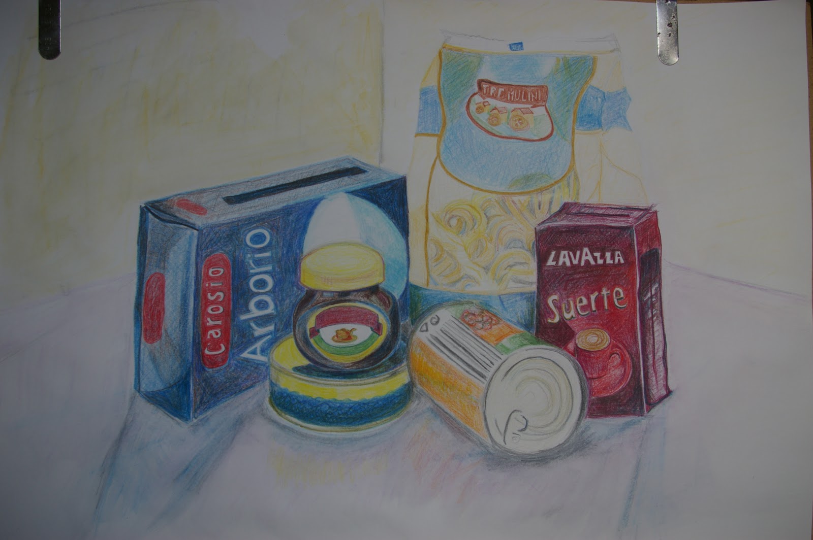
I completed this exercise on 15th October. This is two weeks later than planned because I injured my back and was very immobile for the last fortnight . When it was time to restart I really struggled with motivation to complete this as coming back to it, the problems seemed to have become more obvious. I was tempted to start the next exercise but am glad I stuck with this and completed it. I think in future I must plan my study periods better so that I don't have to leave an uncompleted piece of work for over a week while I'm away working. It causes a loss of momentum. 

The issues with perspective and foreshortening remain. I haven't been able to correct them. The baked bean and tuna tins in the centre are the most problematic area. 

I enjoyed using colour. However, I think that I haven't really represented the tonal variations very well, for example the darkest shadows here are not dark enough. Also some of the surfaces were more reflective than they appear as I haven't left bright enough highlights or given sufficient tonal contrast to capture this. This means that as a whole the arrangement looks rather flat. I've coloured it in rather than building up form.

Despite all these weaknesses, ultimately I have enjoyed this exercise and don't think the final result is too bad for this stage in the course.

Saturday, 29 September 2012

Exercise: Supermarket Shop


This is my progress so far on the supermarket shop exercise. It isn't finished but it's getting dark so the light isn't very good (hence the photo is a bit dark).  I have to go away from home again for a week tomorrow morning so will look at it with fresh eyes on my return and hope no-one knocks over the set-up. I'm enjoying using some colour. However, given that I'm working on an A2 sheet I'm regretting using pencil crayons as it's taking forever to build up the colours. Also my pencil crayons are cheap ones from WH Smiths and it's difficult to get a good depth of colour with them. A friend in England has some high quality pencil crayons she wants to sell so I'll have a try with them while I'm away.

The good thing about colour is it distracts a bit from the problems with form. There's a bit of a problem with the perspective on the rice box and the baked bean tin is slightly bowed as I struggled with foreshortening. I'm also struggling with the tuna can in the centre. The lid on the marmite pot is off centre and the ellipse looks a bit deep. I've found the lettering very difficult too.

There are some reasons I'm not that keen on pencil crayons as a medium. Firstly because I have to press quite hard to get the colour depth I like it means that I'm a bit restricted and can't use big strokes so I don't find them particularly expressive. It all looks a bit tight and twee. I also found it really difficult to place the highlight on the pasta packet. There are a few highlights missing which I might have to paint on with gouache afterwards. Reflective surfaces seem to be difficult to render in pencil crayon.

Friday, 28 September 2012

Exercise: Jars and Jugs

Sketchbook 1: Pages 19-21


I started this exercise by warming up with a rapid 'blind and peek' contour drawing in pen. This was to overcome my lack of confidence for working in pen because of the inability to rub out errors. The results weren't as bad as I expected. The ellipses were off and there results were generally a bit wonky and spilling off the side of the page but the relationships between the bottles and jars were not too bad.


Next I did quite a free sketch without taking the time to really measure anything. It is noticeable how much more feathery and tentative the use of the pen is when I allow myself to look at the paper. Confidence is reduced by having to commit myself to putting a line in the right place when there's not the excuse of being blind. The ellipses on the jars in the foregrounds are not correct especially the middle of the three which looks as if the lid has been put on cross threaded so that it tilts forwards.


In the next sketch I measured up a bit before starting to draw so that the whole composition fitted on the paper. The ellipses on the jars are a bit better although you can see that I really struggled with the lid of the front one. The coke bottle also looks a bit too tall and thin and the part of the ellipse that corresponds to the back part of the label is too tall. The bottle of olive oil (with the tube in the top) is not symmetrical- I think the one in the previous sketch was actually better. The picture still suffers a bit from tentative lines. On the whole, although this may be the more academically correct of the three it is also the one I like the least. In the other two, the jars spilling off the side of the page give a more dynamic and more three dimensional quality to the image.

So far I was working on a small scale in an A4 sketch book. I remembered from the past that I found working large easier and more satisfying so I tried a different arrangement in a different format on a large scale. Far from being easier, I actually found this  even more difficult as it seemed that my lack of hand control was exaggerated further on a large scale. I tried several different set-ups. At first I was putting too many items in and making the picture really cluttered. I've included a couple of examples here of what I ended up with but I really got frustrated with this in the end. I drew in the basic shapes in pencil then when I was happy with the pencil contour drawings I went over with marker pen. One big mistake I made when going over with the pen was just to look at the paper not the subject. My hand is also not yet steady enough so the contours produced are very wobbly. The fact I was not looking at the subject I think contributes to the way these images look a bit dead and cartoony rather than realistic.


The areas I have particularly struggled with are the base of the wine glass and the vase which is lying on its side. In the second of these two I had rearranged things a bit to try  to fit it all on the paper but ended up almost spilling off the left side of the page while leaving a gap on the right. I also need more practice with placement of objects as I don't have much instinct about making a pleasing composition. I'm frustrated but maybe I'm expecting too much at this early stage. Time to move on to the next exercise - maybe a bit of colour will cheer me up!


10th September: Drawing cylinders

I'm in a motel in San Antonnio Texas and woke up very early because of jet lag so decided to practice a bit of drawing before heading to my conference.

I had limited subjects to choose from in the room, it was still dark outside and the lighting wasn't great. Thought I'd try my hand at some cylinders using my toiletries. The idea was daily practice to build my confidence rather than to produce a finished piece of work so I just used my small A5 sketch book.

I spent about half an hour on this. I was happiest with the first objects I drew which were the tallest cans of deodorant and hairspray at the back. I noticed that as time went on I became more tentative and ended up drawing multiple lines especially on the nail varnish pot and remover pads at the front. I realised that my concentration levels had dwindled. Maybe this is because the subject itself was not particularly exciting to me. I know that when I'm studying for written work and it's something I find less than entralling, it works best if I take it in 20 to 30 minute chunks and get up and walk around for 5-10 minutes in between. Note to self: If you notice your lines becoming more hesitatant or you are struggling to concentrate STEP AWAY FROM THE PAPER! Walk abaout a bit or run up and down then come back - but make sure you mark where you were sitting or standing.


Exercise: Boxes and Books

05.09.12 Exercise: Boxes 

I found this exercise very difficult. I first tried drawing the boxes freehand. Unfortunately it is so long since I last drew on a regular basis that I found it impossible to achieve the control I needed to draw a straight line. I also had very little memory of how to deal with the perspective. 

I used my 11 year old son's school book 'Progetto Laboratorio D'Arte' Katia Brandinardi, Walter Moro (La Nuova Italia 2009 ristampa 2011), which had a concise section on geometric perspective to remind myself how to construct the boxes. 

Unfortunately the placement of my horizon line was such that most of the vanishing points were off the side of the page so I ended up guessing whether the lines I'd drawn looked approximately correct. Towards the end I realised that I'd spent most of my time looking at the paper rather than the subject with the result that the last box I drew (the back one which is upright) ended up being too short and squat relative to the others. Also the third box in the stack is wonky and not symmetrical, particularly the back wall of it is narrower at one end than the other.

The boxes do look three dimensional, but this definitely needs more practice.

Friday, 7 September 2012

Project: Making Marks 31st August - 3rd September

Sketchbook 1 Pages 1- 19

Exercise: Holding Pens and Pencils

I'm very out of practice so this was a good exercise to get me back into the handling of drawing implements without the pressure to produce a work of art and also a good way to overcome the fear of a completely blank sketchbook.
Holding the pencil near the end and dangling it onto the paper produced some nice expressive marks with the grainy texture of the paper showing through. It was quite difficult to accurately control the tip when drawing in this way. Holding the pencil near the tip gave finer control and varying the pressure meant the marks could get quite intense and strong. Using the 0.05 pigment liner held near the end produced very scratchy results which looked tentative. Holding near the tip produced a smoother line.
I particularly enjoyed doing the sweeping marks on large paper (especially with charcoal). I could put my whole arm into this and produced some strong gestural curves - nothing tentative there. This didn't work so well with the pigment liners as I was afraid of ruining their tips with the vigorous application.
I really liked the feel of the graphite sitcks on paper. They glide smoothly across the paper it's a lovely sensation through my hand. Varying the pressure with them allowed the grainy texture of the paper to show through.

Exercise: Doodling

I loved this - the freedom to play and experiment was liberating. I did have to really fight the temptation to try to produce a drawing though as my overly-analytical side kept trying to make sense of the doodles.

Exercise: Mark- Making Techniques

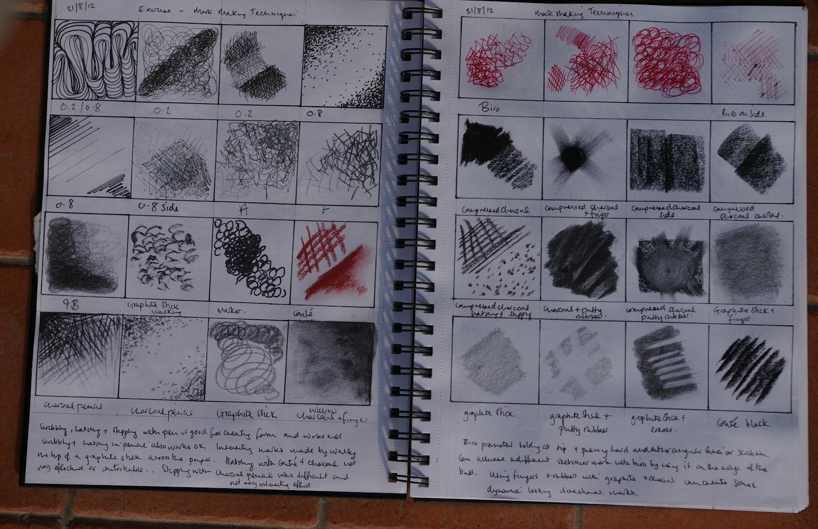
Scribbling, hatching and stippling with pigment liners worked well and could be used to create form. Scribbling and hatching in pencil also worked well and a wide variety of marks could be produced. I made some interesting marks by walking the tip of a graphite stick across the paper. Hatching with conte' and thick charcoal sticks seemed very clumsy and I didn't like the results. 
When picking up the biro  I found I automatically held it near the tip as if to write. This promoted pressing hard on the paper and the marks produced were quite aggressive. I found I could produce scratchy/sketchy marks with the biro by using it more on the side of the nib. 
Compressed charcoal made a very intense dark tone when built up. Using a finger I could make strong directional marks coming out from an area of dark charcoal. I liked using the side of the compressed charcoal as the grain of the paper created an interesting texture and overlapping adjacent sweeps of charcoal allowed variations in tone. Lifting out charcoal or graphite with the putty rubber also produced interesting gradations in tone and directional marks.


31.08.12 Exercise: Mark Making Techniques 

31.08.12 Exercise: Mark Making Techniques
Hatching with pancil crayon allowed the building up of layers and the mixing of colours on the paper. I started with strong lines and then tried building up multiple  layers of very fine hatching. I liked this effect - the two colours were suffused into each other and the individual hatching lines were almost lost. Stippling with pencil crayon was arduous. This medium didn't lend itself well to producing spots of colour and I ended making small dashes instead of dots
I found the oil pastels very difficult to handle. They seemed to work best when colour was applied in thick layers.
Stippling with felt tip and marker allowed the mixing of colour and representation of form and tone but I couldn't produce a great variety of different lines with them. In contrast, a dip pen with ink lent it self well to producing many different types of marks and this could give it more potential than the drawing pens to be expressive.

Exercise: Using Charcoal

I love charcoal. I like anything inherently messy. I tried different thicknesses of willow charcoal as well as compressed charcoal. It was good for producing variations in tone and interesting textures with the grain of paper showing through. I especially liked the strong curves produced when I was making patterns with a piece of a charcoal stick on its side.
Charcoal would be good to use for tonal studies, particularly large scale drawings and gestural drawings. It isn't much good for small, fine details because of its tendency to smdge. 


01.09.12 Exercise: Using Charcoal

01.09.12 Exercise: Using Charcoal

Exercise: Line and Other Marks

Pencil works best for tentative feathery marks and there is much more possible variation in intesity with this and graphite that there is with drawing pen. Ink can be used in a myriad of different ways. A dip pen can produce a large variety of lines ranging from very scratchy, pale impressions to very intense thick lines. I experimented with lots of ways of applying ink to the paper from a fork to a dry crust of stale bread and a scrunched up piece of kitchen roll. I especially liked the effect when I dipped a stick of willow charcoal into the ink and made rapid bold strokes. This produced gestural marks with a very intense deep accent at one end petering to a grainy texture at the other end.

03.09.12 Exercise: Lines and Other Marks