Showing posts with label Gallery Visit. Show all posts

Wednesday, 13 August 2014

Frida Kahlo at the Scuderia del Quirinale, Roma


I visted this exhibition in Rome bacause I had researched Frida Kahlo for my previous research point on self portraiture as self potrtaits were a large part of Kahlo's Oeuvre. She made a motif of her face which is immediately recognisable with its monobrow and moustache. I bought and annotated some postcards of the works I had seen at the exhibition. Frida was heavily influenced by european surrealists as well as being interested in aspects of Mexican and pre-colombian culture and the postion of women in mexican society.

Many of her works are colourful and bold and there is always underlying symbolism in the lements she introduces into her composistions. However, one of my favourite works in the exhibition was one of the less ostentacious and less well known self portraits " Self Portrait with Necklace" 1933. Frida's face is as it always is with her signature facial hair. However, the colours in this are muted. This  work has a quiet intesity about it. Her gaze is piercing and very serious. There is symbolism to the use of the necklace made from pre-colombian beads which expresses a link to her ancestors. 

I made notes on a number of the other paintings in my A3 Sketchbook. There are some quite challenging works in the exhibition including an extching entitled Frida and the abortion.  
I was surprised to find that some of the most overtly sexual paintings she did were in fact her still lives. Many of them include phallic shaped fruit and vegetables and fruits opened to reveal their fleshy parts. One example of this is "The bride who is afraid at seeing life opened" - there is clear sexual innuendo here. There is the hairiness of the coconut and the phallic bananas. The watermelon and the papaya are split open to reveal their juicy interior parts. A small doll wearing a bridal gown peeks out from behind the watermelon afraid of losing her virginity. I'm not sure what the significance of the owl is - perhaps he signifies wisdom and is there to guide her. However, often in Kahlo's paintings the animals  have different significances derived from ancient Mexican and pre-Colombian traditions and  deities.


Thursday, 17 July 2014

Visit to The Carslberg Glyptotec, Copenhagen


On 13th June on a weekend visit to Copenhagen with friends I took the opportunity to visit a gallery. I would have preferred the gallery of contemporary art at Louisiana which was holding an exhibition of the work of Hilma af Klint but time was limited and Louisiana unfortunately was about an hour away from the city so I had to be content with the Carlsberg Glyptotec which is museum based around the personal collection of the founder of the Carlsberg brewery. I had to me selective in what I viewed owing to time constraints so I made my way first of all to the collection of French painting.


Berthe Morisot
The Wet Nurse 1880 (Oil on Canvas)
Composition is such that the gaze of the nurse draws the eye to the focal point of the baby. The baby gazes into the distance creating a sort of circular movement around the painting with the lines of the nurse's dress drawing the eye back in and her hand stopping the eye from exiting at the right hand side of the picture plane. I love the fact that the facial expressions are rendered with minimal detail and the sketchy nature of the marks on the fabric that still clearly capture the fall of light on the folds. Also a limited palate with mainly greenish greys and flesh tones with just a few touches of red which stand out adding visual interest. and aid the movement of the eye lying as they do in an almost diagonal arrangement

Woman Hanging Out the Washing 1881 (Oil on Canvas) Depicts a woman going about her everyday activities - the everyday is a common subject for impressionist painters. Here the impressionistic marks and the play of light and visible brushstrokes add to the sense of movement as the woman reaches up. This mundane activity fills the foreground of the painting while the landscape in darker blueish greens recedes behind her so there is no doubt that the woman is the focus of the painting.

Berthe Morisot (1841-1895) was one of the very few female impressionists. Her everyday subjects are generally women. In that period it was not considered a good thing for a bourgeois woman to works so she was unusual in that the exhibited her work at the Salon and at the impressionist exhibitions. However, she would have been constrained by prevailing attitudes to her gender role not to paint outdoors in urban public spaces. Hence her domestic scenes which depict her friends and family.


Edgar Degas (1834- 1917)
Toilette After the Bath 1888-89 (Pastel on Paper)
Once again, this is an impressionist work depicting everyday activities. In this case a woman getting out of the bath to be dried by the maid. The composition cuts across the woman's body so we do not see her face. The stance is awkward/ungainly. She seems to be lumbering out of the bath in a not too graceful manner. The maid's eyes are turner downwards - is this respectful aversion of the gaze from her naked mistress? No, I don't think so, to me she seems to be giving the woman a sidelong disdainful  glance almost a sneer. Perhaps she is judging the other woman's body and apparent lack of grace? Maybe she could be judging the morality of the other woman (Degas famously painted prostitutes). I like this it is intriguing and focuses me on the attitude of the maid which is not overtly stated but remains somewhat ambiguous. Degas employs a limited palette of blues and greens and captures the luminosity of the flesh and the folds of white fabric against this dark background. He uses pastels in a very painterly way building up strokes of colour like brush strokes on a canvas.
Arabesque - Third Position (Bronze) I selected this postcard, not because the statue in the museum made a great impression on me but rather because I like the way the image is cropped. The cropping converts the sculpture of a ballet dancer into something else. She could be saluting, giving a political gesture ('power to the people', 'heil Hitler') or waving. Shoe could be signalling 'stop' with her palm outstretched or beseeching or begging to avoid cruelty or subjugation. So many possibilities come to mind with this cropped image which don't occur when looking at the original statue. T
The other aspect of this cropped image that attracts me is the close up of the face. It shows that little detail is needed on the contours for it to read effectively as a face.

Gustave Courbet  (1819-1879)
Self Portrait (1850-53) Oil on Canvas

This caught my eye simply because it followed on from my previous research on self portraits. I immediately recognised Courbet's face from across the room. He painted so many self portraits during his career due to a wide streak of narcissism in his character. He looks similar to this in many of them regardless of the age at which he painted them. He portrays himself as young, robust and handsome, immersed in the greenery of nature and looking boldly and knowingly out of the canvas.

Jules Bastien-Lepage (1848-1884)
The Beggar (1880) Oil on Canvas.
Realism influenced by Courbet. Depicts a lowly character rather than one of the upper classes (? a genre piece). The beggar shuffles away from the door. He is stooped. The woman in the interior does not pay him any attention. The little girl has a gaze which suggests empathy. Has she given him something which he is putting into his bag or has he simply been turned away? Realism in painting is not a genre that I am usually attracted to but I have chosen this piece because it provoked discussion with the friends I was with. The expressions are beautifully rendered. The girl's facial expression communicates particularly well.

Edouard Manet (1832-1883)
The Absinthe Drinker (1859)
This is considered to be one of the major masterpieces of the collection. At first glance the man looks like an aristocrat in his top hat and cloak but on closer inspection, he's actually wrapped in a ratty old blanket or shawl. The palette is very dark. He may be in a back street or alleyway. The greenish tones bring to mind the colour of absinthe to me. There is a glass of drink (absinthe) on the ledge next to him and a discarded bottle at his feet. There are visible brush strokes - is this perhaps to reflect the rough nature of the drink and of the drinker's existence (or am I being overly simplistic?). There is something not quite right about his legs. I can't put my finger on what it is but the position of them doesn't seem to quite match with his upper body. Maybe this reflects the awkward ungainliness of the drunk?

Paul Gaugin (1848-1903)
Woman with Flower (1893) Oil on Canvas.
Gaugin was fascinated by 'the primitive'. This may be lie behind his choice of a palette of bold primary colours. However, this Tahitian woman is dressed demurely and posed in the same way as many classic portraits such as in renaissance portraiture which creates an intriguing mismatch of styles. I like the intensity of her gaze which suggests melancholy but this offset by the bright palette which lifts the mood of the painting for me. Gaugin has treated the woman's features sensitively and she is quite beautiful (although he apparently said of the model, "She was not handsome by our aesthetic standards". This is apparently a rare sensitive treatment for Gaugin as he was reputedly very self absorbed and criticised for rendering the Tahitian women in a generic manner without thought to their individual characters.

Pierre Bonnard ( 1867- 1947) The Milliner (1907) Oil on Canvas
The composition of this painting is unusual. The woman is the focal point. She is crammed into the lower part of the canvas. She doesn't engage the viewer- her face is turned away from us. She is looking out of the frame towards the left. This gives a degree of mystery = What is happening there? Who is she talking to? There is a hat on the chair in front of her. Has she briefly paused in her work because something has caught her attention or is she just having a rest and staring absently into space?
The artist doesn't concentrate on depth and recession. The background chair seems almost superimposed on the women's head. . The use of surface patterning is typical of Bonnard but this is less busy than many of his works.
Edouard Vuillard (1868-1940)
Lunch (1909) Tempera on Paper
The composition of this piece is such that the eye follows the woman's arm up from the lower left corner to her face then her gaze directs us down towards the small girl in a sort of circular motion. The faces are rendered in a cursory way but expression is captured well. Vuillard is very interested in patterns - the pattern of the woman's dress, the fireplace and the plate are quite dominant.
Both the Bonnard and the Vuillard look like snapshots of an unguarded moment - almost like candid photography. The beauty in the mundane


I spent about an hour in the winter garden of the Glyptotec which is a large airy atrium at the centre of the ground floor filled with plants and statues. I drew a few sketches of Rodin's the kiss and enjoyed trying to progressively simplify my approach. I also enjoyed using my ney ink brush pen.
I was particularly attracted (or repulsed) by the statue which has a central place in the winte garden by Kai Nielsen (1822 - 1924) entitled 'Watermother' (1919- 1920 - reproduced 2003-2004). This white alabaster statue depicts a nude woman reclining on a plinth in a pond. Out of the water are climbing numerous babies some are latched on to her breasts and feeding. Another sits bizarrely upright on her arm. The material and the smoothness of the stone suggest calm but the image I find quite disturbing - to woman is inundated, stormed over and potentially sucked dry by the swarm of babies which to me would be terrifying but she appears serene. I drew several sketches of the statue. I have not captured the likeness of the statue very well or the smoothness of the stone but I think my use of black ink actually is more in keeping with my emotional response the sculpture.

Monday, 14 July 2014

Urban Sketchers Workshop : Naples- Collecting the City

From the 5th to 8th of June I attended the Urban Sketchers workshop in Naples "Naples Inventory - Collect the City" guided by tutors Simo Capecchi, Caroline Peyron, Nina Johansson, and Federico Gemma. This was attended by more that 30 participants from 11 different countries. It was a great experience and I am very grateful to the tutors and my fellow sketchers for making it such a fun and inspiring few days. 

Day 1:

We met at Museo Nitsch on the morning of day 1. Although we didn't tour the Museum - it was used as a venue for the introductory talk and demonstration, the place itself made an impression just walking through it to get to the meeting room. Herman Nitsch's work is an assault on the senses both visual and auditory. There were photographs and videos of his performance pieces involving ritual, blood and animal offal being poured and rubbed onto  the bodies of the participants. The ritual elements seem to recall the Passion of Christ and other religious imagery. The soundtrack that could  be heard was also quite disturbing. 

After being introduced to the  tutors we divided into two groups for a demonstration. I followed the demonstration with Federico Gemma. He is a very skilled watercolorist and so this was useful for me as  I have very little experience with watercolours and find them hard to handle. Federico demonstrated starting with neutral washes to build up the shadows gradually before moving on to any stronger colours.

From here we made our way to the Museo do Capodimonte. In the late morning we positioned ourselves around the Fontana di Belvedere in the Parco do Capodimonte. This is where we started to sketch. I was quite nervous again about drawing in public especially as there were a number of professional artists and also architects in the group whose graphic skills were far superior to my own. I soon relaxed though and got absorbed in what I was doing but my first few sketches are very wobbly.


Ink and Wash Drawings: Fontana di
Belvedere, Parco Di Capodimonte

Federico also gave us some more tips on watercolours - specifically on various ways of mixing greens.


We had a delicious picnic lunch provided by SlowLina - a slow food caterer which was really very special. 

The afternoon session was led by Caroline Peyron. She had managed to get special permission for us to go into the restoration area of the Museum. The theme of the afternoon was "Order and Disorder". This was inspired by two aspects. the first was how we tend to choose what we draw based on beauty and order so to counter this we were taken into the disordered environment of the laboratorio where priceless works of art are restored but it is a working environment which is dirty, dusty and cluttered. We would then be faced with a contrast of 'order' when we moved up into the museum itself later.
Caroline was also inspired by Proust's 'Paperolles'. Marcel Proust when writing would often want to add ideas or tracts of writing to existing pieces of text. He would at these on pieces of paper which he folded into the area he was working on (see photograph below)


Our task was to select and draw in the laboratorio directly into our sketchbooks ('disorder'). we would then overlay these drawings with drawings created later in the museum ('order'). The overlaid drawings were to be made on tracing paper or acetate and we should also try to rate the overlaid daring to the one underneath in some way. The 'order' drawings were created in the elaborate ballroom of the Pallazzo.

I found this a very interesting exercise. Unfortunately by late afternoon I was very tired and had a banging headache so I only produced one drawing which I was reasonably happy with ('order and disorder' below) But I liked this idea of overlaying drawings and will use this again in the future.


"Order and Disorder"


Day 2:

Day two started at the Zoological Museum under the guidance of Federico Gemma. Federico is a wildlife artist and illustrator as well as having a degree in Zoology. He is a member of the Society of Wildlife Artists in the UK. He was able to pass on some of his wisdom to us. As you can imagine, being all about animals this was right up my street! 

Our task was to make 8 drawings in different media of the specimens in the museum. Although the animals in the museum were stuffed, the drawings seem to somehow make them look more alive. Federico on the other hand usually draws from life and described the process of rapid sketching. He has to try to record what he sees in the minimum possible number of lines/strokes and keep what he has seen in his visual memory for a short time while he continues to draw as his subjects are constantly on the move.


Also at the zoological museum was a small exhibition put on by Franco Lancio Click Here to Link to his Website. The exhibition was of a bird a butterfly and a fish. All of these were constructed from found items which were picked up on a beach on a Greek Island. The pieces were transported back to Italy in empty tzatziki boxes. These creatures were charming and I particularly liked the description of their conception and construction. "When I found them they were in pieces - I gathered them up, took care of them and put them back together" - I found it quite touching!

In the afternoon we went to the National Archeological Museum. We were extremely privileged to be given the opportunity to visit the deposit where items not on display are stored. The afternoon was again led by Caroline Peyron under the theme of "order and disorder" - disorder being the deposit in which there are shelves and shelves of Roman busts. Statues are crammed in higgledy-piggledy and not arranged for viewing. Unfortunately I only had one sheet of tracing paper so was only able to fulfil the brief on one page of my sketchbook but I enjoyed continuing to sketch nevertheless.


Layered drawing 'Order and Disorder' - the underlying
ink drawing is of the multitude of busts in the deposit. I
have superimposed imaged of statues of the female body
so the busts seem to have a voyeuristic effect.
In the evening we went to Riot Studios to see a performance by the theatre group Teatri 35 - Click Here to link to their site. This was a performance of 'tableaux vivantes' based on the works of Caravaggio and i Caravaggeschi accompanied by projected live drawing by our tutors Simo and Caroline. we were also encouraged to sketch during the performance which I thoroughly enjoyed doing. I have included the resulting sketches under the section. 'rapid sketches'. The theatre company were great and the tableaux certainly left big impression.

Day 3:

Day 3 started at the Cimiterio Delle Fontanelle under the Guidance of Simo Capecchi. The cemetery is a very interesting place. It is in the remains of an old quarry and contains the remains of thousands of victims of the plague and cholera. When these epidemics were rife there were so many people dying that it was impossible to bury them all in the existing cemeteries so the remains were put into the quarry. This is a large and dark cavernous space lined on all its walls by piles and piles of skulls and bones. 
A cult grew up around this in which people would go to the cemetery to and 'adopt' a skull. They would pay their respects to the skull, clean it, build it a little house/shrine and offer it gifts. Sometimes they would even name the skull (they thought they were giving it back its living name which came to them in a dream). This would be done in the hope of gaining favour - for example the winning lottery numbers(!) or recovery from an illness.  In 1969 the cemetery was closed on request of the Catholic church as the practice was a superstition and, therefore frowned upon by the religion.

Recently, after protests from local residents who want to bring tourists to this relatively deprived area of Naples, the cemetery was re-opened to the public.

Our theme for this morning was "One and Many" based on the fact that from all the numerous skulls in the cemetery each devotee would choose only one on which to lavish their attention. So we were to choose one item to be the 'hero' of our drawing and then emphasise the plural nature of the many other surrounding objects. 
In my first drawing I emphasised one of the crucifixes which was silhouetted against a light window and this was contrasted against the massive pile of skulls beneath it. In hindsight I should have made the inside of the cemetery much darker and carried this down onto the second page to better link the two pages together and to emphasise the contrast between interior and exterior. I found it quite difficult to draw in the dark environment of the quarry.


For the second drawing I moved to a better lit area. Here I chose one of the skulls to render in colour because it had a green deposit on it. I hoped that the colour would make this individual stand out against the background of the remaining skulls drawn in graphite. On the facing page you can see fragments of funeral posters which are displayed on notice boards when a person dies in this area. These are put up to show respect to the dead. These are fragments of peeling posters I picked up around Naples to juxtapose against the anonymous remains of the fontanelle cemetery.


In the third drawing I tried to show the scale of this great cavern. I wasn't particularly happy with this drawing as perspective and straight lines are still proving problematic.


In the afternoon we walked up to the Funicolare Montesanto station and under the guidance of Nina Johansson we sketched around this busy area of Naples. We were meant to try out three different ways of arranging the sketchbook page. Unfortunately I got inundated by small  chatterbox children who wanted to join in with the drawing so I didn't have a very productive afternoon.


Later in the afternoon we went up onto the balcony of the station and drew from an elevated position. I avoided the architecture and decided to do a quick sketch of a couple of guys lounging on their Vespas and chatting.


Day 4:
An enjoyable morning in the Quartieri Spagnoli searching out the street are of Cyop e Kaf. I have never ventured into the quarter Spagnoli before. This rabbit-warren of streets is usually a very frenetic place and it is vey easy to get confused and lost in these streets. Given that this was a Sunday the streets were not so crazy as usual and were were able to move freely through the streets. Cyop and Kaf work predominantly in this zone of the city. The people of the area have taken them to their hearts and now they are requested to paint doors throughout the area. Their images are in bright primary colours with bizarre-looking humanoid creatures and contain themes and messages which I assume would become clearer on seeing a larger number of the works. They have also undertaken a number of other projects including a film called "il segreto"(The secret) which recounts the rite of the 'cippo do Sant'Antonio'. Local boys from the quarteri after New Year go around collecting wood (especially discarded Christmas trees) and hiding it. In mid January their aim is to make the biggest fire possible. Cyop e Kaf followed the kids around and filmed them going about this secretive activity. They have also created a book which contains an oral history of this zone recounted by local residents.

In the first drawing I have tried to show the street art in relation to its environment by taking frottage from the wall adjacent to the work. I have also sprayed on the other graffiti that was around it using a needle and syringe.


In the second drawing I have just made a study of one of the works which is called 'Scatenati' which means unchained but also has the connotation of crazy. I used watercolour very boldly for this. However, there were also a number of other graffitis scrawled over the painting in chalk and white paint so I used a wax resist to represent these. I really like the bold colours and composition of this.


In the afternoon we went into the gardens of the Palazzo Reale opposite Piazza Plebiscito in the centre of Naples. This was the end of the Workshop. I hung around and did a half-hearted sketch from this raised viewpoint but I found  I was exhausted after a very active few days so didn't stay for the whole afternoon.


The workshop was a fantastic experience. I learnt more about Naples in those four days than I had in the preceding 7 years living nearby!  My favourite part was the fact that we were all obliged to show our sketches to the group after each session so I got to see some very inspiring work and to see what a great variety of approaches the same exercises could produce. I will certainly return again to another Urban Sketchers Workshop. I also hope to keep in touch with many of the people I met and hopefully continue to participate in sketching sessions in Naples with fellow enthusiasts.


Monday, 3 February 2014

Study Visit : Paul Klee at Tate Modern 25th January 2014

This was an informal study visit which was organised by a group of students via the 'OCA sketchbooks' group on Facebook. The is a group in which I am active and regularly post my sketchbook work and have the opportunity to look at other students' work.  I have include a number of images in my write-up here as they are all in the public domain, Klee having died more that 70 years ago.

The organisers had managed to get some funding at the last minute via OCASA so we were accompanied on the visit by OCA tutor Jim Cowan who gave us an introductory talk about the artist , his life and work and also what to expect within the exhibition.

Before attending the visit I had read "Paul Klee: Life and Work" by Boris Friedewald  (Prestel 2011). I hadn't found this book particularly user friendly. It seemed a bit disjointed with the illustrations not easily relatable to the text on the nearby pages. However during the talk given by Jim I was surprised at how much of Klee's history I had retained.
Klee was a musician as well as an artist and the influence of music can be seen coming through in his work especially in terms of visual harmony. His big breakthrough in working with colour and abstraction came during his 1914 trip to Tunisia.

In the style of Kairouan 1914 (watercolour)


There were various identifiable phases to Klee's life. He was a member of 'Der Blaue Reiter' along with his neighbour Wassily Kandinsky. He spent time working at the famous Bauhaus and also as a teacher at the Dusseldorf academy from where he was dismissed by the Nazis and had to go into exile after being named as a 'degenerate artist'.

The exhibition was very large stretching over several large rooms, this was possible by virtue of the fact that despite being tormented by a painful and disabling skin condition called scleroderma in his later years, Klee was a very prolific artist. He was also very organised, cataloguing every piece of work he produced.

There was a fantastic array of techniques on display here and Klee was experimental and inventive in his approach. I particularly liked his use of an 'oil transfer' technique. He also used spray painting and used a sieve to create fine drops of pain over stencilled surfaces. There was so much of interest to see. I have selected just a few of the works to talk about but it was really quite difficult to choose.

With the Violet Pentagon 1919
 

Washy watercolours in shades of mauve, violet and yellow are contrasted with thick dense colour in more acid colours and dense primary red with black in angled shapes around the central pentagon. Although completely abstract, the arrangement of colours is such that the pentagon seems to recede and the bright angled shapes around it create movement almost seeming to spin around the pentagon. I found it interesting that such a simple construction could create such a powerful impression of depth and movement.


Red-Green and Violet-Yellow Rhythms

I love the harmony and rhythm of this painting. It is also interesting to note the cross-over in language between music and painting. This piece concentrates on harmony and balance of colours. There is a strong diagonal rhythm to the painting. The forms include tree-like forms and geometric shapes which suggest possible abstracted architectural forms. I find the colour combination and tonal relationships quite restful. There is a horizontal and vertical component to the composition and perhaps this makes it more restful than if it were all about diagonals. There is an illusion of depth with the juxtaposition of dark and light shapes. The dark shapes seem to recede and apparent overlapping of light coloured shapes contributes to the illusion of depth.

With the Rainbow 1917


I was initially a bit confused by this image. There are subtle gradations of watery colour and overall harmony in the centre which seems to be contradicted by the bright opaque frame of primary red around the outside. Discussing this with Jim he pointed out that this would have been a deliberate decision and asked me to consider why Klee might have done this. I think once again this was to create depth. the frame makes the darker and more muted colours seem to recede. As I looked more closely I started to see a sweeping curved path or road heading from the  centre bottom and receding towards architectural forms with the rainbow in the distance.

I particularly liked some of the oil transfer pieces. Klee put oil paint on to a sheet of paper and placed it oil side down on another piece He then draw an image on the reverse side of the oil covered sheet to transfer oil paint onto the lower sheet.

City Between Realms 1921


This image contains simplified architectural forms and zig-zag arrows pointing upwards and more prominently downwards. Is this a representation of heaved and hell? Is the prominent downward arrow a comment on the direction in which we are heading?


Ghost of a Genius 1922. Oil transfer and watercolour


Is this a self portrait? It looks a bit like Klee with a domed head and a short beard. It also has a puppet-like quality. Did he feel like a puppet or is he just attracted to puppet forms? (He used to make puppets). The figure looks melancholy to me with a slight dejected tilt of the head. Interpreting it with the title maybe he is 'washed up' and recalling past triumphs. I really like the accidental marks that are made by the oil paint sticking to the ribbed texture of this paper.

Comedy 1921 Oil transfer and watercolour
 

I really like this bizarre collection of elongated part-humanoid creatures. One seems to be lying down with another standing on top. Have they fallen and are being trampled by the parade or are they acrobats? I like the colour scheme. The graded jade-green focuses the attention on the upper 2/3rd of the paper and the pale yellow figures stand out against it. Once again the accidental marks made by the oil transfer give an interesting textural element to the otherwise cartoonish work.

A Young Lady's Adventure 1922 - watercolour
on paper


The girl looks serene and happy but again has a puppet like appearance. She is walking in a very dark environment. This makes me feel a sense of dread. There is a strange dark bird-like form in front of her. There is a red zig-zag arrow pointing back in the direction from which she has come - is this a warning? Is the girl naïve or blithely ignoring danger?

Fish Magic 1925 - Oil, Watercolour and Collage on Paper


I love this sgraffito technique. Klee has also attached a square of fabric to the centre of the page along with the diagonal line does this represent fishing equipment/net?
The dark ground allows the bright sgraffito fish to stand out. I also adds a sense of mystery to the piece as a whole.

Fire at full moon 1933
 
The full moon is represented by a yellow circle and the fire is represented by a red cross. The surrounding colours are dark and menacing. The red fights with the colours around it possibly signifying danger and the descent of the world surrounding Klee into darkness. This was done around he time that the National Socialist party (Nazi) came to power in Germany. it is surely not a coincidence that the dangerous red cross is reminiscent of a swastika?

Overall the study visit was an enjoyable and stimulating experience. Thank you to Jim Cowan for stimulating me to think more clearly about what I saw and tank you to Steve Cussons for all her effort in organising a group of students from far flung places to be in the same place at the same time. It was great to meet and compare experiences of the OCA with fellow students - This and the social media groups help to reduce the isolation of distance learning.

Looking at the work of Klee has given me ideas on a number of techniques I'd like to experiment with.

Wednesday, 21 August 2013

Research Point: Different Artists' Depiction of Landscape (Part 3) L.S. Lowry

I was asked to look at the work of Lowry for this section of the course. I must admit, that I've never been much of a fan of his work. Maybe he has suffered from the "match stalk men and match stalk cats and dogs" image from popular culture.  I thought perhaps my lack of admiration might be because I had seen very little of his work 'in the flesh' and it might be the quality and scale of the reproductions that was letting it down so I decided to try and suspend  judgement and go along to 'Lowry and the Painting of Modern Life' at Tate Britain.

This exhibition was extremely popular. It was quite crowded in the gallery which meant it was difficult to view paintings from a distance because of bunches of people in front of them. This didn't help the experience (I really don't like crowds). 

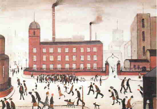
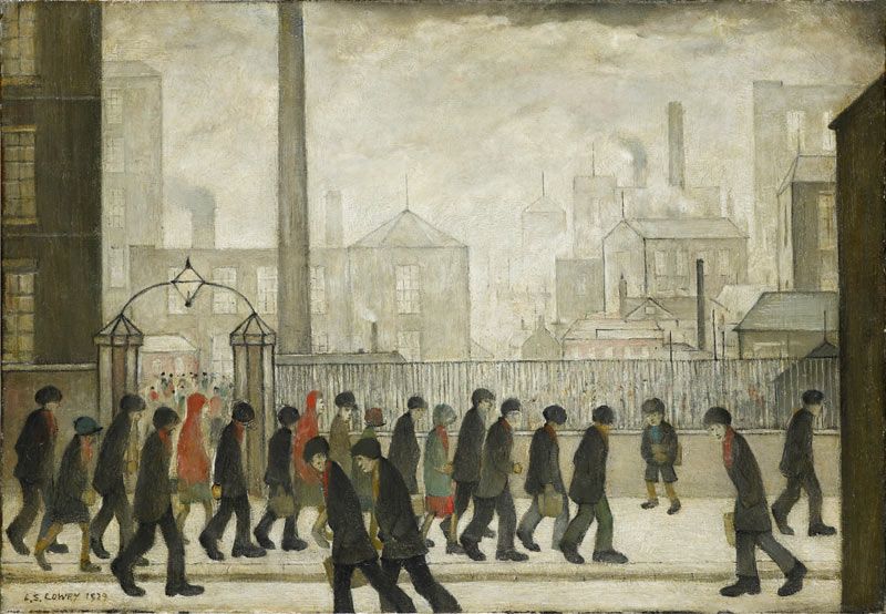
Walking into a room of Lowry's paintings the over-riding impression is one of 'sameness' and grimness and drabness. His colour palettes are very similar and his compositions are often quite horizontal and static. They do not excite admiration of their dynamism or glowing colours - but then I suppose that is the point. In the exhibition catalogue Anne M Wagner says " His repetitions were part of his project, which is to say that they were a way of matching his pictures' rhythm to the life of the street" . His work is cohesive and he apparently uses repetition as a conceptual tool according to Wagner.(1)

Click on the links to see People bent over scurrying to and from work at the mill here, and again here, and again! here

In part 2 of this research point I touched on the fact that the impressionists and post impressionists  were concerned with painting scenes from modern life and Lowry was influenced by this. He was taught at Manchester School of art by Adolphe Valette who was a French Late impressionist (1). 

Valette: Albert Square, Manchester

Valette: Rooftops, Manchester

I am sorry to say that I prefer Valette's work to that of Lowry. Perhaps it is a little over romanticised in its view of the grim northern town but is seems to find the inherent beauty in the reflections on rainy streets - something I don't find in Lowry's work. However, Valette was a great influence on Lowry and in fact Lowry exhibited and was recognised as an important artist in Paris long before he exhibited in London or Manchester. (1)

I can understand the importance of Lowry in his documentation of the industrial world around him. He was in a unique position as an artist. He was not an upper class person coming in as an outsider to portray the working classes in a patronising way. He was part of the everyday life of the places he represented in his role as a rent collector. He wasn't a member of the working classes he represented, however - his job would have put him above the class divide as a lower middle class man. It is tempting to think of him as some kind of working class hero or activist for workers' rights but this was not the case - he was a lifelong Tory.  He documented what he saw around him in an undramatic way because that is how he saw the events around him.  For example an eviction is not viewed with pathos despite how distressing it would have been for the family involved. It was quite a regular/everyday occurrence on these streets where a hand to mouth existence was the norm. In Lowry's painting the family's belongings are on the street and people stand around looking static - not doing very much. There is no wailing or gnashing of teeth apparent.

There are a few works which did grab my attention in the exhibition for various reasons. The first was Saint Augustine's Church Pendlebury link to image here on the Tate website. I think it is the bold composition of this which is so arresting. The bold dark shape of the church rising up in the centre of the page. The low viewpoint and large expanse of grey sky make the viewer feel small and insignificant. In this respect it reminds me of 'The Monk by the Sea' by Caspar David Friedrich which I mentioned in my previous post (part 2 of this research point). which takes me back to elements of the sublime - which i don't really see in many of Lowry's other works.

Next there were some of Lowry's drawings which I liked. Especially this drawing of a street in ancoats. Although it is somewhat featureless, there is a sense of mystery about it - where does that street go to? What is over the brow of that hill?

Another painting which grabbed my attention was The Cripples which Lowry painted in 1949. The figures on the painting are cartoonish and look almost comical. I stood in front of this painting not quite knowing how to feel about it. Twenty first century political correctness suggested that I should automatically feel righteous indignation on behalf of the groups represented here - in particular at their description as 'cripples'.  I didn't like the painting but I also struggled to work out what Lowry was trying to achieve. Was he simply documenting without sentiment the presence of numerous war wounded on the streets of Manchester? Was he making a comment about isolation by putting these people outside a fence? He is quoted as saying that he felt for these people and felt like them and some of the people painted here were apparently well known characters in his area. Was he aiming to comment on the tragedy of so many afflicted people? If so it doesn't really come off because of his handling of the depiction of the figures themselves. It looks a bit patronising. No, even after thinking about this painting for a while I still don't like it. It makes me uneasy - but maybe that is better than some of the other works which just leave me completely cold?

In the final room of the exhibition were Lowry's monumental industrial landscapes of the 1950s for example industrial landscape 1955. These are imaginary landscapes although some details are recognisable as representing real places. They are impressive in the size and scale . another example is Ebbw Vale. Both of these employ a street with people in the foreground to draw the viewer's eye up the centre of the composition into the rest of the scene. An unusual compositional device with its central placement. I do prefer these paintings to some of the earlier paintings but they still don't move me particularly. 

I have come away from the exhibition with a clearer understanding of the positioning of Lowry relative to the impressionists and of Lowry's importance in the documentation of the urban scene at the time he was living and painting there. However I was not converted into a 'Lowry Lover' by my trip. He isn't numbered amongst my favourite artists. I wonder if that is partly because I was brought up in the Industrial North East of England during a recession and wanted to get away from there as soon as possible when I left school? Lowry's paintings don't fill me with nostalgia they just make me shrug my shoulders and walk away.

Reference Material:

Lowry and the painting of Modern Life. T. J. Clark and Anne M. Wagner. Tate Publishing 2013


Monday, 19 August 2013

Gallery Visit - Ibrahim El-Salahi at Tate Modern

This was a retrospective of Ibrahim El-Salahi's work entitled ' A Visionary Modernist'. Once again, I had never heard of the artist before entering the exhibition. 

The first room contained some very large works on paper showing groups of flamenco dancers. The forms were simplified and reminded me a bit of art Deco posters. There was an impression of fluid movement there.

In El- Salahi's work there is a fusion of his westerns training (at the Slade School in London) with calligraphy and traditional islamic symbols such as the crescent which regularly appear in his work. His human forms are simplified and sometimes elongated. I was paeticularly drawn to his compositions which seemed to grow organically from the centre of the canvas. In fact the artist says that this is how he prefers to work - he starts with a small image at the centre and gradually expands the drawing outwards - adding extra sheets of paper as needed. This makes for some very bold compositions.

Visions of the Tomb

Funeral and the Crescent

Having completed the section of the course on mark making and tone I was very interested in El-Salahi's ink drawings. Some of these were monumentally large but on getting close up it was clear what a large variety of marks had been made and what great fluidity there was in this mark making.

Strangely, my greatest emotional response in this exhibition came from some of his smaller and less imposing works from the series 'The Tree'. Looking at these I had an intense feeling of nostalgia coupled with some melancholy. An odd reaction given that these are brightly coloured pieces of innocent trees. It took me a while to figure this out. Eventually I realised that these were based on a Sudanese woven  fabric and that this fabric reminded me very much of the colours and  fabrics from postcards that my mother used to send to me from South America when I was a child. How weird that this unassuming picture should bring out in me a sense of loss and loneliness. I know I was drawn to the composition again because of its organic growth from the centre of the page. Clearly my reaction did not reflect the artist's intention as he states it is about the artist's individual agency and role in society he talks about the tree as a complete spiritual individual with roots bound to the earth and branches extending skywards. 
I think one of the other aspects of these pictures which brought out nostalgia is the way the picture is constructed from sections of multiple lines in varying colours. This reminded me very much of doodling pictures I used to do when I was a teenager. My school exercise books were often covered in doodles constructed from repetition of lines one after the other and developing as they went across the page. It is strange how a work of are can inspire memories  and  communicate with a person unintentionally.


The Tree

The Tree


Sunday, 18 August 2013

Gallery Visit: Ellen Gallagher Retrospective at Tate Modern

Ellen Gallagher: AxME

I didn't know anything about Ellen Gallagher when I walked into this gallery so approached this exhibition without any pre-conceived ideas. This was a very extensive exhibition and somewhat overwhelming in scale but I found it very interesting and it was really helpful in terms of thinking about what drawing can be in terms of materiality. It would be foolish to try to describe the whole content of the exhibition so I'll just pick out a few pieces.

One of the rooms contained some very large pieces made in a grid arrangement Link to image of Pompbang 2003. the grid contains images of black women taken from magazine adverts for wigs and skin creams. Gallagher has modified the images by sticking wigs of pale yellow plasticine onto the pictures. This seems to communicate something about African American women and their identity. The adverts seem to be advertising products to make them look less African. Gallagher has taken this a step further by making them blond. In fact on one of the grid sections I noticed that one of the women's faces had been obliterated by a large white blob.

I wasn't surprised, therefore to learn that Gallagher has African-American (as well as Irish) heritage. 

The issue of race and identity is further raised in several other works in which Gallagher uses penmanship paper (Used by children to aid in practising handwriting) and repeats the motif of googly eyes and fat blubbery lips over and over again. These motifs are borrowed from the tradition of blacked up minstrels in stage and film. One example is Oh! Susannah Seen Here on the Moma website it is named after the song which originated from a slaves lament about families being torn apart but was appropriated by the gold rushers to apparently lose its racial overtone and become just about loss.From a distance this looks like a sort of abstract landscape but on closer inspection the marks are those symbols of racial stereotyping previously mentioned.

In one of the rooms there was a series of paintings painted entirely black. It would be impossible to reproduce the effects of these paintings in a photograph as they depend on the viewer moving around them to see the textured relief as it catches the light. Gallagher has cut bits of rubber in abstract forms and clustered them on the canvas to produce larger images such as a woman's head. They are then painted over with black enamel paint. This made me think about Gary Hume's 'Beautiful' which I had seen the day before as there is some parallel here in technique. Gallagher described these paintings as 'a kind of refusal. Even when reading them- if you stand in front of them they go blank and then if you stand to the side you see only a little'.

In another room I found the Morphia series. These works of collage, watercolour, pencil and ink on paper are suspended inside glass so that they can be viewed from both sides. The artist has worked on developing the images on each side of the paper so that both sides are equally important. The images are not always clear they include wig-like structures and other things that resemble sea creatures.

I really loved two large pieces entitled 'Puppy Chow' and Ok Corral although I still don't understand what the content is. I love the way that the artist has created the image. She has taken thin strips of paper cut from magazines and soaked them in indigo ink. The pieces are stuck together then recut again. She has created a beautiful mosaic-like structure from these pieces. The pieces seem to be more about the materials and their construction than about communicating an idea.

An Experiment of Unusual Opportunity has something disquieting about it. It was a very dark piece with various shapes represented which resembled sea creatures. When I learned whet it was about it really made me shudder. The Experiment refers to an unethical medical experiment in which hundreds of African American men with syphilis remained untreated despite penicillin being an established treatment - simply because the doctors needed autopsy material. The men were therefore allowed to die when their lives could have been saved. I can't say I really understand how the forms depicted represent the subject matter but it is certainly effective in creating disquiet. Maybe the forms are a development of her previous work 'Watery Ecstatic' (see below)

'Watery Ecstatic' is about a mythical underwater Black Atlantis populated by sea creatures descended from drowned slaves. Here I appreciated the number of different materials and techniques that the artist has used, I was particularly interested in the use of incisions through layers of paper to make a drawing. Link to Image here

Ellen Gallagher is certainly a very prolific artist who uses a wide variety of techniques and explores a number of themes and ideas. I found this a very rewarding experience and was pleased that I visited this exhibition. The title AxME is a play on the black American slang for Ask me and 'Acme Corporation' - the fictional company that Wylie Coyote orders all his Road Runner trapping devices from.