Thursday 31 October 2013

Project Drawing Trees: Sketching an Individual Tree

When I first started trying to sketch trees I was really struggling as I was trying to include too much detail. I started with sketches of trees in our garden and next door:

Catalpa and Kaki (Sharon Fruit)
As the exercise progressed and I drew more and more trees I found that I enjoyed identifying the different characteristics of these organic shapes from the spiky angularity of the pine to the cascading flowing shapes of the willow. 
Some of the sketches were more successful than others - for example some of the rapid;y executed sketches I tried to do with a brush and india ink at the beginning of a rainstorm were really appalling. Also I was still trying to get to drops with my new watercolour sketching kit. I tried a sketch of the willow with this and really struggled because having put in the skeleton of the tree, this dark tone showed through the foliage. From this I understood that when using translucent colour I should block in the foliage before the branches.

Norwegian Pine
Willow
Willow
I found that simplifying and breaking down trees into composite shapes was much easier with distant trees than when viewing them close up. There was an almost overwhelming temptation to draw individual leaves and twigs when looking at a tree in close proximity.

Distant Trees (Oak and others Unidentified)
Fig and Olive

Looking at negative shapes between branches (right)
 On one of my walks I noticed a tree which was light in tone against a dark background which made a good subject for looking at the negative shapes between the branches.

Various pines including Mediterranean umbrella pine
Large Cedar overhanging the road.
 There were so many different types of trees in the local neighbourhood that I got a bit carried away with the sketching. I also had another attempt at sketching using watercolour but this time putting the remaining foliage in before the trunk and the branches.There were so many different types of trees in the local neighbourhood that I got a bit carried away with the sketching. I also had another attempt at sketching using watercolour but this time putting the remaining foliage in before the trunk and the branches.


Monday 28 October 2013

Weekly Report: Week Commencing 21st October

This week I have finally put the townscapes project to bed. 

On Friday morning (early) Luigi and I flew to Venice from Naples. On Friday afternoon we wandered around Venice and visited the Peggy Guggenheim collection as well as The Angola Pavillion which was just around the corner from the Peggy Guggenheim.

On Saturday we purchased a two day pass to vista the biennale. We spent all of Saturday at the exhibits at Giardini and all of Sunday at Arsenale. The whole experience was quite overwhelming (but enjoyable). Two days were not enough to see everything and I will have to be very selective about what I put into this blog if I don't want to spend six months writing it up!

Friday 25 October 2013

Check and Log : Townscapes

How did you use a limited colour palette to create a sense of depth?

I used tonal variation to construct the forms for example the intricate shapes of the metalwork on the door and the dark shadow behind this. I used greater detail and darker tones in the foreground than further back (look at the texture inn the wall for example). However, my drawing was rather simple involving a wall in a side street so it was not a large panorama. This meant that there was little scope for the use of aerial perspective to create depth.

Did you preliminary sketches give you enough information for you final pieces of work?

My preliminary sketches gave me quite a lot of information about texture and particular structures. I had separate sketches of the texture of the wall, the ironwork on the door and the Vespa but I think I would have struggled to bring the composition together fully without referring to my photograph.

Would you approach this task differently another time?

My approach to this task was severely limited by depression and anxiety such that I made greater use of photography than I would have liked. I am pleased that I managed to spend some time sketching outdoors and I hope to build on this in the future. So yes, I would approach this differently another time in that, improvement in my mental state permitting, I would do more preliminary sketches on site and rely less heavily on photography.

Have you got that scale of the buildings right? Make notes on what worked and what didn't.

I think the scale is OK on the larger studies completed indoors. (the limited palette study, townscape in line and the Giamei church). However, on the townscape in line the people are much too small in comparison to the buildings even taking into account the fact that there are in the distance across the piazza. 

In some of the outdoor studies the buildings are not accurate. In particular this coloured watercolour and pen study of a street in Cerreto. 


I really struggled with this one as there was not only the usual problem of perspective on the receding street, but also the fact that the street goes up a steep hill. The third house back almost looks like it is a single storey  and the front door looks like it is made for a hobbit. So I definitely had some issues with scale on the buildings in this one. 

Have you captured the colour and atmosphere in your studies?

The study of a townscape in line was monochrome. However this was entirely appropriate for the subject as piazza plebiscite is not a colourful place being entirely made of pale coloured stone. In my other studies I have referenced the colours around me. In the limited palette study I have used blue and yellow as accent colours along with the tonal black and white as these reflect the colours of the yellow stone and the sunlight on the steps as well as the reflective blue of the vespa and the Fiat Punto parked outside the house. The other larger  study I do think captures how colourful Cerreto is. Although I have done very little blending of colours I think this is quite appropriate because the colours around me were bold and bright and in strong sunlight with a bright blue sky.


Thursday 24 October 2013

Exercise: Drawing Statues

I did not complete this exercise in the correct order relative to the course text. Please click on the links below to view the two separate attempts at completing this exercise:

Link to 'Drawing Statues'

Link to 'Drawing Statues Revisited'

Exercise: A limited palette study from your sketches


For this study I developed my sketches from the side-street in Cerreto Sannita but I admit that I did also have a photograph to refer to. I also realise that I haven't really obeyed the letter of the law when it comes to the instructions. I've used charcoal, white conte' and  two soft pastel to draw whereas the brief suggested conte' pencils or coloured pencils. The brief also talks about white paper and I've chosen a grey ground with white conte' for the lightest areas so it may be that my palette is not sufficiently limited. However, I decided to submit it anyway as I do think it gives a good sense of place and I like the simplicity of it. I enjoyed constructing the ironwork on the door from dark and light tones. 

The main negative with this larger study is that I had to draw in the texture of the wall because I used thick sandpaper as a base whereas in the sketchbook I'd created the texture from a combination of frottage and erasure of charcoal. I think the texture loses something as a result of this. You still get a sense that it is a rough - unplastered wall but it isn't as descriptive as the sketchbook piece.

Wednesday 23 October 2013

Exercise:A sketchbook of townscape drawings

It is safe to say that my first attempt at drawing in public in the crowded centre of Naples didn't go too well. It was, therefore, with great trepidation that I embarked on this next exercise. One thing that did help was getting myself onto the OCA sketchbooks group on Facebook. I posted a question about tips for overcoming anxiety when sketching in public. I got a lot of responses some of which were very useful. In particular the suggestion to use a smaller sketchbook as this draws less attention as people think you are writing rather than drawing (an you could just be writing tour shopping list for all they know). The other was to position myself with my back against a well. People like to look aver your shoulder but are less likely to come up in front of you and twiddle all the way round to see what you are drawing. Another suggestion that made me laugh (but I haven't had the courage to try) was to put a hat down with a few coins in it - then people will hurry past without even looking in your direction!

I decided to do my drawing more likely in some quieter backwater towns and village. I tried to time it when I estimated that there would be fewest people about. My first outing was on a cloudy afternoon at about lunchtime when any Italian worth his salt would be at home enjoying a large dinner. This tactic worked as I saw very few people. At my husband's suggestion I tried to draw the Giamei church (built by my husband's ancestor for his wife in a local village). It was difficult to get into a position on the steep narrow street to get a good composition but at least I'd taken the first steep of going out on my own to draw in public. I didn't really understand the instructions clearly about drawing in 10cm squares but I tried to do that. Some of my drawings ended up spilling over onto the rest of the page though.

Unfortunately, it soon started to rain and there wasn't a sheltered area that was convenient to draw from so I had to head home. In fact I found that it was better to go out several days in a row  to this local village (Cerreto Sannita) because I was free to return home after a short period of work if I was overcome by nerves.


On my second outing, I drew the cathedral at the bottom of the hill but found the composition wasn't very interesting as the only position  convenient to draw from was directly in front of the building. I managed less than an hour before I felt I was being scrutinised and went home.


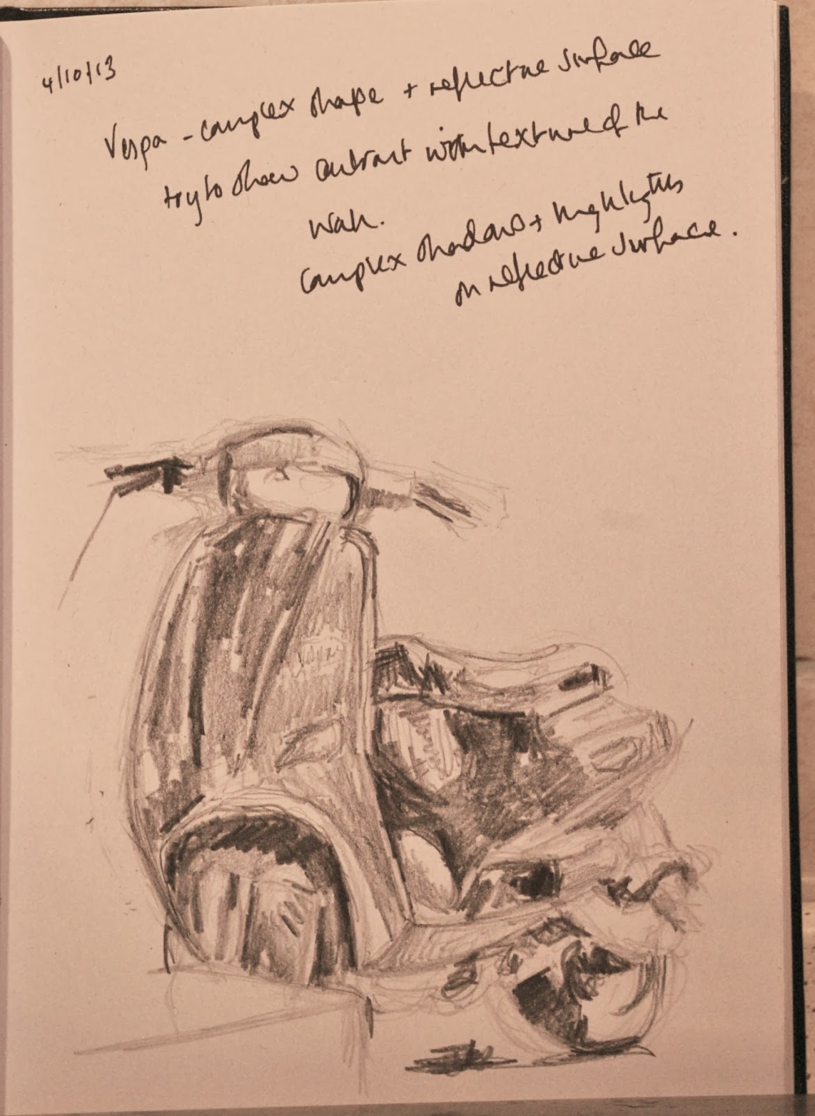
Third time lucky! On my next vista to Cerreto I peeked round the corner from the main Viale into one of the side streets. There I saw a Vespa parked next to the doorway to someone's hose. The wall of the house was rough textured and the golden sunlight o the wall accentuated the texture. The steps up to the door were wide and somewhat overgrown and the door had an attractive iron grid work pattern across it. This scene looked so very typical of the local area and so very Italian that I felt that really did give a sense of place. I made some notes in my sketchbook and rough sketches of the texture of the wall as well as the Vespa (bright and shiny against the roughness of the wall) . I also took a few reference photos of this because I couldn't count on the vespa being there again if I returned.


I decided to use this as the motif for my larger, limited palette study. However I resolved to continue trying to draw townscapes in my sketchbook as I still wasn't comfortable with it. Below are some further examples. Some are drawn from life others from photos
Experimenting with a new watercolour pack. Steep street in
Cerreto Sannita with multicoloured houses and the last of
the geraniums on the balcony

View from my front doorstep

View from my front doorstep minus car

A very old and dilapidated barn adjacent to a neatly rendered
house. Quite a typical sight in these parts

Tonal study in charcoal of a side street and the rear view
of the Giamei Church

The main piazza in Cerreto Sannita. I was attracted by the
rectangular trees! Unfortunately I got the perspective on
the low stone walls wrong so they look sloped.

Larger study of the rear-view of the jelly-mould  Giamei church and side-street worked up in
soft pastel on A2 sand paper. I used my previous tonal study but also referred to
a photograph. I especially liked the colours of the buildings, the bright sunshine on the gable
ends and the colours of the buildings and sky reflected in the sky. The yellow and blue of the
tile on the jelly-mould roof reflect may of the colours in the rest of the piece.

Sunday 20 October 2013

Weekly Report: Week Commencing 14th October

This week I have continued to work on the townscape project and I have continued to post work on the OCA Sketchbooks group. I am making steady but slow progress and plan to have the townscapes project finished before next Friday when dec leave for Venice. 

Luigi is taking me to Venice for the biennale as a late birthday present!! (my birthday was 2nd October - we didn't celebrate because I was depressed)

Sunday 13 October 2013

Weekly Report: Week Commencing 7th October

No progress this week. I have been away working and just about have the energy to work (14-15 hour night shifts), eat and sleep so have not produced any coursework.

Saturday 5 October 2013

Weekly Report : Week Commencing 30th September

This week I contacted my tutor to let her know what's happening. I am making painfully slow progress at the moment and it is clear that I will miss my deadline for completion of this project. 

My tutor was very understanding and has given me and extension for this part. I also requested that I could use photographs just to keep me drawing (for therapeutic reasons) when I am too strung out to go outside.

That being said I have made some progress - I have used som eof the suggestions I was given by the OVA sketchbooks Facebook group. I have made several trips to draw outdoors this week. They have been very short trips at very quiet times but they are a step in the right direction.