Demonstration of Technical and Visual Skills
My technical and visual skills are continuing to improve. In particular during this section my ability to draw figures which are in proportion and to tackle subjects which I have previously found very difficult such as hands, drapery and portraiture have improved dramatically. In fact I did succeed in producing likenesses of myself and of my husband. (when I posted my final piece on social media the comments received suggest that Luigi was immediately recognisable). Obviously there is still a vast amount to learn but I can see evidence of progress over part four and over the course as a whole. Probably the area I need to be most careful of in this section is to maintain fluency as I still have a tendency to get hesitant and indecisive in my line work when nervous. I have tried to overcome this by making more use of continuous line drawing and blind drawing which I particularly enjoy. The other are that needs more work is design and composition, but again, I can see that this is improving with more practice.
Quality of Outcome
Again - this is improving and may be adequate for this stage on a level one course but there is a long, long way to go. I have tried to bring the learning from the exercises together in the assignment pieces. My blog gives a commentary of the ideas and though processes I went through when working towards the assignment. I hope that my ideas are communicated effectively although I haven't tried to express anything too complex at a conceptual level. The drawings are what they are.
Demonstration of Creativity
I have tried some more creative ways of working in my sketchbook. I tried using a needle and syringe filled with ink and could create a variety of marks depending on the pressure at which the ink was expelled. I could also use the needle as a drawing implement. I have drawn with string and with wire. I have used my fingers to spread oil pastel about. I used cross- contour drawing as an alternative way to represent form using line. I have also drawn by feeling my face and by taking a rubbing from it!
I found the decision not to designate my final assignment piece until I had a few large scale pieces to choose from was liberating. I did't feel so inhibited and was able to experiment more - I intend to continue down this route. I am really looking forward to part 5 in which we are further encouraged to experiment.
The other thing that has happened over the course of part 4 is that I have had many ideas which could be developed further - I have noted them and will try to move this to the next level when I have time.
Context
I think that my critical refection in my blog continues to be of a relatively high standard. I have looked at many artists, both during the research points and independently of this and this context has informed and fed in to some of my work. I do like to link information together and make a map of it to help my own understanding. I also have to assimilate and summarise information in order to make it useful to me so I think that I am probably meeting the criteria specified at this stage.
Tuesday, 10 June 2014
Monday, 9 June 2014
Part 4 : Other Research
I have looked at the work of numerous artists during this part of the course, some of these were suggested by my tutor and others I found on my own. The notes here are necessarily brief.
Euan Uglow
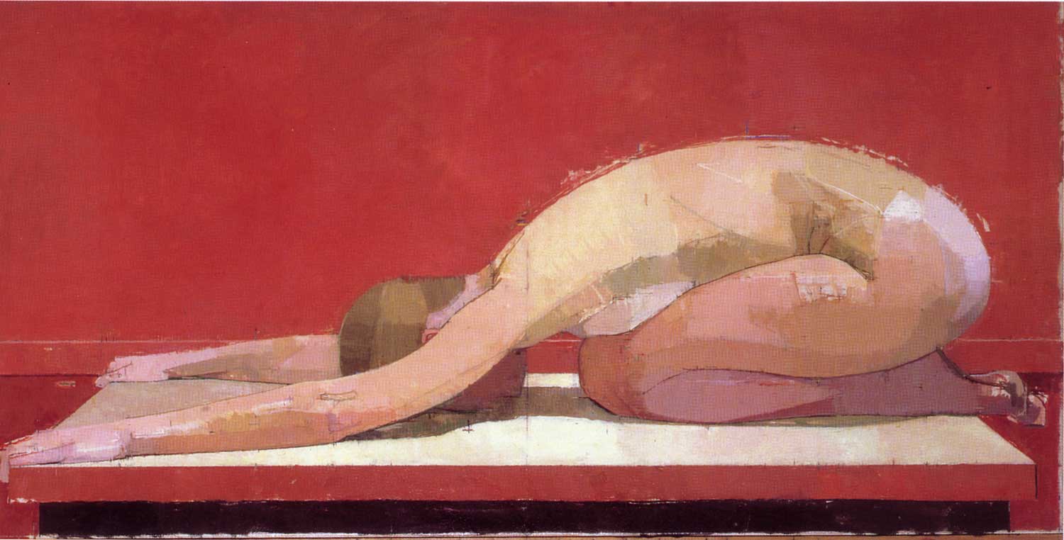
Uglow's main focus was on painting the figure. He had a very precise way of doing so which involved asking models to adopt poses which exaggerated simple geometric shapes and then taking multiple measurements and plotting co-ordinates. He continued to take and plot measurements throughout the process of painting and sometimes his measurement marks are still visible in the final paintings.
Click Here for Uglow Example 1 from Painting Perceptions website
Uglow Example 2 from Painting Perceptions Website
I like Uglow's work. Although the work is painstaking it is not done in this way to produce a photorealistic result. The painting is more than an accurate representation of the body in front of him. I like the way that he selectively simplifies the planes of colour and tonal values. I also like the fact that the means of production is visible in the final painting. He has resisted the urge to tidy everything away - you can see the process of making and thinking which went into the painting and to me this helps me find the artist in the painting. (It's a bit like the excitement I feel when I find the thumbprint of a famous long dead artist on examining a painting close up)
John Currin
Thanksgiving 2003 John Currin on Tate Website - Click Here
Looking at Currin's works, I find many of the characters he portrays are repellent. His work leads me to make immediate judgements about their financial and social status and their personalities. He very skilfully passes and often critical eye over society (in particular American Suburban life) interweaving this with references from art history. In the example above he uses his wife Rachel as the model for all three women. There is a reference to loss of virginity or deflowering. The turkey is waiting to be stuffed which ties in with the woman's open mouth. The whole scene also recalls Parmigianino's "Madonna of the long neck'
Hope Gangloff
Click to link to the artist's website
Hope Gangloff's subjects are mainly her friends. They are young bohemian types often pictured partying or lolling around bleary-eyed with hangovers. They appear young and carefree which is an attractive lifestyle to portray. What I particularly like about her work is that her drawings seem to capture fleeting and unguarded moments and are not formally posed portraits or obviously constructed scenes for a particular narrative purpose. She often uses textiles in her work and the patterning of the textiles contrasts with the relatively simple treatment of her subjects' faces and anatomy. There is a lot of flat patterning and in this way her work reminds me somewhat of that of Gustave Klimt
Goya
There is a striking contrast between the work in Goya's Early Career and that in his later life. His early work was as a court painter and so the style is very formal and not particularly individual.

Later he was troubled by severe illness which affected his balance, made him deaf and also lead to significant psychological suffering - some have suggested that this may have been the result of lead poisoning from the paints that he used. Whatever the underlying cause, his subject matter became much darker and he produced a series of disturbing images called his black painting or which 'Saturn devouring his infant son' is an example.
Euan Uglow
Uglow's main focus was on painting the figure. He had a very precise way of doing so which involved asking models to adopt poses which exaggerated simple geometric shapes and then taking multiple measurements and plotting co-ordinates. He continued to take and plot measurements throughout the process of painting and sometimes his measurement marks are still visible in the final paintings.
Click Here for Uglow Example 1 from Painting Perceptions website
Uglow Example 2 from Painting Perceptions Website
I like Uglow's work. Although the work is painstaking it is not done in this way to produce a photorealistic result. The painting is more than an accurate representation of the body in front of him. I like the way that he selectively simplifies the planes of colour and tonal values. I also like the fact that the means of production is visible in the final painting. He has resisted the urge to tidy everything away - you can see the process of making and thinking which went into the painting and to me this helps me find the artist in the painting. (It's a bit like the excitement I feel when I find the thumbprint of a famous long dead artist on examining a painting close up)
John Currin
Thanksgiving 2003 John Currin on Tate Website - Click Here
Looking at Currin's works, I find many of the characters he portrays are repellent. His work leads me to make immediate judgements about their financial and social status and their personalities. He very skilfully passes and often critical eye over society (in particular American Suburban life) interweaving this with references from art history. In the example above he uses his wife Rachel as the model for all three women. There is a reference to loss of virginity or deflowering. The turkey is waiting to be stuffed which ties in with the woman's open mouth. The whole scene also recalls Parmigianino's "Madonna of the long neck'
Hope Gangloff
Click to link to the artist's website
Hope Gangloff's subjects are mainly her friends. They are young bohemian types often pictured partying or lolling around bleary-eyed with hangovers. They appear young and carefree which is an attractive lifestyle to portray. What I particularly like about her work is that her drawings seem to capture fleeting and unguarded moments and are not formally posed portraits or obviously constructed scenes for a particular narrative purpose. She often uses textiles in her work and the patterning of the textiles contrasts with the relatively simple treatment of her subjects' faces and anatomy. There is a lot of flat patterning and in this way her work reminds me somewhat of that of Gustave Klimt
Goya
There is a striking contrast between the work in Goya's Early Career and that in his later life. His early work was as a court painter and so the style is very formal and not particularly individual.
Later, his style changed dramatically and there were two major influences on this - the first was the Peninsular war after France invaded Spain. His processing of the events of the ear led him to create images with strong political motives including etchings entitles - 'disasters of war' and the famous "Third of May 1808"
 |
| £rd of May 1808. Goya |
Later he was troubled by severe illness which affected his balance, made him deaf and also lead to significant psychological suffering - some have suggested that this may have been the result of lead poisoning from the paints that he used. Whatever the underlying cause, his subject matter became much darker and he produced a series of disturbing images called his black painting or which 'Saturn devouring his infant son' is an example.
.jpg) |
| Saturn Devouring his Son |
I realise that I have not done justice to any of the artists I have researched with these very brief descriptions. More research material can be found in my sketchbooks and there are numerous other artists I would like to explore here if I had an unlimited timescale. Unfortunately I am in serious danger of exceeding the time limit for this course so I will have to stop here and move on to part 5.
Assignment Four: Tone
 |
| Preliminary Graphite Sketches in Sketchbook |
For the tonal exercise of a reclining figure I started with some rapid small scale tonal sketches in my sketchbook. I squinted my eyes so as to get an overall impression of the patten of tonal values rather than getting hung up on details. I had decided on this occasion to move quickly from this to working on a large scale. My next drawing was an A1 charcoal drawing of Luigi who was enjoying a snooze on the sofa. He's a good sleeper so I had a good hour and a half before he woke up. I particularly like the folds in the fabric and in the shiny surface of the leather sofa. There's something not quite right about his head though. I think the ear should be included I may have drawn more of his face than I could actually see because I don't remember seeing his ear but on the drawing it looks as though it should be there.
Having completed a large scale drawing which could serve as my assignment piece if necessary I felt the pressure was off and I was free to play around and experiment. This was the purpose of the A2 sketchbook I had purchased.
I decided to use colour so chose a dark ground and soft pastels for the next drawing. This drawing was much better at the half-way mark. I overworked this piece, particularly around the head and face. His face now looks very stiff and plasticky. I had put so much pastel on the paper that I ended up using white acrylic ink for the highlights on his tee-shirt which had got lost. The piece as a whole was much better when the texture of the paper was showing through - a lesson learned for future drawings. I need to stop sooner or at the very least take photographs during the process of drawing. However, on a positive note, the hands are improving.
I had recently invested in some Windsor and Newton Oilbars so I had a try at using these for the first time. Initially I used just the black one on a sheet of cartridge paper. This was wonderful. I love the creamy texture and thoroughly enjoyed spreading it about with my fingers. A satisfying tactile experience. I also love the dense sooty black it produces and the fact that different marks can be made when it is spread out. I made some lovely marks similar to 'dry brush' marks by scrubbing my fingers across the paper with very little of the medium on them. When applied thickly , the black oil bar produces the darkest of darks but it is also possible to scrape into this dark to produce hatching in a lighter tone which I did with a scalpel blade.
I decided to experiment further with oil bars in colour and to use these in combination with oil pastel. Looking back on the exercise I had done over the course of part four I particularly liked the pastel drawing of Luigi seated with the light from his Kindle tablet illuminating his face (Project: Structure. Exercise: Three Drawings sitting). This reminded me of a modern-day take on a painting I had really liked on my last visit to the Museo di Capodimonte Il Soffio by El Greco- (Click here to link to the image) in which a young man's face is illuminated by a burning charcoal in his hand. These days however, instead of the warmth of fire or candle-light. faces are more commonly illuminated by that cold T.V./computer monitor/phone/tablet light. I wanted to try to capture this cold light.
 |
| A1 Charcoal, putty rubber and compressed charcoal |
I drew in my sketchbook with XL graphite and Inktense blocks. I also tried a rapid sketch with ink and wash. I wanted to be less controlled Inspired by some of the washy ink portraits of Marlene Dumas. My attempt was not so successful but I can see potential for future development here as I love the marks that the ink makes when it spreads on damp paper. I do however think that the ink and wash piece gives an impression of the model being deeply relaxed and heavy with sleep.
 |
| XL Graphite A2 Sketchbook |
 |
| Ink and wash with brush A2 Bockingford paper |
 |
| Soft Pastels and White Ink on a Coloured Ground |
 |
| Oil Bars and a Scalpel Blade A1 Cartridge paper |
I decided to experiment further with oil bars in colour and to use these in combination with oil pastel. Looking back on the exercise I had done over the course of part four I particularly liked the pastel drawing of Luigi seated with the light from his Kindle tablet illuminating his face (Project: Structure. Exercise: Three Drawings sitting). This reminded me of a modern-day take on a painting I had really liked on my last visit to the Museo di Capodimonte Il Soffio by El Greco- (Click here to link to the image) in which a young man's face is illuminated by a burning charcoal in his hand. These days however, instead of the warmth of fire or candle-light. faces are more commonly illuminated by that cold T.V./computer monitor/phone/tablet light. I wanted to try to capture this cold light.
In this composition Luigi said he was going to read a book on his kindle. However, more often he was distracted and gazing at the T.V. screen on the other side of the room (there are so many stimuli these days! - drawing is a welcome release because I can only concentrate on one thing at a time). This was mostly drawn from life although he couldn't hold the position for more than an hour so I had to resort to a photograph and previous sketches to finish the details of his face. (this was, however very difficult to photograph as it was in such low light generally.)
I used a pale grey ground and allowed this to show through on parts of the fabric such as the jeans as a mid tone. Overall I am quite happy with this outcome.I do think you get the sense of the illumination of his face by the tablet. I have used cooler colour choices on his face (lemon yellows and pale blue/greys compared to the more red and yellow ochre illumination of other areas). Despite the fact that my weak point of hands is very much in evidence here I think I have made a reasonable attempt at them in this drawing. I like the overall composition and the balance of tonal values- I think it effectively draws the eye towards the focal point of his face. I am particularly pleased with his jeans. From my previous exercises you will see that drapery is something that I have struggled with. Here I think I have manage to create an impression of the changes in direction of the body underneath as well as the deep folds in the fabric. I have also successfully resisted the temptation to overwork this area and have allowed some of the coloured ground to show through. I also canvassed opinion on the OCA sketchbooks group on Facebook and this confirmed my decision to designate this as my assignment piece.
 |
| Oil Bars and Oil Pastels on a Coloured Ground (Between A1 and A2) |
Monday, 2 June 2014
Assignment Four: Line and Shape
 |
| Preliminary Sketches |
I started with some preliminary sketches in pen and ink and drawing pen on paper. I also drew with OHP pen on acetate as I like the way that the ink flows on the smooth surface. I tried to keep these drawings quite free at this stage. These were very rapid drawings as I moved around the model in his chair to draw from lots of different angles. I decided my favourite composition was with me sitting on the floor in front of the model in his chair with his foot coming towards me. This gave quite a dynamic shape and the foot coming towards me was interesting in terms of the relative scales. I though it might be possible to exaggerate the perspective on this in order to make it even more dynamic.
When I had selected my view I made a very simplified representation of this using a couple of pieces of garden wire which I held in place in my sketchbook using masking tape. I then placed another sheet of paper over this and made a rubbing of it using charcoal. The paper shifted slightly and resulted in a partially repeated line. I quite like this effect, which to me reads as movement of the figure.
Next I tried distorting the image using a distorted grid to re-draw a small sketch of the composition. This was not successful. I hadn't taken into account the effect that distortion I had put into the grid would have on his head. The resulting effect was quite comical. The model looked a bit like a teletubby - not the effect I was going for. I decided that any exaggeration of the composition would have to be done by eye.
I also experimented with various drawing techniques in my sketchbook. I tried putting contour lines on to the surface of the figure to try to indicate rises and falls in the fabric without resorting to shading - I decided to take this further and do a 'cross contour' drawing as I though this would be an alternative way to represent form with line alone. I also experimented with sgraffito but decided that this was actually more suitable for a tonal study.
I tried drawing the composition again using a needle and syringe with ink . In some places I sprayed ink onto the paper and in others I used the needle on the surface of the paper to create a variety of lines. I decided this was a good technique to use as it would help me to overcome the tendency to become too tight and controlled when drawing an assignment piece. This technique is not particularly controllable. This sketch, however was out of proportion - his legs were too short and head too big relative to his body.
 |
| Basic body shape created with wire and masking tape |
 |
| Rubbing in charcoal of the wire body shape |
 |
| Attempt to distort and exaggerate the perspective with the foot in the foreground |
 |
| Trying out contour drawing in drawing pen and sgraffito with wax crayon |
 |
| Drawing with ink and syringe and with string |
I went on to produce two large scale drawings. One was a cross contour drawing and the other used the ink and syringe technique.
The cross contour drawing I produced by drawing a basic shape of my figure on the page. I then referred to a photographic reference to try to decide where the contours of the figure and fabric would rise and fall. There was no outlining. I started from one side of the page and drew across the width of the page, allowing the line to deviate with the contours of the figure. This took a long time to achieve but I thoroughly enjoyed the process of doing this drawing. I find this type of drawing meditative - there wasn't any anxiety or too much thinking involved just calm and repetitive mark making. It is therapeutic. The final drawing doesn't have as much impact as I would like. However, I think there is scope to use this type of technique for certain parts of a larger drawing such as describing the folds in a piece of clothing.
The final drawing was drawn using the ink and syringe technique. I paid more attention to the overall proportions of the figure this time and slightly exaggerated the advancement of the foot towards me (but only very slightly). I really struggled, however with the perspective on the floor tiles and the background in general. Originally they too were in line but I made an error with the perspective that I couldn't rectify so I ended up using tonal shading with charcoal for the background. This helped the line drawn and simplified figure to stand out. However, looking back at this now I don't like this background at all. It looks a bit half - hearted. I think I should either have taken the background further in terms of tonal variations or reworked the piece altogether. I'm happy with the figure in isolation. I think the proportions are OK and I also think his expression of frowning concentration is captured (he was watching sport on T.V.)
 |
| First try at cross contour drawing in sketchbook preliminary tonal sketches underneath |
 |
| Cross contour drawing using fine drawing pen on an A1 sheet of paper. |
The final drawing was drawn using the ink and syringe technique. I paid more attention to the overall proportions of the figure this time and slightly exaggerated the advancement of the foot towards me (but only very slightly). I really struggled, however with the perspective on the floor tiles and the background in general. Originally they too were in line but I made an error with the perspective that I couldn't rectify so I ended up using tonal shading with charcoal for the background. This helped the line drawn and simplified figure to stand out. However, looking back at this now I don't like this background at all. It looks a bit half - hearted. I think I should either have taken the background further in terms of tonal variations or reworked the piece altogether. I'm happy with the figure in isolation. I think the proportions are OK and I also think his expression of frowning concentration is captured (he was watching sport on T.V.)
 |
| Assignment drawing: Ink drawn with a needle and syringe. Background is charcoal. |
Subscribe to:
Posts (Atom)