Friday 14 February 2014

Renal Colic

I've had renal colic as a result of kidney stones getting stuck in my left ureter obstructing the flow of urine. This is an extremely painful condition which has really knocked me sideways and has meant I have not been able to sit up straight let alone concentrate on drawing anything specific. I decided to make a drawing of the experience using some new inktense block I had bought.

I closed my eyes and imagined the edges and the shape of the sensation. I then imagined the colours it might be and sketched it.


Sunday 9 February 2014

Check and Log: Gesture

How well have you managed to capture the poses? What could be improved?

I think I have captured the poses quite well in most cases. However, some of the drawings are too detailed especially the first few of the two minute poses that I did and some of the left handed drawings in the 'energy' exercise. Improvements could be made by being much more selective in the number of lines drawn. This is why the drawings made with less controllable implements such as bits of string or syringes and needles full of ink seem to be more successful.

Do you think your figures balanced? If not where did you go wrong

I do think that my figures balanced. I don't get the uneasy feeling that they are about to topple over when I look at them

How did you go about conveying a sense of energy?

I tried various methods to do this. Mostly this consisted of not drawing static lines. Where lines or forms looked too clean or static if they were drawn in charcoal or graphite I broke up their continuity using a putty rubber.

I also drew multiple lines when drawing with my left hand. I was influenced in doing this by the sketches by John Singer Sargent of Spanish Dancers. Unfortunately this wasn't as successful as I hoped - it looks more like uncertainty in drawing with my left hand rather than confident representation of movement - I might have to revisit this with my right hand.

I enjoyed spraying ink onto the paper. This technique I do feel conveys energy as it involves energy and lack of control in the application - I sprayed the ink at high pressure through a very fine needle. The lines produced were flowing partly because the drawing implement is not in contact with the paper allowing freedom of movement.


Saturday 8 February 2014

Project :Gesture. Exercise: Energy

These drawings can be found on pages 37 to 47 of Sketchbook 5. I experimented with various ways of suggesting movement. I drew with charcoal or graphite stich and made marks in the drawing with a putty rubber to make it look less static. I did blind continuous line drawings. I also experimented with drawing with my non dominant hand (my left hand). I tried to use continuous line as much as possible even with my left hand - I was pleasantly surprised by the results. I had to concentrate very hard to draw with my left hand but the results were less wobbly than I expected ( in fact less wobbly than sometimes my right hand draws when I am nervous or lacking in confidence)

Graphite Stick and Putty Rubber

Conte' on Ingres Paper

Ink Sprayed onto Paper using a Fine Needle and Syringe
Leaping Dancer


Biro on Sugar Paper drawn with
non-dominant (left) hand

Woodless Pencil


XL Charcoal

Charcoal, Drawing Pen, Putty Rubber


XL Charcoal


Biro and XL Charcoal
Drawn with Left Hand

Biro and XL Charcoal
Left Hand

Blind Continuous Line Drawing in Biro

Woodless Pencil


Woodless Pencil

I enjoyed this exercise. Overall I think the more successful drawing sin conveying energy and movement are the syringe and needle ink drawings and the drawings made with graphite stick or X L Charcoal and putty rubber.

Friday 7 February 2014

Project: Gesture. Exercise: Stance


These drawings can be found in sketchbook 5 on pages 26 to 36.
I thoroughly enjoyed this exercise. Having practised previously I realised that I would get better result if I drew for shorter times and used media that were less controllable than pencil or drawing pen. The first few drawings were made with a fine 'rigger' watercolour brush and black India ink. Because the brush had long and flexible bristles I could produce a good variety of marks from very fine lines with the tip to very broad black marks with the side of the brush. I really liked the quality of these first few drawings. The instructions in the course notes were to draw the line of the centre of balanced on to the figures. I didn't want to deface the drawings so I photocopied them and drew lines onto the copies which I have stuck into the sketchbook alongside the original drawings.


1 minute pose
Ink and Brush


30 second pose
Ink and Brush


1 minute pose
Ink and Brush
1 Minute
Ink and Brush


1 Minute
Ink and Brush


30 Seconds
Ink and Brush


1 Minute
Conte and Coloured Pencil


30 Seconds
Conte and Coloured
Pencil


30 Seconds
Conte and Coloured
Pencil


After the ink drawings I moved on to using conte' and coloured pencil. My idea was to draw a broad stroke of conte' to show the main gesture of the pose and then use the coloured pencil in continuous line to give more detail of the pose but without losing that fluidity of the drawing. These drawings overall I didn't feel were as successful as the ink drawings but the best of these was the female figure in sanguine conte' and dark blue coloured pencil which is on page 33 of sketchbook 5.

Tutor Feedback: Assignment 3

Overall Comments

My own responses to the comments are in blue Italics.

Thank you for submitting assignment 3 for Drawing 1. It is clear that you have worked hard on this assignment despite its difficulties and that your research and learning log backs up your studies well, however, at times, although you have an acute awareness of this, the work tightens and then loosens around your confidence.
It is true that my work has suffered during this assignment owing to issues with confidence.

 I would suggest that you try to look when you can at work in its physical sense to see and understand the many different approaches to drawing as two are very rarely similar and I would like you to think carefully about your own ability where possible. Obviously a lack of confidence can really restrict the work or at best get in the way at times. I would like you to try and really enjoy it much more in terms of the experience of drawing for this is such an important part of the process. 

I found the statement 'I would like you to think carefully about your own ability' a bit ambiguous - I was concerned that this might mean that my ability was not sufficient for the course and I should just relax and forget about putting in for assessment. I asked for clarification on this. Hayley said she thought it was still worthwhile applying to be assessed.

You have managed to submit an extensive assignment overall and have worked extremely hard at all aspects of this assignment despite personal difficulties so this is to be highly commended. That said, loosening up and worrying less about what may happen along the way can allow you the freedom and space to make mistakes and it so often that these mistakes can over time become the unexpected and most unintentionally inventive outcome. Creatively these ‘more lucid moments’ are much more liberating and your confidence will grow with a much more ‘devil may care’ attitude. I appreciate that due to your working life this is the absolute antithesis of having the responsibility and duty of care to your patients but in the long run the freedom within this creative path can be for you both therapeutic as well as a liberating release that will bring back the balance of working hard through serious study whilst being allowed the freedom to play, discover and learn at the same time. This is how the work evolves naturally, confidence grows and achievements become a lot more attainable, so embrace the work where you can with a little less earnest approach and exciting things will happen.

Having a 'less earnest approach' will be difficult for me as I feel that my earnest approach is what has got me this far. I will try to embrace this (but trying too hard to change my approach would also be excessively earnest! - I'll try hard not to try so hard!! - a bit of an oxymoron!)

Your learning log is well written and articulate and fully supports your own work well. A more developmental and experimental approach to drawing in your finished work (as you have already grasped in your sketchbooks) will enhance your work and experience overall so please don’t feel afraid to ask questions if you have difficulties along the way as distance learning can with a heavy workload be quite difficult to juggle. You have clearly worked extremely hard and I look forward to seeing a much lighter approach to Assignment 4 if you can embrace the approach I have suggested. I am leaving you with this quote below to consider for the next assignment.


‘Intelligence is not to make no mistakes, but quickly to see how to make them good’
Bertholt Brecht

I have seen on the OCA website the work of a painting student who did very well in avoiding tightening up for the assignment piece by working in a large format sketchbook and simply selecting the most successful pieces from this book. I think this approach might work for me as I usually enjoy the sketchbook work much more than the assignment pieces and the more relaxed attitude is beneficial.


Feedback on assignment 
Demonstration of technical and Visual Skills, Quality of Outcome, Demonstration of Creativity 

Project: Landscape Drawing

Research point: Albrecht Dürer, Claude Lorrain, and L. S. Lowry
A very articulate, in depth and questioning personal response to the work of artists that have historically embraced landscape or have emulated their surroundings in a variety of different ways. Your written research demonstrates that you are good at knitting together ideas and formulae taken from artists working techniques and your visual skills at reading an image are particularly strong.

Exercise: A sketchbook walk
You have made four quick sketches from your walk and have annotated well, describing the temperature, light and points of interest within the compositions. 

Exercise: 3600 studies
These sketches are a fantastic example of how to work quickly, respond to the landscape immediately in front, to the side and behind you and demonstrate a good visual sense and visual description of what was in front of you from your garden. The charcoal drawings feel expressive and dynamic and you have explored your medium well in this exercise. Using charcoal lightly, broadly and heavily in places demonstrates that you have approached the exercise as directed, which has resulted in a competently drawn outcome, so well done.

Research point: Monet, Pissarro, and Cezanne
Excellent detailed research containing relevant contextual quotations as well as demonstrating the use of two contrasting artists as well as the history of oil paint tubes and the relationship of working en plein air with approaching the ‘truth’ in nature. Your research standard is high with many threads woven throughout to merge your readings with your discoveries on artists and their surrounding history, so well done as it’s a very interesting read overall.

Exercise: Drawing cloud formations
You really have explored a wide range of media and techniques for this exercise and have maintained good annotation and learning log entries in support of your additional research and practice of drawing cloud formations throughout. For me the charcoal and ink on pastel paper feels very reminiscent of the approach taken by John Constable in his drawing research of landscape and it is good to see you looking not only at the clouds themselves but also the work of other artists in support of your own studies. Your explorations with surfaces are also particularly interesting. The painted over collaged torn tissue, the thickness of gouache and the multi media approach is a successful one and the supporting postcards are also good supporting research.

Exercise: Plotting space through composition and structure
Plotting and selecting an atmospheric scene with intersections of field, sea and sky here has allowed you to produce a very dramatic, pictorially interesting landscape with good supporting studies in your sketchbook. Overall you have critiqued your drawing studies well. It is important, even when studying, fore, mid and backgrounds that you spend time refining what it is you are seeing. Try wherever possible to remember that you do not have to explain everything that is in front of you. You have referenced subtraction, erasing and so on earlier on in the previous exercises so where you recognise that the composition is full of information try to eradicate a lot of it by reduction. Try to use one line to depict the information rather than 5 for example. On many occasions the brain in fills this information and so it is not necessary to ‘explain it all’. Over complication of the composition just confuses the eye and the brain, so allow the drawing space by taking away or leaving parts empty or reduces to its lowest denomination.

This is a fair comment. I felt that this drawing was too 'busy' . I will be trying to simplify more in future exercises.


Research point: Claude Lorrain, Turner
Excellent research throughout, demonstrating your understanding of contextual references of working with foreground, middle ground and distance in the pictorial plane You have again been very observant in your deductions regarding the issues that each artist was involved in and your approach to writing about this is very good, demonstrating that you have good visual and research skills.

Project: Perspective
Exercise: Parallel perspective – an interior view
You have managed two attempts at parallel perspective and clearly have an understanding of how it should be. Overall these studies are not bad for a first attempt and you have clearly learnt from this exercise.

Yes the perspective needs more work but I have made an initial step forwards.

Exercise: Angular perspective
Again this has been another interesting exercise for you. You have found some good help with this approach to technical drawing and have interestingly picked out some errors within found drawings in regard to parallel perspective. It would be good to see you consider this in other drawings at a later stage but tackling the books for this exercise has clearly helped, so well done for not abandoning this exercise. More practice at home could be very useful in your understanding of how to draw interior and exterior landscapes. You have analysed the difficulties faced clearly in your learning log and it is hoped that with more practice you will obtain further knowledge and understanding of this topic.

Project: Townscapes
Exercise: Study of a townscape using line
From your learning log I can feel the tension that has been brought to you whilst attempting to draw outside. As I read through the whole journey, it became clear that your determination to not be paralysed by fear was tantamount and your will power to succeed with this exercise was enormous. For me, the attempts at doing so improve each time and your selection of environment and timing clearly paid off. The drawings do start off very wobbly but judging from the intimidation from onlookers it is hardly surprising. However, as you work right up to visiting a museum at a quieter period of time with your back against a wall the work went from strength to strength. I can only commend you for facing your fear head on and dealing with it in a positive way throughout despite the odds against success. The fact that you referred back to photographs at the beginning suggested that you were not about to abandon the exercise and this proved to be the turning point for you to revisit the outside and deal with things in a more appropriate and beneficial manner from a personal perspective. 

Exercise: A sketchbook of townscape drawings
Subsequent architectural drawings in your A5 sketchbook reveal an attempt to tackle composition. The framing with boxes allows you to do this competently and the work feels much calmer overall. You mover on to colour studies, charcoal studies and lightly drawn scenes of Venice, all seemingly more interesting and varied in terms of composition.

Exercise: A limited palette study from your studies
You have submitted competent and well - executed drawings that demonstrate a reasonably good eye for perspective, scale, colour and tone. The limited palette works well but be mindful to not be too ‘over executed’ in places? The detail however is competent.

I enjoyed this drawing but can see that it is not as free as some of the preliminary sketchbook studies.

Exercise: Drawing statues
The final equestrian drawings really pay off. The weight, stance and power of these statues really come through your work. The sense of movement captured is good and it is of little concern at this point that the composition is out. You managed to do it and be successful so well done to you.

Project: Drawing trees
Exercise: Sketching an individual tree
You have clearly drawn out many studies of trees using a good variety of different mediums. The enquiring textural qualities of the details within the trees and their overriding detailing works well and your decision to keep it simple works well as you move through the studies.  You have annotated clearly throughout your sketchbook and have made good attempts at working with colour. 

Exercise: Larger study of an individual tree
The detailing of the bark, foliage and base is there. The sense of the character of the tree is evident with its twists and bows and I wonder if due to these qualities you could have used ink in a more varied way? However, this is a really good attempt with clear, supporting contextual referencing in your learning log.

Exercise: Study of several trees
You have submitted a fantastically array of work for this exercise encapsulating the weather, light and atmospheric conditions within each piece.  I really feel that the drawings on the grey paper are particularly good due to the simplicity of the work overall, reducing line to light and shade in this work really works hard at encapsulating the sense of the piece. You move on to draw very enigmatic pieces and manage to capture interesting composition, tone and colour well. As you move on it is clear that you reflect on past exercises through looking and depicting negatives space and have produced a good series of colour drawings on acetate as a result.

Check and logs
Your learning log is packed with good, descriptive writing demonstrating a critical look at what it is you have been asked to do, the journey you made and the outcomes. Contextually everything is appropriately placed and you demonstrate a sound ability to link ideas together from varying aspects of the course as you progress. The reflective qualities of your writing demonstrates that you are learning from your experiences and putting them practically into place as you progress throughout the course. The checks are complete, extensive and well written and ordered. 

Assignment Three
Your reflections on the whole of this assignment in your learning log reveal a troublesome journey with the whole of this assignment in terms of time constraints, work/life balance and difficulties in overcoming the fears of working in public spaces. Your determination to conquer these problems has been very exemplary and the work right up to and including the final assessment work includes these difficulties. However perseverance and sheer determination shines through even to the point that you have a break from the final assignment work and revisit 10 days later to redo the work in a less restrained and controlled manner.

The work in your sketchbook is a lot more relaxed and successful in terms of exploratory approach. You explain your discovery of a fellow student who works through the work and then selects the work he has managed against the titles and content of both exercises and final assignment pieces and this would clearly fit you much better overall as the work in the sketchbook feels and looks a lot more content, questioning and exploratory in nature. Dividing the picture plane is an interesting idea and as you work through this much more experimental approach to drawing and painting the work becomes energetic, vivid and ‘alive’. It appears that then you start to reflect back on perspective drawing and its past difficulties and the work immediately starts to tighten and become a lot more ‘academic’ in nature rather than the free flowing, energetic work that I had come to see in your sketchbook. Yes - confidence problems again. The overarching comment about wishing the pictorial plane had included an open window clearly links to the subsequent reading you have done and correlates with the sense of taking the inside out and bringing the outside in to keep the work exciting, fresh and open. The first final large finished piece therefore looks harshly divided up by the window frame and controlled in terms of pictorial order. You have however decided to include the textural quality of collage to the piece suggesting your creative links to the piece and a more free approach to relaying the sense of perspective.

Subsequent experimentation in your sketchbook and a further understanding of how to obtain a ‘voice’ within your own work is clearly demonstrated in your learning log both in a written reflection and though supporting images and suggests a much freer approach to depicting its subject. The final drawings are much more fluid, expressive and really allow the eye compositionally to look around the page with ease. Keeping the monochromatic drawing limited in terms of palette the work breathes easily and feels confident in execution.

The second drawing in coloured pencil tightens up slightly, quite possibly as a lot of detail has been drawn and although visually much busier the work finds a middle ground in terms of business. The tonal aspects of shadowing in the mid ground works well in terms of slight abstraction within its minimalism and the sense of perspective is a lot more determined than the previous drawing. The colour palette works well on the ground and for me it would have been an interesting challenge to depict (with this medium of coloured pencil) a similar image to the previous one. For example how would you manage to gain the fluidity of line using coloured pencil? What if it were a mainly linear drawing with limited blocks of tone for shadow only? This type of approach will come over time with more practice and so too will the confidence to reduce the image to its simplest of form, but well done for having the bravery to revisit the assignment and move it on as far as you have. I would really like to rework this assignment as I still wasn't satisfied with the outcome. Unfortunately owing to time constraints this may not be possible.


Sketchbooks 
Demonstration of technical and Visual Skills, Demonstration of Creativity 
You sketchbooks are full, exploratory and fluid. With clear annotation throughout it is clear that using sketchbooks to prepare for an experimental approach to making work works really well for you and your creativity and problem solving techniques are evident throughout. You are using your sketchbooks well and it would be good to have seen a little more evidence of your visit to Venice in there, although I do appreciate that there was an awful lot of work to absorb there.


Learning Logs or Blogs/Critical essays 
Context 
Your learning log is, as it usually is, very clear, thorough and well written. Despite it being you least favourite thing to do within your studies you are extremely competent at it and it is always a pleasure to read as it clearly lays out the whole journey in terms of difficulties, enjoyments and reflects on your studies throughout. You are good at threading a weaving your reading and research to your own work and the whole process is articulate, contextually relevant, wide ranging and intelligent throughout.


Suggested reading/viewing 
Context 

Pointers for the next assignment
Your next assignment is ‘Drawing Figures’. Look at the work of these artists in order for you to become more fluid in your approach to drawing.


Gustave Marchetti
Egon Schiele
Ron Muek
John Currin
Otto Dix
Ana Mendieta
Sam Taylor Woods
Tracey Emin
Hope Gangloff


And anything seen in the flesh in terms of exhibitions that contain drawing in its loosest and more interesting form.


Pointers for the next assignment
Look at a wide variety of figure drawing throughout history, especially at the range within each artist for example Goya started off as a state painter before the Spanish Civil War and you can follow the emotional side of the work right through the changes evident in his world. Play around with new materials, perhaps unexpected ones and draw through loose and new techniques, i.e. try out by holding the pencil at the very end, draw with garden canes and ink, wire or anything new and exciting with unknown outcomes.


Tutor name: Hayley Lock
Date 23.01.14
Next assignment due 14.04.14

Thursday 6 February 2014

Project Gesture : Initial Sketches and Research

I had a slight handicap with the gesture project initially as my models were busy so I had to find another way to proceed. On the advice of a fellow student I tried Quickposes.com this website allows you to practice drawing rapid poses by putting up images of models for varying lengths of time (of you  choice). Clearly it isn't the same as drawing from life as it is drawing from a two dimensional image but it was good practice and I enjoyed it.

Also on this website I found some gesture drawings by Ryan Woodward as well as a link to his animation 'conte' animated' I really like the energy of these drawings and the way thet movement is captured with a few marks. Also in my sketchbook (4 : pages 14 and 15) I inserted gesture drawings by Auguste Rodin, John Singer Sargeant and Henri Matisse.


Sketchbook 5: Pages 12 and 13 - Female torso drawn with coloured ink applied
with syringes and needles and then another sheet placed over it to create a
monoprint of sorts
Facing page - Gesture research Ryan Woodward.

Auguste Rodin often made blind gesture drawings encouraging the model to move around while he was drawing. A quote I found from Rodin is " What is drawing? Not once in describing the shape of that mass did I shift my eyes from the model. Why? because I wanted to ensure that nothing evaded by grasp of it . - my objective is to test whether my hands already feel what my eyes see". I like this as I have developed something of a passion for blind drawing. It is something I will do to get me warmed up when starting a drawing session and I love the quality of line that it produces as the hand moves freely over the page unencumbered by the slow though processes of visual comparison between what is in front of you and what is emerging on the page. 

I put some photos of John Singer Sargeant's sketches of Spanish dancers in my sketch book - what I like about these images is that the multiple lines used are not a reflection of uncertainty - rather they are confident lines capturing the rapid movement of the figure (Sketchbook 4 Page 15)


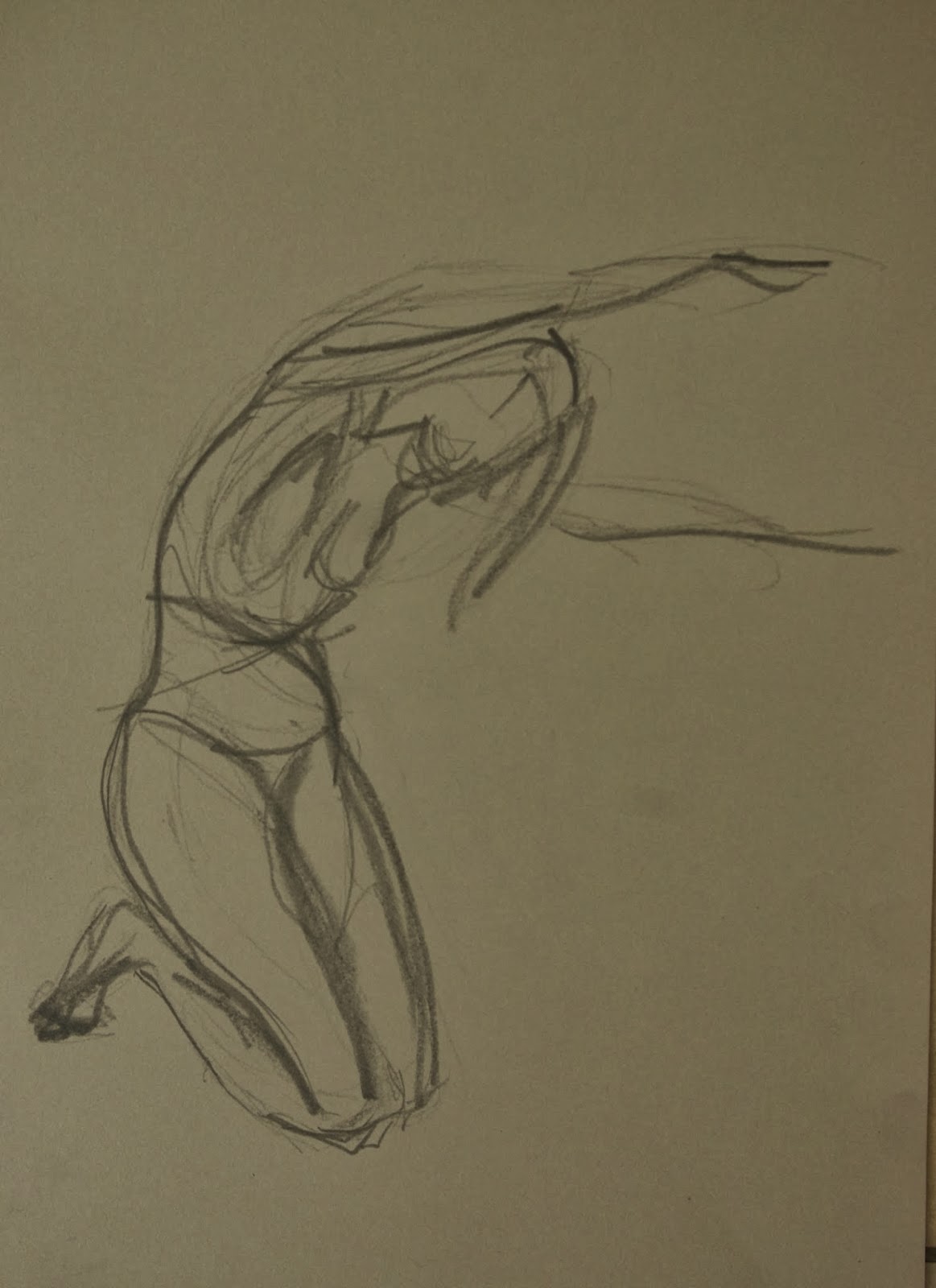
Sketchbook 5: Page 16 and 17
" minute and 1 minute Poses


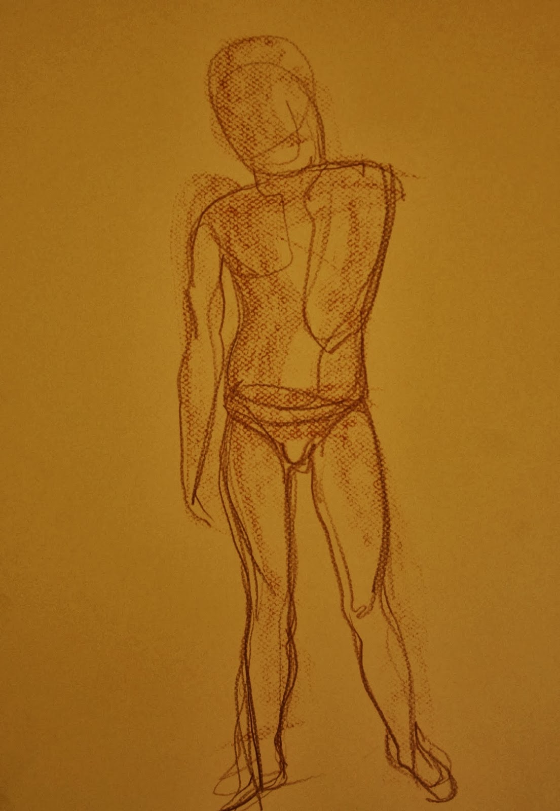
Sketchbook 5: Pages 18 and 19
1 minute and 30 Second poses


Sketchbook 4 Pages 84 and 85
Gesture drawings made with string dipped in ink
and marks made with inky fingers


Sketchbook 4: Page 86
Marks made with string and ink.
Fine lines made with the tip of the string
Broader marks bade by dragging the
body of the saturated string across the page
Sketchbook 4 Page 87: Marks made with string
and ink as above


Sketchbook 5 : Page 20 and 21 30 second gesture drawings
using conte' neocolour crayon and water and ink with a sumi-e brush
Sketchbook 5: Pages 22 and 23
Development of some of the 30 second drawings using an insulin syringe and needle
to spray ink onto the page - trying to depict movement


Sketchbook 5: Pages 24 and 25
Further gesture research - Tracey Emin
I am interested in how she manages to maintain the free
and gestural quality of the original drawing when producing an
embroidered image.


I found that with the first few 2 minute sketches, although it felt like very little time I was trying to represent everything and outline the whole figure. As the time got shorter, paradoxically the drawing became easier - perhaps because I was feeling that there was no pressure to think about proportions and likeness.

I experimented with various ways of making the gestures . I found that when I used drawing tools which were less controllable such as dragging floppy string dipped in ink across the page or spraying ink onto the page from a syringe and needle, the results were quite pleasing. I think that this may be related to the fact that it was necessary to be more selective about the number of lines I drew.

Tuesday 4 February 2014

Drawing the Figure: Research: Maria Lassnig and Ellen Altfest

Two of the artists which interested be at the Venice biennale last year were Maria Lassnig and Ellen Altfest

Maria Lassnig (who died in May this year in her nineties) was interested in depicting her body as she experienced it rather than as it appears. I have put reproductions of some of her work in my sketchbook (Sketchbook 4 page 29).

'You or Me' 2005 was a particularly arresting image dominating the space in which it was hung. It depicts and elderly woman with a sagging body and desperation in her pale eyes. she has a pistol pointed at her head and another at the viewer. The colour scheme uses acid and artificial-looking greens. The skin tones have an unhealthy yellowish greenish tinge to them all of which adds to the emotional tone of the painting. Lassnig described her work as " Pure realism, a little embellished and uglified".

Lassnig: Du Oder Ich - click to link to image

An example of this uglification can be seen in " the hospital" which depicts heads and bodies in hospital beds. An image of decrepitude ugliness and weakness.
Lassnig: The hospital - click link

Ellen Altfest

Has a different approach. She produces small scale studies of parts of the body. She especially concentrates on the less attractive features of male physiques. Her work is painstaking and tends towards photorealism. Each painting takes months to complete as she describes every minute detail of her subject. These are not portraits - they do not say anything about the people she paints. What I like about this is that she is impartial. She treats the parts of her human subjects which she depicts in the same way as she approaches still lives composed of inanimate objects. This means she has an unflinching and almost clinical approach to the depiction of armpits, penises and hairy backs.

For image click here

This image shows a foot as a component of a still life

Monday 3 February 2014

Study Visit : Paul Klee at Tate Modern 25th January 2014

This was an informal study visit which was organised by a group of students via the 'OCA sketchbooks' group on Facebook. The is a group in which I am active and regularly post my sketchbook work and have the opportunity to look at other students' work.  I have include a number of images in my write-up here as they are all in the public domain, Klee having died more that 70 years ago.

The organisers had managed to get some funding at the last minute via OCASA so we were accompanied on the visit by OCA tutor Jim Cowan who gave us an introductory talk about the artist , his life and work and also what to expect within the exhibition.

Before attending the visit I had read "Paul Klee: Life and Work" by Boris Friedewald  (Prestel 2011). I hadn't found this book particularly user friendly. It seemed a bit disjointed with the illustrations not easily relatable to the text on the nearby pages. However during the talk given by Jim I was surprised at how much of Klee's history I had retained.
Klee was a musician as well as an artist and the influence of music can be seen coming through in his work especially in terms of visual harmony. His big breakthrough in working with colour and abstraction came during his 1914 trip to Tunisia.

In the style of Kairouan 1914 (watercolour)


There were various identifiable phases to Klee's life. He was a member of 'Der Blaue Reiter' along with his neighbour Wassily Kandinsky. He spent time working at the famous Bauhaus and also as a teacher at the Dusseldorf academy from where he was dismissed by the Nazis and had to go into exile after being named as a 'degenerate artist'.

The exhibition was very large stretching over several large rooms, this was possible by virtue of the fact that despite being tormented by a painful and disabling skin condition called scleroderma in his later years, Klee was a very prolific artist. He was also very organised, cataloguing every piece of work he produced.

There was a fantastic array of techniques on display here and Klee was experimental and inventive in his approach. I particularly liked his use of an 'oil transfer' technique. He also used spray painting and used a sieve to create fine drops of pain over stencilled surfaces. There was so much of interest to see. I have selected just a few of the works to talk about but it was really quite difficult to choose.

With the Violet Pentagon 1919
 

Washy watercolours in shades of mauve, violet and yellow are contrasted with thick dense colour in more acid colours and dense primary red with black in angled shapes around the central pentagon. Although completely abstract, the arrangement of colours is such that the pentagon seems to recede and the bright angled shapes around it create movement almost seeming to spin around the pentagon. I found it interesting that such a simple construction could create such a powerful impression of depth and movement.


Red-Green and Violet-Yellow Rhythms

I love the harmony and rhythm of this painting. It is also interesting to note the cross-over in language between music and painting. This piece concentrates on harmony and balance of colours. There is a strong diagonal rhythm to the painting. The forms include tree-like forms and geometric shapes which suggest possible abstracted architectural forms. I find the colour combination and tonal relationships quite restful. There is a horizontal and vertical component to the composition and perhaps this makes it more restful than if it were all about diagonals. There is an illusion of depth with the juxtaposition of dark and light shapes. The dark shapes seem to recede and apparent overlapping of light coloured shapes contributes to the illusion of depth.

With the Rainbow 1917


I was initially a bit confused by this image. There are subtle gradations of watery colour and overall harmony in the centre which seems to be contradicted by the bright opaque frame of primary red around the outside. Discussing this with Jim he pointed out that this would have been a deliberate decision and asked me to consider why Klee might have done this. I think once again this was to create depth. the frame makes the darker and more muted colours seem to recede. As I looked more closely I started to see a sweeping curved path or road heading from the  centre bottom and receding towards architectural forms with the rainbow in the distance.

I particularly liked some of the oil transfer pieces. Klee put oil paint on to a sheet of paper and placed it oil side down on another piece He then draw an image on the reverse side of the oil covered sheet to transfer oil paint onto the lower sheet.

City Between Realms 1921


This image contains simplified architectural forms and zig-zag arrows pointing upwards and more prominently downwards. Is this a representation of heaved and hell? Is the prominent downward arrow a comment on the direction in which we are heading?


Ghost of a Genius 1922. Oil transfer and watercolour


Is this a self portrait? It looks a bit like Klee with a domed head and a short beard. It also has a puppet-like quality. Did he feel like a puppet or is he just attracted to puppet forms? (He used to make puppets). The figure looks melancholy to me with a slight dejected tilt of the head. Interpreting it with the title maybe he is 'washed up' and recalling past triumphs. I really like the accidental marks that are made by the oil paint sticking to the ribbed texture of this paper.

Comedy 1921 Oil transfer and watercolour
 

I really like this bizarre collection of elongated part-humanoid creatures. One seems to be lying down with another standing on top. Have they fallen and are being trampled by the parade or are they acrobats? I like the colour scheme. The graded jade-green focuses the attention on the upper 2/3rd of the paper and the pale yellow figures stand out against it. Once again the accidental marks made by the oil transfer give an interesting textural element to the otherwise cartoonish work.

A Young Lady's Adventure 1922 - watercolour
on paper


The girl looks serene and happy but again has a puppet like appearance. She is walking in a very dark environment. This makes me feel a sense of dread. There is a strange dark bird-like form in front of her. There is a red zig-zag arrow pointing back in the direction from which she has come - is this a warning? Is the girl naïve or blithely ignoring danger?

Fish Magic 1925 - Oil, Watercolour and Collage on Paper


I love this sgraffito technique. Klee has also attached a square of fabric to the centre of the page along with the diagonal line does this represent fishing equipment/net?
The dark ground allows the bright sgraffito fish to stand out. I also adds a sense of mystery to the piece as a whole.

Fire at full moon 1933
 
The full moon is represented by a yellow circle and the fire is represented by a red cross. The surrounding colours are dark and menacing. The red fights with the colours around it possibly signifying danger and the descent of the world surrounding Klee into darkness. This was done around he time that the National Socialist party (Nazi) came to power in Germany. it is surely not a coincidence that the dangerous red cross is reminiscent of a swastika?

Overall the study visit was an enjoyable and stimulating experience. Thank you to Jim Cowan for stimulating me to think more clearly about what I saw and tank you to Steve Cussons for all her effort in organising a group of students from far flung places to be in the same place at the same time. It was great to meet and compare experiences of the OCA with fellow students - This and the social media groups help to reduce the isolation of distance learning.

Looking at the work of Klee has given me ideas on a number of techniques I'd like to experiment with.