Showing posts with label Assignment 3. Show all posts

Friday, 7 February 2014

Tutor Feedback: Assignment 3

Overall Comments

My own responses to the comments are in blue Italics.

Thank you for submitting assignment 3 for Drawing 1. It is clear that you have worked hard on this assignment despite its difficulties and that your research and learning log backs up your studies well, however, at times, although you have an acute awareness of this, the work tightens and then loosens around your confidence.
It is true that my work has suffered during this assignment owing to issues with confidence.

 I would suggest that you try to look when you can at work in its physical sense to see and understand the many different approaches to drawing as two are very rarely similar and I would like you to think carefully about your own ability where possible. Obviously a lack of confidence can really restrict the work or at best get in the way at times. I would like you to try and really enjoy it much more in terms of the experience of drawing for this is such an important part of the process. 

I found the statement 'I would like you to think carefully about your own ability' a bit ambiguous - I was concerned that this might mean that my ability was not sufficient for the course and I should just relax and forget about putting in for assessment. I asked for clarification on this. Hayley said she thought it was still worthwhile applying to be assessed.

You have managed to submit an extensive assignment overall and have worked extremely hard at all aspects of this assignment despite personal difficulties so this is to be highly commended. That said, loosening up and worrying less about what may happen along the way can allow you the freedom and space to make mistakes and it so often that these mistakes can over time become the unexpected and most unintentionally inventive outcome. Creatively these ‘more lucid moments’ are much more liberating and your confidence will grow with a much more ‘devil may care’ attitude. I appreciate that due to your working life this is the absolute antithesis of having the responsibility and duty of care to your patients but in the long run the freedom within this creative path can be for you both therapeutic as well as a liberating release that will bring back the balance of working hard through serious study whilst being allowed the freedom to play, discover and learn at the same time. This is how the work evolves naturally, confidence grows and achievements become a lot more attainable, so embrace the work where you can with a little less earnest approach and exciting things will happen.

Having a 'less earnest approach' will be difficult for me as I feel that my earnest approach is what has got me this far. I will try to embrace this (but trying too hard to change my approach would also be excessively earnest! - I'll try hard not to try so hard!! - a bit of an oxymoron!)

Your learning log is well written and articulate and fully supports your own work well. A more developmental and experimental approach to drawing in your finished work (as you have already grasped in your sketchbooks) will enhance your work and experience overall so please don’t feel afraid to ask questions if you have difficulties along the way as distance learning can with a heavy workload be quite difficult to juggle. You have clearly worked extremely hard and I look forward to seeing a much lighter approach to Assignment 4 if you can embrace the approach I have suggested. I am leaving you with this quote below to consider for the next assignment.


‘Intelligence is not to make no mistakes, but quickly to see how to make them good’
Bertholt Brecht

I have seen on the OCA website the work of a painting student who did very well in avoiding tightening up for the assignment piece by working in a large format sketchbook and simply selecting the most successful pieces from this book. I think this approach might work for me as I usually enjoy the sketchbook work much more than the assignment pieces and the more relaxed attitude is beneficial.


Feedback on assignment 
Demonstration of technical and Visual Skills, Quality of Outcome, Demonstration of Creativity 

Project: Landscape Drawing

Research point: Albrecht Dürer, Claude Lorrain, and L. S. Lowry
A very articulate, in depth and questioning personal response to the work of artists that have historically embraced landscape or have emulated their surroundings in a variety of different ways. Your written research demonstrates that you are good at knitting together ideas and formulae taken from artists working techniques and your visual skills at reading an image are particularly strong.

Exercise: A sketchbook walk
You have made four quick sketches from your walk and have annotated well, describing the temperature, light and points of interest within the compositions. 

Exercise: 3600 studies
These sketches are a fantastic example of how to work quickly, respond to the landscape immediately in front, to the side and behind you and demonstrate a good visual sense and visual description of what was in front of you from your garden. The charcoal drawings feel expressive and dynamic and you have explored your medium well in this exercise. Using charcoal lightly, broadly and heavily in places demonstrates that you have approached the exercise as directed, which has resulted in a competently drawn outcome, so well done.

Research point: Monet, Pissarro, and Cezanne
Excellent detailed research containing relevant contextual quotations as well as demonstrating the use of two contrasting artists as well as the history of oil paint tubes and the relationship of working en plein air with approaching the ‘truth’ in nature. Your research standard is high with many threads woven throughout to merge your readings with your discoveries on artists and their surrounding history, so well done as it’s a very interesting read overall.

Exercise: Drawing cloud formations
You really have explored a wide range of media and techniques for this exercise and have maintained good annotation and learning log entries in support of your additional research and practice of drawing cloud formations throughout. For me the charcoal and ink on pastel paper feels very reminiscent of the approach taken by John Constable in his drawing research of landscape and it is good to see you looking not only at the clouds themselves but also the work of other artists in support of your own studies. Your explorations with surfaces are also particularly interesting. The painted over collaged torn tissue, the thickness of gouache and the multi media approach is a successful one and the supporting postcards are also good supporting research.

Exercise: Plotting space through composition and structure
Plotting and selecting an atmospheric scene with intersections of field, sea and sky here has allowed you to produce a very dramatic, pictorially interesting landscape with good supporting studies in your sketchbook. Overall you have critiqued your drawing studies well. It is important, even when studying, fore, mid and backgrounds that you spend time refining what it is you are seeing. Try wherever possible to remember that you do not have to explain everything that is in front of you. You have referenced subtraction, erasing and so on earlier on in the previous exercises so where you recognise that the composition is full of information try to eradicate a lot of it by reduction. Try to use one line to depict the information rather than 5 for example. On many occasions the brain in fills this information and so it is not necessary to ‘explain it all’. Over complication of the composition just confuses the eye and the brain, so allow the drawing space by taking away or leaving parts empty or reduces to its lowest denomination.

This is a fair comment. I felt that this drawing was too 'busy' . I will be trying to simplify more in future exercises.


Research point: Claude Lorrain, Turner
Excellent research throughout, demonstrating your understanding of contextual references of working with foreground, middle ground and distance in the pictorial plane You have again been very observant in your deductions regarding the issues that each artist was involved in and your approach to writing about this is very good, demonstrating that you have good visual and research skills.

Project: Perspective
Exercise: Parallel perspective – an interior view
You have managed two attempts at parallel perspective and clearly have an understanding of how it should be. Overall these studies are not bad for a first attempt and you have clearly learnt from this exercise.

Yes the perspective needs more work but I have made an initial step forwards.

Exercise: Angular perspective
Again this has been another interesting exercise for you. You have found some good help with this approach to technical drawing and have interestingly picked out some errors within found drawings in regard to parallel perspective. It would be good to see you consider this in other drawings at a later stage but tackling the books for this exercise has clearly helped, so well done for not abandoning this exercise. More practice at home could be very useful in your understanding of how to draw interior and exterior landscapes. You have analysed the difficulties faced clearly in your learning log and it is hoped that with more practice you will obtain further knowledge and understanding of this topic.

Project: Townscapes
Exercise: Study of a townscape using line
From your learning log I can feel the tension that has been brought to you whilst attempting to draw outside. As I read through the whole journey, it became clear that your determination to not be paralysed by fear was tantamount and your will power to succeed with this exercise was enormous. For me, the attempts at doing so improve each time and your selection of environment and timing clearly paid off. The drawings do start off very wobbly but judging from the intimidation from onlookers it is hardly surprising. However, as you work right up to visiting a museum at a quieter period of time with your back against a wall the work went from strength to strength. I can only commend you for facing your fear head on and dealing with it in a positive way throughout despite the odds against success. The fact that you referred back to photographs at the beginning suggested that you were not about to abandon the exercise and this proved to be the turning point for you to revisit the outside and deal with things in a more appropriate and beneficial manner from a personal perspective. 

Exercise: A sketchbook of townscape drawings
Subsequent architectural drawings in your A5 sketchbook reveal an attempt to tackle composition. The framing with boxes allows you to do this competently and the work feels much calmer overall. You mover on to colour studies, charcoal studies and lightly drawn scenes of Venice, all seemingly more interesting and varied in terms of composition.

Exercise: A limited palette study from your studies
You have submitted competent and well - executed drawings that demonstrate a reasonably good eye for perspective, scale, colour and tone. The limited palette works well but be mindful to not be too ‘over executed’ in places? The detail however is competent.

I enjoyed this drawing but can see that it is not as free as some of the preliminary sketchbook studies.

Exercise: Drawing statues
The final equestrian drawings really pay off. The weight, stance and power of these statues really come through your work. The sense of movement captured is good and it is of little concern at this point that the composition is out. You managed to do it and be successful so well done to you.

Project: Drawing trees
Exercise: Sketching an individual tree
You have clearly drawn out many studies of trees using a good variety of different mediums. The enquiring textural qualities of the details within the trees and their overriding detailing works well and your decision to keep it simple works well as you move through the studies.  You have annotated clearly throughout your sketchbook and have made good attempts at working with colour. 

Exercise: Larger study of an individual tree
The detailing of the bark, foliage and base is there. The sense of the character of the tree is evident with its twists and bows and I wonder if due to these qualities you could have used ink in a more varied way? However, this is a really good attempt with clear, supporting contextual referencing in your learning log.

Exercise: Study of several trees
You have submitted a fantastically array of work for this exercise encapsulating the weather, light and atmospheric conditions within each piece.  I really feel that the drawings on the grey paper are particularly good due to the simplicity of the work overall, reducing line to light and shade in this work really works hard at encapsulating the sense of the piece. You move on to draw very enigmatic pieces and manage to capture interesting composition, tone and colour well. As you move on it is clear that you reflect on past exercises through looking and depicting negatives space and have produced a good series of colour drawings on acetate as a result.

Check and logs
Your learning log is packed with good, descriptive writing demonstrating a critical look at what it is you have been asked to do, the journey you made and the outcomes. Contextually everything is appropriately placed and you demonstrate a sound ability to link ideas together from varying aspects of the course as you progress. The reflective qualities of your writing demonstrates that you are learning from your experiences and putting them practically into place as you progress throughout the course. The checks are complete, extensive and well written and ordered. 

Assignment Three
Your reflections on the whole of this assignment in your learning log reveal a troublesome journey with the whole of this assignment in terms of time constraints, work/life balance and difficulties in overcoming the fears of working in public spaces. Your determination to conquer these problems has been very exemplary and the work right up to and including the final assessment work includes these difficulties. However perseverance and sheer determination shines through even to the point that you have a break from the final assignment work and revisit 10 days later to redo the work in a less restrained and controlled manner.

The work in your sketchbook is a lot more relaxed and successful in terms of exploratory approach. You explain your discovery of a fellow student who works through the work and then selects the work he has managed against the titles and content of both exercises and final assignment pieces and this would clearly fit you much better overall as the work in the sketchbook feels and looks a lot more content, questioning and exploratory in nature. Dividing the picture plane is an interesting idea and as you work through this much more experimental approach to drawing and painting the work becomes energetic, vivid and ‘alive’. It appears that then you start to reflect back on perspective drawing and its past difficulties and the work immediately starts to tighten and become a lot more ‘academic’ in nature rather than the free flowing, energetic work that I had come to see in your sketchbook. Yes - confidence problems again. The overarching comment about wishing the pictorial plane had included an open window clearly links to the subsequent reading you have done and correlates with the sense of taking the inside out and bringing the outside in to keep the work exciting, fresh and open. The first final large finished piece therefore looks harshly divided up by the window frame and controlled in terms of pictorial order. You have however decided to include the textural quality of collage to the piece suggesting your creative links to the piece and a more free approach to relaying the sense of perspective.

Subsequent experimentation in your sketchbook and a further understanding of how to obtain a ‘voice’ within your own work is clearly demonstrated in your learning log both in a written reflection and though supporting images and suggests a much freer approach to depicting its subject. The final drawings are much more fluid, expressive and really allow the eye compositionally to look around the page with ease. Keeping the monochromatic drawing limited in terms of palette the work breathes easily and feels confident in execution.

The second drawing in coloured pencil tightens up slightly, quite possibly as a lot of detail has been drawn and although visually much busier the work finds a middle ground in terms of business. The tonal aspects of shadowing in the mid ground works well in terms of slight abstraction within its minimalism and the sense of perspective is a lot more determined than the previous drawing. The colour palette works well on the ground and for me it would have been an interesting challenge to depict (with this medium of coloured pencil) a similar image to the previous one. For example how would you manage to gain the fluidity of line using coloured pencil? What if it were a mainly linear drawing with limited blocks of tone for shadow only? This type of approach will come over time with more practice and so too will the confidence to reduce the image to its simplest of form, but well done for having the bravery to revisit the assignment and move it on as far as you have. I would really like to rework this assignment as I still wasn't satisfied with the outcome. Unfortunately owing to time constraints this may not be possible.


Sketchbooks 
Demonstration of technical and Visual Skills, Demonstration of Creativity 
You sketchbooks are full, exploratory and fluid. With clear annotation throughout it is clear that using sketchbooks to prepare for an experimental approach to making work works really well for you and your creativity and problem solving techniques are evident throughout. You are using your sketchbooks well and it would be good to have seen a little more evidence of your visit to Venice in there, although I do appreciate that there was an awful lot of work to absorb there.


Learning Logs or Blogs/Critical essays 
Context 
Your learning log is, as it usually is, very clear, thorough and well written. Despite it being you least favourite thing to do within your studies you are extremely competent at it and it is always a pleasure to read as it clearly lays out the whole journey in terms of difficulties, enjoyments and reflects on your studies throughout. You are good at threading a weaving your reading and research to your own work and the whole process is articulate, contextually relevant, wide ranging and intelligent throughout.


Suggested reading/viewing 
Context 

Pointers for the next assignment
Your next assignment is ‘Drawing Figures’. Look at the work of these artists in order for you to become more fluid in your approach to drawing.


Gustave Marchetti
Egon Schiele
Ron Muek
John Currin
Otto Dix
Ana Mendieta
Sam Taylor Woods
Tracey Emin
Hope Gangloff


And anything seen in the flesh in terms of exhibitions that contain drawing in its loosest and more interesting form.


Pointers for the next assignment
Look at a wide variety of figure drawing throughout history, especially at the range within each artist for example Goya started off as a state painter before the Spanish Civil War and you can follow the emotional side of the work right through the changes evident in his world. Play around with new materials, perhaps unexpected ones and draw through loose and new techniques, i.e. try out by holding the pencil at the very end, draw with garden canes and ink, wire or anything new and exciting with unknown outcomes.


Tutor name: Hayley Lock
Date 23.01.14
Next assignment due 14.04.14

Friday, 3 January 2014

Reflection on Assignment 3

Demonstration of Technical and Visual Skills

I think that my visual skills are improving as I move through the course. I have demonstrated competent use of a number of media and my understanding of composition is better than when I started. However there is a lot of room for improvement. 
I am particularly disappointed with the final pieces I produced for assignment three as I feel that they do not represent the best pieces I produced during part 3. Although the composition of the view on to the patio is quite interesting and I am quite happy with the aerial perspective and the harmony of the colours, I do think there are some problems with perspective in the foreground and have not pushed the media to their ultimate limits. 
Being selective in what to draw in order to get the best design and composition on the page is an area I still need to work on.

Quality of Outcome

Again - this is improving and may be adequate for this stage on a level one course but there is a long, long way to go. I think with my assignment I have started to try to communicate visual ideas - In this case the sense of longing  to be outdoors when cooped up inside. However I do not know whether I have communicated these ideas effectively as that can only really be decided by someone coming to the images without any prior knowledge. I have been looking at these images for too long to be able to look at them objectively.

Demonstration of Creativity

I have done some experimental work in my sketchbook over the course of part 3. I have, however taken very few risks with the larger pieces or the assignment pieces. There is still little evidence of a personal voice coming through here. I'm still trying things out - but this is still a very early stage in my development.

Context

I have learnt a great deal about landscape art over the course of part three. I have enjoyed the insights. Where perhaps I fall down a bit on this is in incorporating this contextual information into my own work. I have noticed that sometimes work that I have admired comes out in my work subconsciously (for example my tree experiments reminded me of Mondrian's abstractions when I reviewed them but this wasn't deliberate). I have made an attempt to use my learning consciously when preparing for assignment 3. I'm not sure that this has helped the final outcome, however. Perhaps I was over-thinking and would have a more satisfying outcome with a more instinctive response to the brief. 


Overall, I have found this part of the course extremely difficult for the reasons I have outlined in my blog. This may colour my opinion of the resulting work. I am glad, however that I stuck with it (looking at a lot of other students' learning logs it seems that quite a few 'fall by the wayside' at this point in the course). Although at times I've been clinging on by my fingernails  and I'm, therefore not satisfied with the work I produced, I congratulate myself on the fact I've got through this and out the other side. I am happy with what I have learned. I have certainly made great progress in my attitude to drawing in public and showing my work to others. There are a lot of areas where I could go back and improve the outcome but I need to move on now. 

One area where I disappointed myself was in my aim to continue to simplify and 'leave space for the viewer's imagination'. This was one of my main aims at the start of part three to build on some of the sketchbook work I'd done in the "drawing animals' project of part two. With all my difficulty getting through this section I somehow lost sight of this goal (although I did do some work towards it when drawing trees). My assignment pieces, however do not demonstrate this aim. I am looking forward to part 4 and hope to be able to remedy this with some strong gestural and pared-down drawing. 


Friday, 20 December 2013

Assignment 3: Choosing

Drawing 1: Assignment 3
Drawing 2: Assignment3
I decided to view the two finished pieces together to assess them against the requirements for this assignment and clarify in my mind the positives and negatives about each one.


The requirements were: 

  • View from a window or door
  • Include natural objects
  • Man made objects with straight lines
  • Demonstrate understanding of linear perspective
  • Demonstrate understanding of aerial perspective
  • A3 size

So I'll look at each of the drawings in turn


Drawing 1:

View from a window or door? - Yes

Includes natural objects?-Yes, however the tree is not represented in the best way that I am capable of - it looks a bit uniform in density (like a child's 'lollipop tree')

Man made objects with straight lines included?-  Yes, fence posts, pallet, house and outbuildings.

Demonstrates understanding of linear perspective? - Minimal. there is a suggestion of linear recession with the fence posts. However, the house is in the middle distance and therefore quite small. It doesn't clearly demonstrate angular perspective on this drawing.

Demonstrates understanding of aerial perspective? -There has been an attempt at this but it is not entirely successful in this drawing. The mountains do not look sufficiently distant I think the colours chosen are too warm and bright. This could be improved by working over the mountains with duller, greyer shades of oil pastel.

A3? - No - approximately A2 in size

Overall, notwithstanding the above caveats, this is the drawing which I prefer of the two. It is simpler. I think it communicates a longing to escape from the dullness of the interior and I enjoyed the creative process of making it much more than drawing 2. I don't think either of these are wall-worthy but if I had to choose one of them to live with I would choose drawing 1. Maybe this is also because it is the more decorative of the two (which could also be a negative point if the assessors are prejudiced against decorative forms).

Drawing 2:

View from a window or door? - Yes

Man made objects with straight lines included? - Yes, tables, chairs, doors, windows, roof.

Demonstrates understanding of linear perspective? - Yes, to a certain extent although it was drawn freehand so the perspective is not perfect in particular the table top and patio chairs.

Demonstrates understanding of aerial perspective? - Yes, the colour and treatment of the background trees gives a better impression of distance than is achieved in drawing 1.

A3? - Yes

Overall, therefore I think drawing 2 satisfies the requirements of the assignment better than drawing 1. The things I like about this drawing are the harmony and the lovely inviting light on the patio. I think the reason I don't prefer this drawing is because it is a bit too busy and cluttered. There is too much going on with the complex reflections, the banks of foliage, the pot plant, the cats, the chairs , tables and person - I think that this drawing would have benefited from greater selectivity on what to include. It is not a picture I would choose to live with.  However, given that it better satisfies the requirements, this will be my 'official' assignment piece.

Neither of these assignment pieces meet the standard I was aiming for. However this is all part of the learning process I suppose. If there were not faults then there would be nothing to work on and develop in my next drawings. Onward and Upward! I am very much looking forward to part 4.


Thursday, 19 December 2013

Assignment 3: Revisited

After returning from working away for a week I reviewed my assignment piece.


I felt a bit better about it than when I had left it 10 days earlier but there were still some major problems with the piece that meant I wasn't happy to send it to my tutor as seen. The main problem really was the original choice of the composition which was not something which I could easily rectify. Also the colour choices are very bright and the treatment of the focal points like the tree is quite flat giving an overall impression of being childish and unsophisticated. I could work into it to try to overcome the problem with the aerial perspective and the flatness but that would not change the overall composition. I was also conscious that the prescribed size for the piece was A3. This piece is considerably bigger which might be a negative point as regards assessment. The other thing that bothered me was that there was insufficient demonstration of angular perspective with just the house in the distance and the three fence posts on the left side. I therefore decided to go in a different direction.

I had posted my work on OCA Sketchbooks Facebook page and had received some useful feedback. The most useful I felt was about perhaps trying to link the interior and exterior spaces by having echoing shapes to create a sort of rhythm to the picture, and breaking the monotony of the rectangular window shape. This was almost the direct opposite of what I  had done with my piece which aimed to emphasise the difference between indoors and outdoors. From my original thumbnail sketches I decided to choose a scene looking out from the kitchen to the patio. This is the area where we spend most of our time especially in the summer months. I decided in this case to emphasise the Mediterranean feel of interchangeability between indoor and outdoor while still emphasising the appealing nature of the outdoors. 

It was one of those very bright but crisp winter days and I had been drinking tea on the patio while considering what to do. I decided that leaving the teapot and cup on the table would give a sort of narrative to the piece. (Although a Mediterranean scene it is owned by and English person). This also reminded me of Eric Ravillious as some of the charm of his interiors arises from from the mystery of the lack of people but the evidence of the previous activity of people. Such as this patio view and this view of an attic room. However, my plans were thwarted when my husband Luigi sat down at the table to read a magazine. I made a swift change of plan and decided to make him a focal point as the eye is naturally drawn to a human subject within a composition. He agreed not to move about too much so I made some very rapid sketches. 

 The first, rapid pencil sketch helped me to see the fact that the vertical bars of the kitchen chair back echoed the beams under the roof of the veranda. Also the open door created some diagonal lines on the left side of the page leading my eye out towards the patio scene. I had made some quite large errors in the drawing though as I could actually see both of the patio chairs on my side of the outdoor table. Also, in reality I could see much less of the tabletop than I have drawn here.
 My second rapid sketch was in colour (watercolour which I worked into with graphite) and helped me to identify that there was a certain harmony to the colour within the scene. The colours in the patio and tiles on the kitchen floor as well as the patio roof were all orangey in colour and the green of the kitchen interior reflects the green of the foliage outside. The shiny white plastic chairs reflected colours from all over the place and did not in fact look white at all. There was a very bright light shining from behind the items on the patio casting long shadows towards me. Looking at the finished sketch I realised I'd got a bit confused with the tonal values and made the roof  darker than it really was. I decided to do a rapid sketch in charcoal to establish the tonal values (below)
The darkest areas were in the foreground inside the kitchen and there were some very bright areas of light on the tablet and the patio as well as the small area of sky that I could see. 

All the above sketches were in my A4 sketchbook. So far so good - but I was coming to realise that this exploratory phase of work was the part which I enjoyed the most and then it starts to go astray when I start to think about producing a finished assignment piece. This might be to do with performance anxiety i.e. fear of failure making me become more stiff and deliberate and losing the exploratory, spontaneous, joyous nature of the previous sketchbook work. A number of the videos by tutors and assessors  on the OCA website talk about avoiding 'making pictures'. I started a discussion about this on the OCA sketchbooks Facebook page as I really don't have a clear idea what this means. I think probably it has to do with being exploratory in every piece so that you see it as working towards a body of work rather than trying to produce a single picture. 

I also looked at a video which showed the work of Peter Appleton. He is a level three student who has done exceptionally well in his studies. His approach is to work  in a large scale sketchbook and not to designate work as either preliminary work or final piece but to treat each page as an exploration and to select the pieces which work best as his final 'finished' pieces. He does, however, make many, many paintings before selecting from amongst them. I think that this approach might work better for me for the next assignment. As my fellow student Mags put it 'sneaking up on the assignment' or 'assignment by stealth'. I decided, therefore to start working on A3 paper but still in the same  sketchy, exploratory manner. Unfortunately, because I had already spent so much time on this assignment I had limited time to complete this before my son went into hospital so I decided just to continue to work on A3 paper until my time ran out and then select whether to designate this view or the other as my assignment piece. 

I started by doing a very quick sketch in pen and wash. By this time the light had changed somewhat so I had to refer back to my other sketches and a reference photo for the light effects. However, a cat and kitten had also arrived. The kitten was another focal point on a diagonal from the interior to Luigi reading so I decided to include the cats too. For the line work on this piece I decided to lift the pen from the paper as little as possible to try to maintain the sort of fluidity of line I was  enjoying with blind drawings.


I liked the outcome of this and felt that the composition, quality of line and tonal variation worked quite well. Unfortunately the paper wasn't thick snout to take the wash so it buckled quite badly. The drawing in the foreground is quite rough and the chairs are a bit wonky but overall I like this one. 

Having noticed the wobbliness and wonkiness of this freehand drawing I started trying to construct the scene using a ruler and rules of perspective. This was because I found the patio chairs very challenging and thought they this and my depiction of the open door might be helped by measurement. I soon realised that this wasn't actually helping. Working with a ruler and measurements makes me take my attention away from the subject too much and starts to make everything more static. I decided that this wasn't the way in which I wanted to work. I prefer to draw freehand and just tolerate the fact that my likes won't be perfectly straight. 

I went back to freehand drawing. I wanted the drawing to be about how inviting the sunny outdoors was so I wanted to use colour as well as to harmonise indoors and outdoors but to really get a strong impression of the bright sun on the patio. I started drawing in coloured pencil on a textured and coloured paper. I used a white chalk pencil for the highlighted areas. 


I started by gradually layering the coloured pencil but found (as on previous attempts with this medium) that I really lacked the patience to use this throughout. To get better depth of colour more quickly in the foreground area I worked into the soluble coloured pencil with water soluble marker pens with stipples and hatching to give a suggestion of the patterning on the kitchen tablecloth and to give an impression of the dark reflections in the window of the patio door.  

I do think that this does achieve what I wanted which is that the light and the arm tones of the shadows on the patio look inviting. It makes me want to get up and join Luigi out here. Other positives are the colour harmony and the echoing of the shapes of the kitchen chair and the roof of the veranda. I also think that the attempt to demonstrate aerial perspective has worked better in this drawing than the previous attempt at assignment three. There are some problems with the perspective though - in particular the patio table top appears to twist slightly towards me. The version of the table and also of Luigi reading was better in the rapid pen and wash sketch. In this version Luigi is in a slightly different position and I have tried to draw him more literally. Unfortunately he has ended up bearing a striking resemblance to Dr Bunsen Honeydew of the Muppet show. I hope to significantly improve my representation of human beings in part 4 of the course.

In my next entry I will review the two 'finished' assignment pieces side by side to try to choose between them.


Sunday, 1 December 2013

Assignment 3: View From a Window or Door

26th November 2013: The requirements for this piece are quite prescriptive in order to demonstrate the learning from part three of the course so I need to find a view that fits the following criteria:

  • Includes natural objects such as trees and plants
  • Has demonstrable depth allowing me to show understanding of linear or aerial perspective
  • Contains linear objects such as buildings, walls, fences.
I'm lucky in that our house has numerous windows and a number of these give views which meet the criteria and are also aesthetically pleasing. With minimal tweaking I am confident that it will be possible to produce a reasonable composition without having to venture further afield. 

There are a number of other things to consider. First: to include or not to include the window frame? My instinct is to include the window frame as this will provide a big advantage by acting as a ready-made view finder for me. This should stop the landscape becoming overwhelming and help me to draw what I can see without the temptation to turn my head from side to side to take in a wider view. Whether this is the best decision with come clear as I explore by sketching. The next decision is, how far back from the window to draw from.i.e. do I want this drawing to be more about the contrast between indoors and outdoors or really just about the outdoors conveniently framed by the window? A few days ago we were having violent storms and I would have been tempted to draw more of the interior to give the feeling of safety in the house from the (sublime) events outside. However, the weather is much more settled now so I feel I'll concentrate on what's going on outside the window with minimal interior space in the picture. 

That brings me onto the next problem- weather and changing light. I'm not the next Monet and I haven't got the luxury of time to make a series of a hundred different drawings of my environment for this assignment. However the weather and time of day have a dramatic effect on what I can see out of the window - especially when clouds and mist cover the mountains. I'll start off by sorting out the topography and basic composition but when it comes to using tone and colour I'll have to make some very quick reference sketches and notes when I see a light effect or cloud formation that I like because everything changes so quickly.

As research before starting this assignment I re-read Chapter 5 'Framing the View' of 'Landscape in Western Art' by Malcolm Andrews. 

This chapter looks at a number of examples of work to examine " the psychological impressions made when a landscape is mediated by an interior, where the interior intrudes into the picture to define the boundaries of a chosen scene or scenes. The presence of an interior determines our relationship with that landscape , which is so often inflected by our sense of duality 'indoors and outdoors'.  I found this chapter very interesting. I like the author's point that city dwellers can replace one framed view of a landscape (a window) with a simulated view (a framed landscape painting/drawing or photograph). 

Of particular resonance with me was the passage where the author talks about the difference in outlook between Northern European people and residents of the Mediterranean countries. For reason of climate, Northern Europeans spend much of their time indoors whereas in Mediterranean countries indoors and outdoors become much more interchangeable. This meant that the window view (sometimes with a figure looking longingly out of the window) became a favourite motif of the Northern European Romantics. I can identify with this having lived most of my life in the UK. With so few sunny days the urge to get outdoors when one occurs is enormous and I can remember during my younger years always having to study for exams during the summer months. I can clearly remember gazing longingly out of the window with my books spread out in front of me. There was a sense of injustice and a lamentation  of the 'prison pallor' that I always seemed to have. Having lived in Italy for several years now it is amazing how quickly I have come to take sunny days for granted. I automatically spend more time outdoors and often the door to the kitchen is wide open. When visitors come form the UK I find that they almost obsessively want to spend every possible moment outdoors and find it hard to comprehend that when left alone we don't eat outdoors every day!

So the window view "brings the confinement of the interior into contrast with the immensity of the space outside" end " the effect of the window frame is to accentuate a sense of distance- cultural and visual that the outside world acquires"  

An example is Friedrich Wasman: View From a Window 1832-33. Here the drab treatment of the window frame 'throws the exterior into bright relief' also the rectangular shape of the window frame contrasts with the strong diagonals of the exterior landscape. 

Another example I found when looking through a National Geographic Photography book was View of Switzerland's Bernese Alps, 2001 a photograph by Jodi Cobb. Here again, the interior is dark and subordinated to the monumental nature of the view outside although only a slim rectangle of it is glimpsed through the open window. 

Both of these images speak to me of being cooped up indoors and longing to be outside. They successfully communicate a sense of confinement and a contrast/distance between indoors and outdoors. This was my starting point. I decided that in my pieces I would try to communicate that memory of being stuck indoors when the outside was so bright and inviting.

26th November 2013 : First Thumbnails,  composition ideas.


I went around the house drawing thumbnail sketches from various windows. I decided to keep the window perpendicular to me so I could use this to my advantage as a framing device without over- complicating the composition. So the window is parallel with the picture plane. My favourite view is from the back of our house. I thought that a view from the landing would be best because of the hight vantage point. However, the corridor up there was too narrow to get far enough back from the window but be comfortable to draw so I elected to do the view from the living room window with some minor changes - such as moving the mountain slightly to the left such that its highest point didn't coincide with the middle of the window.


27th November 2013: I fiddled with the composition some more, removing some outbuildings and selecting only certain details in the foreground as well as changing the angle of the house in the right hand side middle distance as I felt if the roof was parallel to the bottom of the frame it would be a block to the eye moving around the composition. Once I has settled on a composition I made several copies and used these for experiments with tone, colour and texture.

First I established the main tonal values of the scene:


It was a bright day with a few wisps of cloud. The scene was well illuminated. Despite the fact that the window frames are white they appeared very dark in tone when I squinted my eyes. The very darkest tonal values were under the eaves of the tobacco-drying shed. Between the slats of the pallet in the foreground and under the line of trees and shrubs on the left hand side. 

I then started to use colour, trying to keep in mind the fact that I was supposed to demonstrate aerial perspective. 


I chose bright greens and warm reds, browns and oranges in the foregrounds and middle distance. The mountains in the background, although dominant, are distant.  When it isn't a completely crew day they look a purply/blue colour. However, I think the purple I've used in this sketch is too bright so they jump forwards too much.

I wanted to try to include some of the repetitive line drawing I'd been doing.


These exercises had really reminded me of the linear marks and rugged texture of the mountains when I fist did them. I tried to use this on the mountains in the background of my drawing. Unfortunately the monochrome lines were too distinct and detailed for a background object so I covered them with coloured in grey, blue, purple and greed which I burnished over with white.


The result was OK but not as exciting as I chad hoped for. I then thought back to 'experimenting with coloured media' in part two and remembered that when using sgraffito and resist techniques  I had been reminded of mountains. First I tried applying oil pastel thickly, scraping linear marks into it and applying black paint over the top.


This didn't really work. Despite the scraping, the oil pastel still resisted the paint. I ended up drying to drive the paint into the scored lines with firm pressure on paper towel soaked with gouache. This just seemed to kill all the colour but didn't result in the texture I was looking for. Some interesting Directional marks were made with the resist overpainted with payne's grey watercolour in the foreground.

28th November 2013: I tried a different approach to the sgraffito. Namely placing a layer of colour then overlaying that with pale grey/white oil pastel and scraping through this to reveal the colour underneath. This worked better.


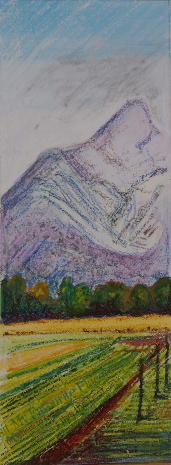
I also remembered that looking at the work of Ellen Gallagher, Kurt Jackson and the mosaics in the Archaelogical museum at Naples had inspired me to want to try some collage. My idea was that lines of text could be used instead of directional lines. I also tried glossy magazine paper to represent the glossiness of the window frame but decided against this as when focussing on the view outdoors the frame is actually not in focus and a but blurry to my eyes so it would be better to treat the window frame more simply.


I encountered a similar problem with the lines of text in the background as I had with the drawn monochrome lines. They were too detailed and drew the eye to the background. I tried scraping white gouache over this area to knock the lines back but ended up just obliterating them completely. I then scraped over this gouache with the oil pastels - I liked the texture this created. I decoded I would use collage just in the foregrounds and avoid it in the background.

29th November 2013: I started to work on the final piece incorporating as much as I had learned from these experiments as possible. I found the A3 size overly confining so decided to to a diptych of separate pieces on A3 and then frame them with a larger window frame. 


When working the collage in the foreground I was fortunate to come across several phrases that related to a sense of place such as 'my favourite place' and 'disagree over where to live' I put these in as diagonal directional lines to give a sense of recession. I worked over these with watercolour and then a small amount of oil pastel being careful not to completely obliterate the text. I then worked jul pastel over scraped gouache for the mountains in the background. I chose to use charcoal for the window frame as it would make the outdoor scene appear bright and vibrant in comparison.


By this time it was late on 30th November and I had an early flight to the UK on the morning of 1st December. I had to decide whether to submit this. I really wasn't happy with it. Although on the positive side it did achieve my objective of throwing the exterior scene into bright relief I didn't feel it achieved all the objectives of the assignment. The aerial perspective wasn't good as the mountains in the background seem too close I think they are too bright in colour and there is insufficient foreground detail to help them recede. The composition on the right side is unresolved. All the objects in the middle distance (tree, house and shed) are in an almost straight line with each other.  However, the big compositional mistake I made in the beginning was to ignore the fact that the windows are symmetrical which creates a big bold line right down the centre of the page. The idea of a diptych might have worked if each of the window scenes were strong enough to stand alone but I don't think they are. If I were to start again I would open the windows.

I decided not to submit on this trip but to view this with fresh eyes on my return.


Please see also: (links below)