- Includes natural objects such as trees and plants
- Has demonstrable depth allowing me to show understanding of linear or aerial perspective
- Contains linear objects such as buildings, walls, fences.
I'm lucky in that our house has numerous windows and a number of these give views which meet the criteria and are also aesthetically pleasing. With minimal tweaking I am confident that it will be possible to produce a reasonable composition without having to venture further afield.
There are a number of other things to consider. First: to include or not to include the window frame? My instinct is to include the window frame as this will provide a big advantage by acting as a ready-made view finder for me. This should stop the landscape becoming overwhelming and help me to draw what I can see without the temptation to turn my head from side to side to take in a wider view. Whether this is the best decision with come clear as I explore by sketching. The next decision is, how far back from the window to draw from.i.e. do I want this drawing to be more about the contrast between indoors and outdoors or really just about the outdoors conveniently framed by the window? A few days ago we were having violent storms and I would have been tempted to draw more of the interior to give the feeling of safety in the house from the (sublime) events outside. However, the weather is much more settled now so I feel I'll concentrate on what's going on outside the window with minimal interior space in the picture.
That brings me onto the next problem- weather and changing light. I'm not the next Monet and I haven't got the luxury of time to make a series of a hundred different drawings of my environment for this assignment. However the weather and time of day have a dramatic effect on what I can see out of the window - especially when clouds and mist cover the mountains. I'll start off by sorting out the topography and basic composition but when it comes to using tone and colour I'll have to make some very quick reference sketches and notes when I see a light effect or cloud formation that I like because everything changes so quickly.
As research before starting this assignment I re-read Chapter 5 'Framing the View' of 'Landscape in Western Art' by Malcolm Andrews.
This chapter looks at a number of examples of work to examine " the psychological impressions made when a landscape is mediated by an interior, where the interior intrudes into the picture to define the boundaries of a chosen scene or scenes. The presence of an interior determines our relationship with that landscape , which is so often inflected by our sense of duality 'indoors and outdoors'. I found this chapter very interesting. I like the author's point that city dwellers can replace one framed view of a landscape (a window) with a simulated view (a framed landscape painting/drawing or photograph).
Of particular resonance with me was the passage where the author talks about the difference in outlook between Northern European people and residents of the Mediterranean countries. For reason of climate, Northern Europeans spend much of their time indoors whereas in Mediterranean countries indoors and outdoors become much more interchangeable. This meant that the window view (sometimes with a figure looking longingly out of the window) became a favourite motif of the Northern European Romantics. I can identify with this having lived most of my life in the UK. With so few sunny days the urge to get outdoors when one occurs is enormous and I can remember during my younger years always having to study for exams during the summer months. I can clearly remember gazing longingly out of the window with my books spread out in front of me. There was a sense of injustice and a lamentation of the 'prison pallor' that I always seemed to have. Having lived in Italy for several years now it is amazing how quickly I have come to take sunny days for granted. I automatically spend more time outdoors and often the door to the kitchen is wide open. When visitors come form the UK I find that they almost obsessively want to spend every possible moment outdoors and find it hard to comprehend that when left alone we don't eat outdoors every day!
So the window view "brings the confinement of the interior into contrast with the immensity of the space outside" end " the effect of the window frame is to accentuate a sense of distance- cultural and visual that the outside world acquires"
An example is Friedrich Wasman: View From a Window 1832-33. Here the drab treatment of the window frame 'throws the exterior into bright relief' also the rectangular shape of the window frame contrasts with the strong diagonals of the exterior landscape.
Another example I found when looking through a National Geographic Photography book was View of Switzerland's Bernese Alps, 2001 a photograph by Jodi Cobb. Here again, the interior is dark and subordinated to the monumental nature of the view outside although only a slim rectangle of it is glimpsed through the open window.
Both of these images speak to me of being cooped up indoors and longing to be outside. They successfully communicate a sense of confinement and a contrast/distance between indoors and outdoors. This was my starting point. I decided that in my pieces I would try to communicate that memory of being stuck indoors when the outside was so bright and inviting.
26th November 2013 : First Thumbnails, composition ideas.


I went around the house drawing thumbnail sketches from various windows. I decided to keep the window perpendicular to me so I could use this to my advantage as a framing device without over- complicating the composition. So the window is parallel with the picture plane. My favourite view is from the back of our house. I thought that a view from the landing would be best because of the hight vantage point. However, the corridor up there was too narrow to get far enough back from the window but be comfortable to draw so I elected to do the view from the living room window with some minor changes - such as moving the mountain slightly to the left such that its highest point didn't coincide with the middle of the window.


27th November 2013: I fiddled with the composition some more, removing some outbuildings and selecting only certain details in the foreground as well as changing the angle of the house in the right hand side middle distance as I felt if the roof was parallel to the bottom of the frame it would be a block to the eye moving around the composition. Once I has settled on a composition I made several copies and used these for experiments with tone, colour and texture.
First I established the main tonal values of the scene:

It was a bright day with a few wisps of cloud. The scene was well illuminated. Despite the fact that the window frames are white they appeared very dark in tone when I squinted my eyes. The very darkest tonal values were under the eaves of the tobacco-drying shed. Between the slats of the pallet in the foreground and under the line of trees and shrubs on the left hand side.
I then started to use colour, trying to keep in mind the fact that I was supposed to demonstrate aerial perspective.

I chose bright greens and warm reds, browns and oranges in the foregrounds and middle distance. The mountains in the background, although dominant, are distant. When it isn't a completely crew day they look a purply/blue colour. However, I think the purple I've used in this sketch is too bright so they jump forwards too much.
I wanted to try to include some of the repetitive line drawing I'd been doing.

These exercises had really reminded me of the linear marks and rugged texture of the mountains when I fist did them. I tried to use this on the mountains in the background of my drawing. Unfortunately the monochrome lines were too distinct and detailed for a background object so I covered them with coloured in grey, blue, purple and greed which I burnished over with white.

The result was OK but not as exciting as I chad hoped for. I then thought back to 'experimenting with coloured media' in part two and remembered that when using sgraffito and resist techniques I had been reminded of mountains. First I tried applying oil pastel thickly, scraping linear marks into it and applying black paint over the top.

This didn't really work. Despite the scraping, the oil pastel still resisted the paint. I ended up drying to drive the paint into the scored lines with firm pressure on paper towel soaked with gouache. This just seemed to kill all the colour but didn't result in the texture I was looking for. Some interesting Directional marks were made with the resist overpainted with payne's grey watercolour in the foreground.
28th November 2013: I tried a different approach to the sgraffito. Namely placing a layer of colour then overlaying that with pale grey/white oil pastel and scraping through this to reveal the colour underneath. This worked better.

I also remembered that looking at the work of Ellen Gallagher, Kurt Jackson and the mosaics in the Archaelogical museum at Naples had inspired me to want to try some collage. My idea was that lines of text could be used instead of directional lines. I also tried glossy magazine paper to represent the glossiness of the window frame but decided against this as when focussing on the view outdoors the frame is actually not in focus and a but blurry to my eyes so it would be better to treat the window frame more simply.

I encountered a similar problem with the lines of text in the background as I had with the drawn monochrome lines. They were too detailed and drew the eye to the background. I tried scraping white gouache over this area to knock the lines back but ended up just obliterating them completely. I then scraped over this gouache with the oil pastels - I liked the texture this created. I decoded I would use collage just in the foregrounds and avoid it in the background.
29th November 2013: I started to work on the final piece incorporating as much as I had learned from these experiments as possible. I found the A3 size overly confining so decided to to a diptych of separate pieces on A3 and then frame them with a larger window frame.
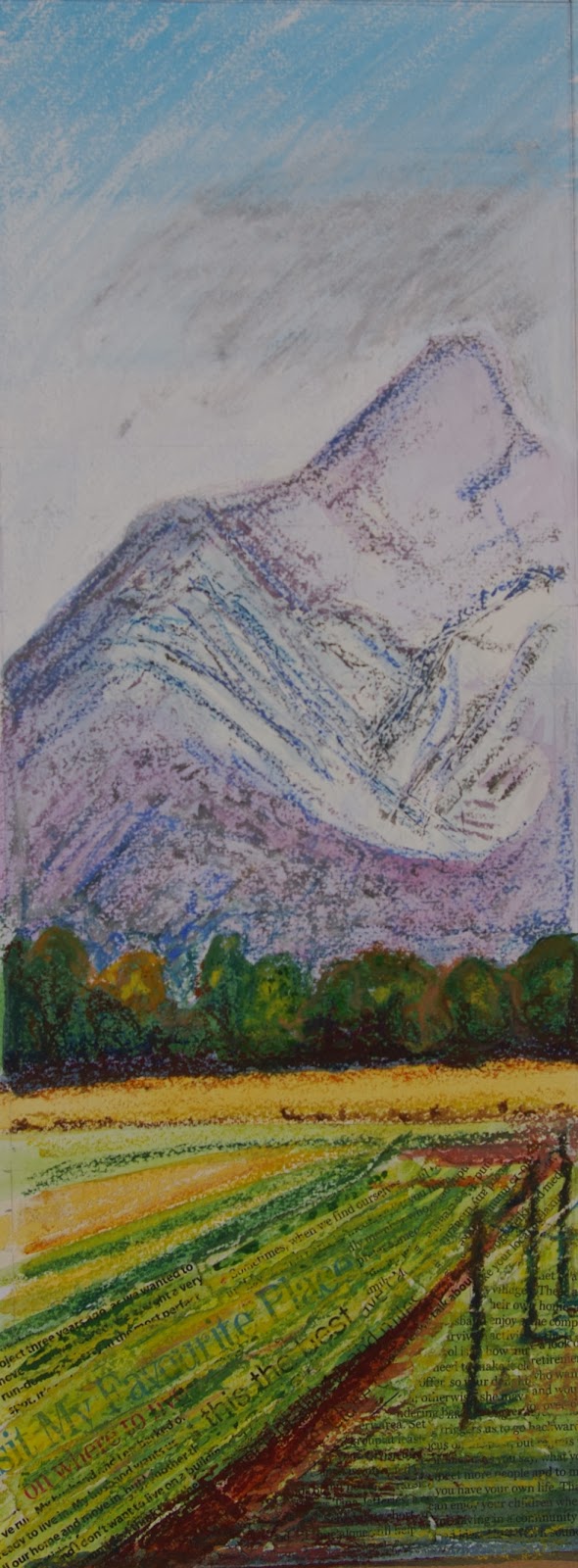
When working the collage in the foreground I was fortunate to come across several phrases that related to a sense of place such as 'my favourite place' and 'disagree over where to live' I put these in as diagonal directional lines to give a sense of recession. I worked over these with watercolour and then a small amount of oil pastel being careful not to completely obliterate the text. I then worked jul pastel over scraped gouache for the mountains in the background. I chose to use charcoal for the window frame as it would make the outdoor scene appear bright and vibrant in comparison.

By this time it was late on 30th November and I had an early flight to the UK on the morning of 1st December. I had to decide whether to submit this. I really wasn't happy with it. Although on the positive side it did achieve my objective of throwing the exterior scene into bright relief I didn't feel it achieved all the objectives of the assignment. The aerial perspective wasn't good as the mountains in the background seem too close I think they are too bright in colour and there is insufficient foreground detail to help them recede. The composition on the right side is unresolved. All the objects in the middle distance (tree, house and shed) are in an almost straight line with each other. However, the big compositional mistake I made in the beginning was to ignore the fact that the windows are symmetrical which creates a big bold line right down the centre of the page. The idea of a diptych might have worked if each of the window scenes were strong enough to stand alone but I don't think they are. If I were to start again I would open the windows.
I decided not to submit on this trip but to view this with fresh eyes on my return.
Please see also: (links below)
No comments:
Post a Comment