Friday 27 December 2013

Weekly Report: Week Commencing 23rd December

I have had very little time to myself this week because Luca is still immobile in the wheelchair and we had all the family over for Christmas so I prepared christmas dinner for 10 people. I haven't stuck to my resolution to draw every day. The most creative I've been is in baking cakes to give out to friends and neighbours. Not course related but satisfying nevertheless. Happy Christmas everyone!


Sunday 22 December 2013

Weekly Report: Week Commencing 16th December.

This week I finally completed assignment three for which I have made a separate post.

With assignment 3 completed I am having a short pause in my studies enforced because my son has been in hospital for some surgery. It was nothing too serious but he is immobile as he has casts on both of his feet at the moment. He needs more of my attention than usual. However, I plan to take advantage of his immobility and use him as a model for part 4. (Unfortunately he is only going to be able to do sitting and reclining poses. I'll need others for standing poses.) 

18th December: I took my small sketchbook with me to the hospital and took advantage of him snoozing to draw some very rapid pen sketches. In the first one I looked at the paper very little to warm up. The second is a better (but not wonderful) likeness.


Snoozing After Surgery


22nd December: In common with most teenage boys, Luca is obsessed with his games console. I sketched him playing - again a very rapid sketch with a biro. He was concentrating to intently on his game that he didn't even notice he was being observed.

Intense Concentration.

I plan to continue my resolution of drawing something every day even during this time when most of my energy is directed elsewhere.

Friday 20 December 2013

Assignment 3: Choosing

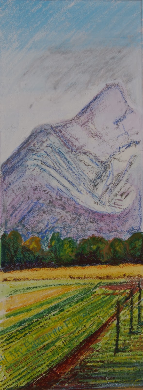
Drawing 1: Assignment 3
Drawing 2: Assignment3
I decided to view the two finished pieces together to assess them against the requirements for this assignment and clarify in my mind the positives and negatives about each one.


The requirements were: 

  • View from a window or door
  • Include natural objects
  • Man made objects with straight lines
  • Demonstrate understanding of linear perspective
  • Demonstrate understanding of aerial perspective
  • A3 size

So I'll look at each of the drawings in turn


Drawing 1:

View from a window or door? - Yes

Includes natural objects?-Yes, however the tree is not represented in the best way that I am capable of - it looks a bit uniform in density (like a child's 'lollipop tree')

Man made objects with straight lines included?-  Yes, fence posts, pallet, house and outbuildings.

Demonstrates understanding of linear perspective? - Minimal. there is a suggestion of linear recession with the fence posts. However, the house is in the middle distance and therefore quite small. It doesn't clearly demonstrate angular perspective on this drawing.

Demonstrates understanding of aerial perspective? -There has been an attempt at this but it is not entirely successful in this drawing. The mountains do not look sufficiently distant I think the colours chosen are too warm and bright. This could be improved by working over the mountains with duller, greyer shades of oil pastel.

A3? - No - approximately A2 in size

Overall, notwithstanding the above caveats, this is the drawing which I prefer of the two. It is simpler. I think it communicates a longing to escape from the dullness of the interior and I enjoyed the creative process of making it much more than drawing 2. I don't think either of these are wall-worthy but if I had to choose one of them to live with I would choose drawing 1. Maybe this is also because it is the more decorative of the two (which could also be a negative point if the assessors are prejudiced against decorative forms).

Drawing 2:

View from a window or door? - Yes

Man made objects with straight lines included? - Yes, tables, chairs, doors, windows, roof.

Demonstrates understanding of linear perspective? - Yes, to a certain extent although it was drawn freehand so the perspective is not perfect in particular the table top and patio chairs.

Demonstrates understanding of aerial perspective? - Yes, the colour and treatment of the background trees gives a better impression of distance than is achieved in drawing 1.

A3? - Yes

Overall, therefore I think drawing 2 satisfies the requirements of the assignment better than drawing 1. The things I like about this drawing are the harmony and the lovely inviting light on the patio. I think the reason I don't prefer this drawing is because it is a bit too busy and cluttered. There is too much going on with the complex reflections, the banks of foliage, the pot plant, the cats, the chairs , tables and person - I think that this drawing would have benefited from greater selectivity on what to include. It is not a picture I would choose to live with.  However, given that it better satisfies the requirements, this will be my 'official' assignment piece.

Neither of these assignment pieces meet the standard I was aiming for. However this is all part of the learning process I suppose. If there were not faults then there would be nothing to work on and develop in my next drawings. Onward and Upward! I am very much looking forward to part 4.


Thursday 19 December 2013

Assignment 3: Revisited

After returning from working away for a week I reviewed my assignment piece.


I felt a bit better about it than when I had left it 10 days earlier but there were still some major problems with the piece that meant I wasn't happy to send it to my tutor as seen. The main problem really was the original choice of the composition which was not something which I could easily rectify. Also the colour choices are very bright and the treatment of the focal points like the tree is quite flat giving an overall impression of being childish and unsophisticated. I could work into it to try to overcome the problem with the aerial perspective and the flatness but that would not change the overall composition. I was also conscious that the prescribed size for the piece was A3. This piece is considerably bigger which might be a negative point as regards assessment. The other thing that bothered me was that there was insufficient demonstration of angular perspective with just the house in the distance and the three fence posts on the left side. I therefore decided to go in a different direction.

I had posted my work on OCA Sketchbooks Facebook page and had received some useful feedback. The most useful I felt was about perhaps trying to link the interior and exterior spaces by having echoing shapes to create a sort of rhythm to the picture, and breaking the monotony of the rectangular window shape. This was almost the direct opposite of what I  had done with my piece which aimed to emphasise the difference between indoors and outdoors. From my original thumbnail sketches I decided to choose a scene looking out from the kitchen to the patio. This is the area where we spend most of our time especially in the summer months. I decided in this case to emphasise the Mediterranean feel of interchangeability between indoor and outdoor while still emphasising the appealing nature of the outdoors. 

It was one of those very bright but crisp winter days and I had been drinking tea on the patio while considering what to do. I decided that leaving the teapot and cup on the table would give a sort of narrative to the piece. (Although a Mediterranean scene it is owned by and English person). This also reminded me of Eric Ravillious as some of the charm of his interiors arises from from the mystery of the lack of people but the evidence of the previous activity of people. Such as this patio view and this view of an attic room. However, my plans were thwarted when my husband Luigi sat down at the table to read a magazine. I made a swift change of plan and decided to make him a focal point as the eye is naturally drawn to a human subject within a composition. He agreed not to move about too much so I made some very rapid sketches. 

 The first, rapid pencil sketch helped me to see the fact that the vertical bars of the kitchen chair back echoed the beams under the roof of the veranda. Also the open door created some diagonal lines on the left side of the page leading my eye out towards the patio scene. I had made some quite large errors in the drawing though as I could actually see both of the patio chairs on my side of the outdoor table. Also, in reality I could see much less of the tabletop than I have drawn here.
 My second rapid sketch was in colour (watercolour which I worked into with graphite) and helped me to identify that there was a certain harmony to the colour within the scene. The colours in the patio and tiles on the kitchen floor as well as the patio roof were all orangey in colour and the green of the kitchen interior reflects the green of the foliage outside. The shiny white plastic chairs reflected colours from all over the place and did not in fact look white at all. There was a very bright light shining from behind the items on the patio casting long shadows towards me. Looking at the finished sketch I realised I'd got a bit confused with the tonal values and made the roof  darker than it really was. I decided to do a rapid sketch in charcoal to establish the tonal values (below)
The darkest areas were in the foreground inside the kitchen and there were some very bright areas of light on the tablet and the patio as well as the small area of sky that I could see. 

All the above sketches were in my A4 sketchbook. So far so good - but I was coming to realise that this exploratory phase of work was the part which I enjoyed the most and then it starts to go astray when I start to think about producing a finished assignment piece. This might be to do with performance anxiety i.e. fear of failure making me become more stiff and deliberate and losing the exploratory, spontaneous, joyous nature of the previous sketchbook work. A number of the videos by tutors and assessors  on the OCA website talk about avoiding 'making pictures'. I started a discussion about this on the OCA sketchbooks Facebook page as I really don't have a clear idea what this means. I think probably it has to do with being exploratory in every piece so that you see it as working towards a body of work rather than trying to produce a single picture. 

I also looked at a video which showed the work of Peter Appleton. He is a level three student who has done exceptionally well in his studies. His approach is to work  in a large scale sketchbook and not to designate work as either preliminary work or final piece but to treat each page as an exploration and to select the pieces which work best as his final 'finished' pieces. He does, however, make many, many paintings before selecting from amongst them. I think that this approach might work better for me for the next assignment. As my fellow student Mags put it 'sneaking up on the assignment' or 'assignment by stealth'. I decided, therefore to start working on A3 paper but still in the same  sketchy, exploratory manner. Unfortunately, because I had already spent so much time on this assignment I had limited time to complete this before my son went into hospital so I decided just to continue to work on A3 paper until my time ran out and then select whether to designate this view or the other as my assignment piece. 

I started by doing a very quick sketch in pen and wash. By this time the light had changed somewhat so I had to refer back to my other sketches and a reference photo for the light effects. However, a cat and kitten had also arrived. The kitten was another focal point on a diagonal from the interior to Luigi reading so I decided to include the cats too. For the line work on this piece I decided to lift the pen from the paper as little as possible to try to maintain the sort of fluidity of line I was  enjoying with blind drawings.


I liked the outcome of this and felt that the composition, quality of line and tonal variation worked quite well. Unfortunately the paper wasn't thick snout to take the wash so it buckled quite badly. The drawing in the foreground is quite rough and the chairs are a bit wonky but overall I like this one. 

Having noticed the wobbliness and wonkiness of this freehand drawing I started trying to construct the scene using a ruler and rules of perspective. This was because I found the patio chairs very challenging and thought they this and my depiction of the open door might be helped by measurement. I soon realised that this wasn't actually helping. Working with a ruler and measurements makes me take my attention away from the subject too much and starts to make everything more static. I decided that this wasn't the way in which I wanted to work. I prefer to draw freehand and just tolerate the fact that my likes won't be perfectly straight. 

I went back to freehand drawing. I wanted the drawing to be about how inviting the sunny outdoors was so I wanted to use colour as well as to harmonise indoors and outdoors but to really get a strong impression of the bright sun on the patio. I started drawing in coloured pencil on a textured and coloured paper. I used a white chalk pencil for the highlighted areas. 


I started by gradually layering the coloured pencil but found (as on previous attempts with this medium) that I really lacked the patience to use this throughout. To get better depth of colour more quickly in the foreground area I worked into the soluble coloured pencil with water soluble marker pens with stipples and hatching to give a suggestion of the patterning on the kitchen tablecloth and to give an impression of the dark reflections in the window of the patio door.  

I do think that this does achieve what I wanted which is that the light and the arm tones of the shadows on the patio look inviting. It makes me want to get up and join Luigi out here. Other positives are the colour harmony and the echoing of the shapes of the kitchen chair and the roof of the veranda. I also think that the attempt to demonstrate aerial perspective has worked better in this drawing than the previous attempt at assignment three. There are some problems with the perspective though - in particular the patio table top appears to twist slightly towards me. The version of the table and also of Luigi reading was better in the rapid pen and wash sketch. In this version Luigi is in a slightly different position and I have tried to draw him more literally. Unfortunately he has ended up bearing a striking resemblance to Dr Bunsen Honeydew of the Muppet show. I hope to significantly improve my representation of human beings in part 4 of the course.

In my next entry I will review the two 'finished' assignment pieces side by side to try to choose between them.


Sunday 15 December 2013

Weekly Report: Week Commencing 9th December

I travelled back to Italy in Wednesday 11th after visiting my family in North Yorkshire and receiving an early Christmas present 'Anatomy for Artists' by Sarah Simblet which will be very useful for part 4 of the course.

On 11th I was bored at the airport so I did some very quick sketches of people around me both before departure and on arrival. Most of these people also had an air of boredom about them with slumped shoulders and a mooching gait. Some looked bewildered while staring up at the arrivals screens. This was the first time I had ever tried drawing people in a public place. I really enjoyed it but had to sketch very rapidly because I didn't want to get caught in the act and because the population of people on front of me changed very rapidly. 

Images of boredom:


From 12th December onwards I continued to work on assignment 3. (see posts "Assignment 3 revisited" and "Assignment 3- Choosing").


Sunday 8 December 2013

Weekly Report: Week Commencing 2nd December

This week I was away from home working. My work was, therefore confined to my small sketchbook. I deliberately took a break from working on the assignment so that I would be refreshed on my return home.

I had noticed when drawing the statues that I really struggled with the hands and feet so started the week by drawing my own hands. They are a handy (excuse the pun) subject to sketch in a spare five minutes because I always have them with me.

"you need Hands":


I did feel I made some progress with these drawings. I especially like the fluidity of line on the pen drawings on the first picture collage - these were done almost blind with just an occasional peek at the paper. This encouraged me to do more blind drawings.

On December 5th Nelson Mandela Died so I was inspired to draw a portrait based on a newspaper photo.


The pencil  drawing was my first attempt. Although I do think there's something of a likeness there the drawing in general is unexciting. It looks stiff and inhibited (like the sort of drawing I dis as a self-conscious teenager). His neck is also much too thin so he resembles a lollipop. My immediate reaction to this was to need to loosen up by doing a blind drawing and a continuous line drawing to get that fluidity back. Neither of these are a good likeness to the subject but I like them better probably because I enjoyed the process of making them much more.

Knowing that in part 4 I will have to produce a self portrait also did a blind contour 'selfie'

I'd equate this more to a 'selfie' (self portraits generally taken with a mobile phone or similar for posting on social media) because of the rapidity of execution. However, the selfie is generally supposed to be flattering. This isn't a good likeness - my eyes are too close together, the mouth is too wide and I've given myself extra double chins. However, it does look like a reasonably proportioned face which is a start for such a rapid contour drawing.


Sunday 1 December 2013

Assignment 3: View From a Window or Door

26th November 2013: The requirements for this piece are quite prescriptive in order to demonstrate the learning from part three of the course so I need to find a view that fits the following criteria:

  • Includes natural objects such as trees and plants
  • Has demonstrable depth allowing me to show understanding of linear or aerial perspective
  • Contains linear objects such as buildings, walls, fences.
I'm lucky in that our house has numerous windows and a number of these give views which meet the criteria and are also aesthetically pleasing. With minimal tweaking I am confident that it will be possible to produce a reasonable composition without having to venture further afield. 

There are a number of other things to consider. First: to include or not to include the window frame? My instinct is to include the window frame as this will provide a big advantage by acting as a ready-made view finder for me. This should stop the landscape becoming overwhelming and help me to draw what I can see without the temptation to turn my head from side to side to take in a wider view. Whether this is the best decision with come clear as I explore by sketching. The next decision is, how far back from the window to draw from.i.e. do I want this drawing to be more about the contrast between indoors and outdoors or really just about the outdoors conveniently framed by the window? A few days ago we were having violent storms and I would have been tempted to draw more of the interior to give the feeling of safety in the house from the (sublime) events outside. However, the weather is much more settled now so I feel I'll concentrate on what's going on outside the window with minimal interior space in the picture. 

That brings me onto the next problem- weather and changing light. I'm not the next Monet and I haven't got the luxury of time to make a series of a hundred different drawings of my environment for this assignment. However the weather and time of day have a dramatic effect on what I can see out of the window - especially when clouds and mist cover the mountains. I'll start off by sorting out the topography and basic composition but when it comes to using tone and colour I'll have to make some very quick reference sketches and notes when I see a light effect or cloud formation that I like because everything changes so quickly.

As research before starting this assignment I re-read Chapter 5 'Framing the View' of 'Landscape in Western Art' by Malcolm Andrews. 

This chapter looks at a number of examples of work to examine " the psychological impressions made when a landscape is mediated by an interior, where the interior intrudes into the picture to define the boundaries of a chosen scene or scenes. The presence of an interior determines our relationship with that landscape , which is so often inflected by our sense of duality 'indoors and outdoors'.  I found this chapter very interesting. I like the author's point that city dwellers can replace one framed view of a landscape (a window) with a simulated view (a framed landscape painting/drawing or photograph). 

Of particular resonance with me was the passage where the author talks about the difference in outlook between Northern European people and residents of the Mediterranean countries. For reason of climate, Northern Europeans spend much of their time indoors whereas in Mediterranean countries indoors and outdoors become much more interchangeable. This meant that the window view (sometimes with a figure looking longingly out of the window) became a favourite motif of the Northern European Romantics. I can identify with this having lived most of my life in the UK. With so few sunny days the urge to get outdoors when one occurs is enormous and I can remember during my younger years always having to study for exams during the summer months. I can clearly remember gazing longingly out of the window with my books spread out in front of me. There was a sense of injustice and a lamentation  of the 'prison pallor' that I always seemed to have. Having lived in Italy for several years now it is amazing how quickly I have come to take sunny days for granted. I automatically spend more time outdoors and often the door to the kitchen is wide open. When visitors come form the UK I find that they almost obsessively want to spend every possible moment outdoors and find it hard to comprehend that when left alone we don't eat outdoors every day!

So the window view "brings the confinement of the interior into contrast with the immensity of the space outside" end " the effect of the window frame is to accentuate a sense of distance- cultural and visual that the outside world acquires"  

An example is Friedrich Wasman: View From a Window 1832-33. Here the drab treatment of the window frame 'throws the exterior into bright relief' also the rectangular shape of the window frame contrasts with the strong diagonals of the exterior landscape. 

Another example I found when looking through a National Geographic Photography book was View of Switzerland's Bernese Alps, 2001 a photograph by Jodi Cobb. Here again, the interior is dark and subordinated to the monumental nature of the view outside although only a slim rectangle of it is glimpsed through the open window. 

Both of these images speak to me of being cooped up indoors and longing to be outside. They successfully communicate a sense of confinement and a contrast/distance between indoors and outdoors. This was my starting point. I decided that in my pieces I would try to communicate that memory of being stuck indoors when the outside was so bright and inviting.

26th November 2013 : First Thumbnails,  composition ideas.


I went around the house drawing thumbnail sketches from various windows. I decided to keep the window perpendicular to me so I could use this to my advantage as a framing device without over- complicating the composition. So the window is parallel with the picture plane. My favourite view is from the back of our house. I thought that a view from the landing would be best because of the hight vantage point. However, the corridor up there was too narrow to get far enough back from the window but be comfortable to draw so I elected to do the view from the living room window with some minor changes - such as moving the mountain slightly to the left such that its highest point didn't coincide with the middle of the window.


27th November 2013: I fiddled with the composition some more, removing some outbuildings and selecting only certain details in the foreground as well as changing the angle of the house in the right hand side middle distance as I felt if the roof was parallel to the bottom of the frame it would be a block to the eye moving around the composition. Once I has settled on a composition I made several copies and used these for experiments with tone, colour and texture.

First I established the main tonal values of the scene:


It was a bright day with a few wisps of cloud. The scene was well illuminated. Despite the fact that the window frames are white they appeared very dark in tone when I squinted my eyes. The very darkest tonal values were under the eaves of the tobacco-drying shed. Between the slats of the pallet in the foreground and under the line of trees and shrubs on the left hand side. 

I then started to use colour, trying to keep in mind the fact that I was supposed to demonstrate aerial perspective. 


I chose bright greens and warm reds, browns and oranges in the foregrounds and middle distance. The mountains in the background, although dominant, are distant.  When it isn't a completely crew day they look a purply/blue colour. However, I think the purple I've used in this sketch is too bright so they jump forwards too much.

I wanted to try to include some of the repetitive line drawing I'd been doing.


These exercises had really reminded me of the linear marks and rugged texture of the mountains when I fist did them. I tried to use this on the mountains in the background of my drawing. Unfortunately the monochrome lines were too distinct and detailed for a background object so I covered them with coloured in grey, blue, purple and greed which I burnished over with white.


The result was OK but not as exciting as I chad hoped for. I then thought back to 'experimenting with coloured media' in part two and remembered that when using sgraffito and resist techniques  I had been reminded of mountains. First I tried applying oil pastel thickly, scraping linear marks into it and applying black paint over the top.


This didn't really work. Despite the scraping, the oil pastel still resisted the paint. I ended up drying to drive the paint into the scored lines with firm pressure on paper towel soaked with gouache. This just seemed to kill all the colour but didn't result in the texture I was looking for. Some interesting Directional marks were made with the resist overpainted with payne's grey watercolour in the foreground.

28th November 2013: I tried a different approach to the sgraffito. Namely placing a layer of colour then overlaying that with pale grey/white oil pastel and scraping through this to reveal the colour underneath. This worked better.


I also remembered that looking at the work of Ellen Gallagher, Kurt Jackson and the mosaics in the Archaelogical museum at Naples had inspired me to want to try some collage. My idea was that lines of text could be used instead of directional lines. I also tried glossy magazine paper to represent the glossiness of the window frame but decided against this as when focussing on the view outdoors the frame is actually not in focus and a but blurry to my eyes so it would be better to treat the window frame more simply.


I encountered a similar problem with the lines of text in the background as I had with the drawn monochrome lines. They were too detailed and drew the eye to the background. I tried scraping white gouache over this area to knock the lines back but ended up just obliterating them completely. I then scraped over this gouache with the oil pastels - I liked the texture this created. I decoded I would use collage just in the foregrounds and avoid it in the background.

29th November 2013: I started to work on the final piece incorporating as much as I had learned from these experiments as possible. I found the A3 size overly confining so decided to to a diptych of separate pieces on A3 and then frame them with a larger window frame. 


When working the collage in the foreground I was fortunate to come across several phrases that related to a sense of place such as 'my favourite place' and 'disagree over where to live' I put these in as diagonal directional lines to give a sense of recession. I worked over these with watercolour and then a small amount of oil pastel being careful not to completely obliterate the text. I then worked jul pastel over scraped gouache for the mountains in the background. I chose to use charcoal for the window frame as it would make the outdoor scene appear bright and vibrant in comparison.


By this time it was late on 30th November and I had an early flight to the UK on the morning of 1st December. I had to decide whether to submit this. I really wasn't happy with it. Although on the positive side it did achieve my objective of throwing the exterior scene into bright relief I didn't feel it achieved all the objectives of the assignment. The aerial perspective wasn't good as the mountains in the background seem too close I think they are too bright in colour and there is insufficient foreground detail to help them recede. The composition on the right side is unresolved. All the objects in the middle distance (tree, house and shed) are in an almost straight line with each other.  However, the big compositional mistake I made in the beginning was to ignore the fact that the windows are symmetrical which creates a big bold line right down the centre of the page. The idea of a diptych might have worked if each of the window scenes were strong enough to stand alone but I don't think they are. If I were to start again I would open the windows.

I decided not to submit on this trip but to view this with fresh eyes on my return.


Please see also: (links below)