Much of the information I have written in this section has come from 'The Linear Economy' in 'The Primacy of Drawing- Histories and Theories of Practice' by Deanna Petherbridge. (Yale University Press- 2010)
Line drawing can take many forms- not just pencil, pen or charcoal on paper. We can draw on steamed up window with a finger or a line in the sand with a stick. Many artists have employed alternative media for drawing with line. Marcus Raetz made drawings from Twigs, Garbriel Orozco drew lines with bicycle tyre going through a puddle. Picasso drew in the air with a torch and had the drawings captured on film. Land artists make lines by walking or carefully placing natural materials.
A line is a directional mark and can be used to represent many different things including movement, spatial relationships, texture, volume. Lines are often used in drawing to represent lines that are perceived but do not actually exist - that is they define the effects of light and mass to represent the boundary of an object. This is a convention - it is not a transcription of reality as the line drawn is not actually there.
Lines can be varied in many ways: Thickness, pressure, speed of drawing, and medium. The appearance and gesture of the lines produced may be nuanced by the emotional or physical state of the artist or lines may be drawn in a completely uninflected way as a simple outline (something Petherbridge has termed 'dumb line'). Lines may also be affected by the skill level, education and degree of hand-eye co-ordination of the artist.
The response of the viewer to the line is also dependent on several things:
- The viewer needs to have some familiarity with the conventions of the use of lines in drawing. Is this something we are all born with or is it learnt? Young children understand drawings before they can read. Drawing has been around as a system of communication before writing. Deanna Petheridge talks about 'the primal nature' of drawing.
- The viewer applies a sort of cognitive mapping to interpret the lines of a drawing
- The viewer may respond to the expressivity of the medium
- They may respond to the subject matter
- They may respond to the gestural nature of the marks or the inflection of the lines.
"Thus the eye, like a grazing animal feels out the terrain, not only from top to bottom but from left to right and in all directions for which it feels the need. It travels paths laid down for it in the work which itself came into being through movement and became fixated movement."
The research point was to look at several artists and their use of line:
Clean Classical lines- Elegance

J.L. David (1748-1825)
A French neoclassical artist - in reaction against the prevailing Rococo style which he saw as frivolous. You can clearly see the influence of classical Rome/Greece in his clean lines especially in the drawing on the right. There is a delicacy to the lines and hatching he uses to describe the face of the woman. It is not overblown or overly complicated.
Sensual (serpentine) Lines:
Ingres (1786-1867)
Ingres was a student of David. He maintains this strong neoclassical style, resisting the rise of romanticism. There is a beautiful clarity to the way he describes the face of the woman in this family portrait.
In the studies for 'La Grande Odalisque' he has concentrated on serpentine lines as these can be associated with sensuality and to me they are beautiful. - There was been a lot of argument and rhetoric surrounding the description of a line a beautiful. Some such as William Dyce arguing " Nothing can be more absurd than to refer beauty, as some theorists have done, to a particular kind of line- we have just as much grounds for concluding that a right angle or a straight line is the cause of beauty". Mondrian certainly thought so - capitalising on straight lines and right angles in his work. Personally I am more drawn to these curved serpentine lines. In fact Ingres was criticised because the drawing was anatomically incorrect. He had added a few vertebrae to his model. This shows he was prepared to sacrifice mimetic accuracy for his perception of beauty.
Serial Drawing and Reduction to Simple Lines:

The two example drawings by Matisse shown here also have a sensuality about them which to me seems as much about the quality of the line as it is about the subject matter. Once again in the reclining figure we have the serpentine lines but you can also see on the charcoal drawing that there have bee a series of executions of the drawings on the same page. Ghosts of the previous lines are left behind adding an extra dimension to the drawing and a sense of movement. The other drawing in ink is much cleaner and the form has been simplified down to just a few lines forming an outline. Matisse is quoted as saying. " I must say that I achieved a very rare voluptuousness and elegance (in the pen drawings), I poured my entire sensibility into them, and if it weren't for the social obligation to provide my contemporaries with works somewhat richer in terms of means, the humble pen drawing, well prepared by an analytic study would be entirely adequate to purge me of my passionate emotions"
Matisse was a fan of making reductive serial executions - trying to reduce more complex drawings to their simplest forms.
Picasso (1881-1973)
Picasso also employed serial drawings in his sketchbooks making small changes from one page to the next. This may have been a tactic to continue working when creativity was low and to hope for a breakthrough. The two drawings above of Lydia Lopokowa also show evidence of a reductive process like that of Matisse. There is an elegance to the restraint of the drawing style here. The face as the focal point is slightly more clearly defined than other elements of the drawing. In the second pass the drawing is simplified further. Picasso was influenced by the work of Ingres during this phase of his career and this comes through in the clean lines and restrained drawing technique.

Returning to the subject of sensual lines. I love the utter simplicity of these drawings by Eric Gill. The artist has used different thickness and blackness of lines to describe different aspects of the figure as well as volume without using a lot of tonal modelling. The weight of certain parts of the outline help you to read volume and the soft smudged lines describe the form which falls within the outline without over elaborating.
Lines to Indicate Volume:
Juan Gris (1887-1927)
This artist is better known for his cubist painting. In these portrait drawings, however he uses simple outlines with minimal gestural changes of inflection. there are a few alterations to the weight of the lines. He uses minimal shading/stippling and minimal construction lines. Despite the fact that these drawings are mainly in outline they do imply volume. This is achieved by the alteration in the weight and thickness of the lines. and breaks in lines. the line of the nose coming forward for example is thicker and clearer than the line of the receding cheek.
Other artists have used other techniques using lines to indicate volume:
Henry Moore (1898-1986)
It the three drawings above you can see that the artist has built volume using numerous multidirectional lines. He crosses the lines over and over the object in many directions- longitudinal and cross sectional and places very dark hatching in the background in order to make the background recede and the form come forwards.
Lines of Construction:
Giacometti (1901 -1966)
This artist used construction lines going over and over the drawing to build the form. I watched a video of him painting using a small brush and black paint which I found on 'You Tube' and it showed him constantly measuring and placing a line then measuring again and placing another going over and over the same area.

Cross Contour:
The drawing of a torso by Giovanni Segantini (1858-1899) uses cross contour lines to construct the form. The curved lines caress the contours of the body in a luxuriant fashion. The form is impressively constructed but to my eye the contouring seems mannered and a bit over the top. It doesn't feel as though the artist is genuinely exploring the form. It feels more calculated and detached than that. A conscious display of his skill rather than authentic response to the subject.
In the drawing by Georges Seurat on the same page, the artist has taken the use of cross contouring to the extreme such that the mass of scribbly lines eventually congeal into an almost uniform tone.

Looking at the two drawings by Carl Philip Fohr (1795-1818) and Lucian Freud (1922-2011) there are some similarities between the two drawings although they were drawn more than a century apart. I saw these two drawings in Deanna Petherbridge's book under the title 'Economy and Focus in Capturing Likeness - Preserving Clarity, Selectivity and Compositional Resolution' Both of these drawings do just what is described above. They are controlled drawings with precise outlines. Textural elements are controlled. The lines are confident - there are no pentimenti or revisions. The two artists have both arrived at similar solutions for their self portraits although one was not influenced by the other.
Lines to Represent Texture:
Below these two drawings of clarity and simplicity I have revisited what could really be considered the opposite extreme - the work of Van Gogh who used a myriad of different lines, marks and Dashes to describe form and texture in his pen and ink drawings. (See Research point in part 1)
Lines to Describe Movement or Energy
Under the heading 'Performativity- Traces of action', Deanna Petherbridge says " The uninflected and controlled outlines of neoclassical or outline drawing systems, often designated as remote, cold and mechanistic by commentators call for very different reading from that class of variable lines that appear to be marked by the hand and in extension the artist's body. Varying of inflected lines, which vibrate with their conditions of making, involve breaks, interruptions, stresses, thickenings and regular or disordered rhythms that appear to betray the emotive state of the artist.'

Edgar Degas (1837-1919)
Recognised popularly for his drawings of dancers, horse racing and women bathing, Degas made repeated charcoal drawings of similar subjects and poses. He used pastel extensively and build the drawings up in a painterly fashion using many marks and lines to indicate light and suggest movement.
I have included this drawing by Kathe Kollwitz (1867-1945) although it is a mainly tonal drawing because of the powerful zig-zag line of dense charcoal that extends along her drawing arm. This seems to fizz with energy as she works at the easel.
Willem de Kooning (1904-1997)
The drawing I have included here is untitled and apparently abstract but to me it reads as a woman. Here he has made exploratory marks and lines. Some of the lines of charcoal have been erased leaving ghost marks which add to the sense of movement here.
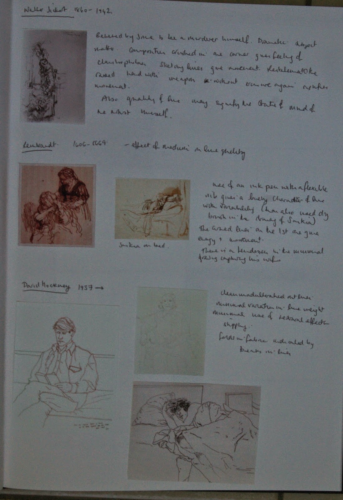
Walter Sickert (1860-1942)
This drawing depicts an act of violence. 'He killed his father in a fight' is the title. Sickert is believed by some to have been a murderer himself. Here the composition is crushed into one corner of the paper giving a feeling of discomfort and claustrophobia being 'up close and personal' with this deed. The sketchy gestural lines give the impression of movement and the restatement of the hand with the weapon without erasure further signifies movement. The ragged and jagged nature of the lines may say something about the state of mind of the artist or may just speak about the subject matter of the piece.
Effect of Medium on Line Quality:
During this exploration I have seen a number of different media and their effect on the lines drawn - in particular charcoal can produce a variety of lines due to its ability to be smudges and erased leaving a ghost of itself on the page. In the two drawings by Rembrandt (1606-1669) he has used an ink pen with a flexible nub. I really like the character of these lines - there is great variability (he has also used a dry brush technique on his drawing of Saskia on a bed. The curved lines repeated on the first drawing encode movement. There is a particular tenderness in the handling of the lines and minimal drawing in the picture of his wife on the bed.
Graphic Lines:
David Hockney (1937- Now)
David Hockney's line drawing are simple and effective .There is no unnecessary embellishment - clean outlines with folds in fabric simply indicated by breaks in lines. The lines are unadulterated and uninflected. They certainly preserve clarity and focus in capturing the likeness of the people he is representing.
In the introduction to 'Drawing Now: Between the Lines of Contemporary Art' Tracey (I.B Tauris London/New York 2007) There is a passage which refers to the writing of Emma Dexter which talks about contemporary drawing moving away from mimesis and expressivity of inflected line towards the 'anecdotal and narrative, subjectivity and leanings towards the poplar and vernacular' She is saying that in order to be authentic, contemporary drawing leans away from highly resolved and conventional modes of drawing towards the immediacy of 'dumb line'. However, like all movements this also eventually becomes an convention when self consciously applied. The authors quote David Shrigley (1968- Now) as an artist who has managed to successfully navigate this minefield being humorous cynical and self reflexive. His drawings are characterised by weak line work and poorly executed text with crossings out. His weak line is often corrected by the use of a ruler. Whether the weak line is a true manifestation of 'outsider art' in that he has no choice but to draw in this way not having the ability to make more resolved drawing, whether he deliberately chooses this style (more likely) or whether he is just seized by an immediate urge to communicate something and puts id down in a messy rush the viewer doesn't get to know. His drawings are like cartoons and often feature misshapen humanoid creatures drawn from the mind rather than from direct mimesis of observed objects. They are often cynical and provoke thinking about the absurdity of things that happen on an everyday basis. His humour is attractive but at the same time, the apparently unskilled nature of his drawings are challenge to the general public when hung in a major gallery. (This is the sort of thing my husband would hate because he would think that he could do it himself). In this I suppose he continues in the footsteps of people like Patrick Caulfield or the pop artists who do not like the broad divide and distinction between high and low art. I'm a bit ambivalent about his work. I find some of his drawings charming. Some have a poignancy about them and some are just plain funny - some of them I would buy and send as greeting cards (I have a sick sense of humour) but I'm still on the fence about their place as fine art. I still don't quite 'get it' - but then Shrigley also pokes fun at the art or the general public in art galleries world in some of his work. For example in this work here, and this work here http://www.davidshrigley.com/draw_htmpgs/blank_page/6_drawing.html in fact I ended up spending quite a long time on his website once I started looking! His work reminds me of Gary Larson's 'The Far Side' and also the unfired small clay statues by Fischli and Weiss that I saw at the Biennale in Venice last year which illustrated an eclectic mixture of moments from history and items from popular culture in a cartoonish way. I think it's time to wind this research point up now as I am starting to digress and the research could go on forever.
Reference Material:
The Primacy of Drawing- Histories and Theories of Practice by Deanna Petherbridge. (Yale University Press- 2010)
Drawing Now - Between the Lines of Contemporary Art TRACEY (I.B.Tauris & Co. Ltd. 2007)
Biographies of David and Ingres were also accessed at Oxford Art Online vie Bridgeman Education.
No comments:
Post a Comment