I suspect that the two artists are exhibited alongside each other because there are some similarities in their approaches, namely that both artists use flat expanses of colour and outlining to produce Images without trying to build form by tonal gradations.
Patrick Caulfield
Although I had researched this artists I had never seen any of his work in person. Seeing this exhibition really brought home to me the importance of the physical presence of the work in giving the full aesthetic experience. I had seen reproductions of many of the paintings in the exhibition on the internet and in books but they had so much more impact in person that I was left with the feeling that although the reproductions had provided me with the bare bones of information about the paintings it would have been be very wrong to make judgements about the paintings based on that information alone.
The first thing that struck me was that the size of the paintings was much larger than I had anticipated and the colours were much bolder than they seemed in reproduction. In the first room was Caulfield's portrait of Juan Gris whom he cited as one of his major influences.Most of the other paintings do not have human beings in them - the artist concentrates mainly on interiors such as abandoned foyers and restaurants. I've chosen some of the works that I particularly liked to write about.
The first image I have chosen is 'Dining Recess' (1972 Acrylic on Canvas) Link To Image on the Art Council's Website. This large canvas had great impact despite being mainly filled with a flat grey paint. The focal point of the which is a 1970's spherical glass pendulum lamp is represented by a flat creamy white circle and is placed almost directly in the centre of the composition. Despite the fact that this is a light there is no representation of illumination - light or shadows in the dining recess. The illusion of depth (the recess itself) is created solely by the use of line- strong diagonals and verticals. Conveniently the interior decor of the recess includes lots of vertical lines which I interpret as pine cladding or something similar rather than stripes on wallpaper. The chair and tables are also very much of their era so the arrangement looks like something that might have been photographed and presented as a 'lifestyle choice' in something like Ideal homes magazine. The diagonal of the blue colour of the twilit window at the top of the recess provides a counterpoint to the the creamy pendulum light in breaking up the otherwise monotonous great.
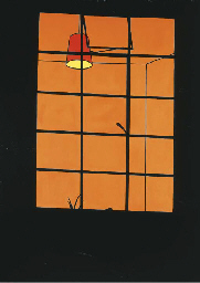
The next image I was drawn to was Window at Night (Oil on Canvas 1969) Click to link to image on Chritie's website. There is an orange glow to the interior behind the window. An illuminated hanging lampshade can be seen. The window frame and wall of the house are black silhouettes and there is the silhouette of just a few leaves of a houseplant in the bottom part of the window. The reason I like it is because of the way my imagination works when viewing this. It feels voyeuristic because, although there is no human presence in the picture, the fact that the lights are on (and the houseplant suggests this is a home) leads me to think there is someone at home and we are peering into their world without their awareness (although in fact we can see very little of it). In this way it reminds me of Dennis Hopper's NightHawks- those anonymous night-time customers in the diner illuminated but unaware that they are observed*. This could be a scene from a thriller in which the action is about to take place we are either the hapless witnesses about to see an argument or a brutal murder or I am a stalker hiding in the shadows waiting for the object of my obsession to appear in the window! There is something lonely about this painting.
*(Actually flicking back through the exhibition leaflet I find that Dennis Hopper is mentioned so it is probably the leaflet that put this in my mind rather than a direct association)
In his later work Interior with a Picture (Acrylic on Canves 1985-6) there are several different devices introduced . Firstly he uses a trompe L'oiel effect on the picture within the painting. He has painted the still life of the picture in a much more realistic style than the environment the picture is placed in. This is the artist making a point about the false distinctions bewteen what is real and what is artificial. In this painting he also plays with illumination and shadows. The picture on the wall seems to be illuminated from above and to the right and its imposing frame casts a large geometric shadow down to the left. The thing that made me smile the most about this painting though, was the faithful representation of the patterned flock wallpaper as it took me back to my childhood in the seventies - it is very evocative. I remember one of my friends had burgundy flock wallpaper in her house while we had magnolia wood chip. She thought it was the very height of sophistication. Looking at it now it has the aesthetic of a very old fashioned pub or a downmarket tandoori restaurant. Caulfield's work often observes interior decor trends and in this way makes comments about taste and kitsch.
Gary Hume
The entrance to the Gary Hume Exhibition was a pair of pink gloss painted doors with large brown circles where windows might be and brown rectangles where the push plates on hospital doors would be. The over large 'windows' give an anthropomorphic effect making the pair of doors look a bit like a face. This harks back to Gary Hume's 'Hospital Doors' series produced in the eighties when Maggie Thatcher was running down the NHS.
I found this exhibition a bit less accessible in terms of intention than the Patrick Caulfield one. There didn't seem to be an obvious chronology or development to the work - the paintings seemed to be randomly selected examples and there wasn't an obvious pathway through it.
The overall impression was of glossiness. The artist uses gloss household pain on aluminium for much of his work. This is another case where viewing the works in reproduction would not be particularly informative or give the intended experience as there so much of this work is about that glossy, high-shine surface which doesn't really translate into reproduction.
Hume uses simplification and outlines like Caulfield but he doesn't use painted black lines. Instead he uses layers of the paint to build up an outline or scrape it back so that the outline is part of the texture of the surface rather than a painted line. It looks a bit like enamelling in jewellery. One striking example of this is Beautiful (2002). In reproduction this looks like a salmon-pink circle with a black abstract shape at the centre. Standing directly in front of the painting gives a similar impression. However, moving from side to side around the painting as the light catches the surface at different angles you can see that there is a portrait in the textured surface (in fact a portrait of Kate Moss with Michael Jackson's nose superimposed - is this a comment on whet is considered beautiful and society's obsession with celebrities?)
I left this exhibition with more questions than answers. Why does Angela Merkel's mouth look like a lemon in a sea of pale green? (And what does it have to do with a horse?). Why does Tony Blackburn look like a three- leafed clover or shamrock surrounded by a cap of black hair (If he were a four leafed clover would he have been luckier in his career?) Why does the person with the slumped and sagging body in Older have a leaf or wing shaped area growing out of the back of their head? Is this a cheerleader's arm obscuring the Moon? Why doesn't the moon continue to the left side of the arm? Is it a crescent ? Does this say something about American foreign policy towards islamic countries? Or is it just an abstract painting with a recognisable pompom?
I quite liked the visual joke of the sculpture of 'The back of a Snowman' - no face so the viewer keeps circling it. The glossiness and the characteristic simplification and expanses of flat colour were impressive. I can't however, say that after viewing this exhibition I'm really any clearer about the artist's intentions - he doesn't really elaborate or give a lot of clues. But maybe that's the point. Perhaps I'm supposed to ask questions and making the answers obvious would spoil the experience? I don't know.
No comments:
Post a Comment