Tuesday, 20 August 2013

Exercise: A Sketchbook Walk

The aim of this exercise was to go for a walk in a familiar environment and to draw four rapid sketches during the walk.  A viewfinder was recommended to help to focus in on a point of interest. Written observations were to be made along with the sketches.

I chose to do may favourite local walk which is down to Hannibal's bridge. This is restored Roman bridge very near our house. (Local legend has it that this is the point at which Hannibal turned back towards Carthage). I love this place and any visitors that come to stay all get dragged down here for a walk whether they like it or not!

The bridge is in an isolated position and the path down to the river can be a bit treacherous so my husband and son came along for company. This had an advantage as it meant that I couldn't cheat on the 15 minute time limit I set for each sketch. However it also backfired in a couple of other ways: The first was that they kept asking me questions or talking to me and I found it extremely difficult (in fact impossible) to talk and concentrate on drawing at the same time. The second disadvantage was that although it was only my close family, I still  felt scrutinised while drawing. This meant that I wasn't relaxed and my approach to the drawings got a bit panicky and therefore somewhat scribbly and incoherent. 

This was only my second ever attempt at drawing outdoors and I immediately encountered some practical difficulties. I took a camping chair with me but the terrain was so rough that I ended up either perched precariously on a rock or standing up for each sketch. I found I couldn't perch/stand, hold the viewfinder and draw at the same time. Using the Neocolour soluble crayons with the bottle of water and paintbrush I'd brought with me was challenging. I drew most of the detail with drawing pen.

I started the drawings from the bottom or furthest part of the walk as it was evening (it was too hot in the middle of the day to go out drawing) and I didn't want to risk it getting dark on my way up the winding and overgrown path back to the road. The first drawing, therefore is from the edge of the river looking back towards the bridge. 


It was about 7.30 pm. The scene wasn't strongly illuminated because the sun had already gone behind the mountains and the bridge lies in a deep gorge. What light there was came from behind the bridge and the deepest shadows were therefore my side of the bridge in the foreground. The focal point I'd chosen was the bridge itself. The bridge framed illuminated rocks and foliage behind it. There were interesting angular planes to the rocks in the foreground with deep crevices between them. I really struggled with the tree in the foreground as the foliage was quite spindly and a really didn't know how to approach it.

The next drawing was looking downstream from the top of the bridge. I had to stand up for this one as sitting down caused the railings to interfere with my view. The bridge is narrow and leaning with the sketchbook on  the railing made me a bit nervous that I might drop the book in the water. 


The focal point was meant to be the boulders in the river which were smooth and almost white like enormous beach pebbles. they were only darkened underneath here they were wet and shadows were cast. The tree in the foreground was supposed to lead the eye towards the boulders but this is the same tree as caused problems in the first picture . The bark was very dark and that made it very dominant in the foreground. I also think I haven't positioned it correctly as it looks disconnected and about to fall into the river - probably because I seem to have missed out any shadow at he tree's base. The foliage on the tree was sparse spindly and lighter in colour than the trees in the background and again I struggled to try to represent it. The water was clean and clear but had a dark green hue in the light but I could still see the impressions of other boulders under the surface of the water.


 The third drawing was looking upstream from the same position at the top of the bridge. The character of the river bank is very different on this side with deep craggy rocks with crevices between them. The river curves and bends. My focal point was the ripples on the river and the rocky outcrop on the left hand side in the foreground. There were very deep shadows under the rocks to the right hand side. The ripples in the foreground were very difficult to try to capture. The foliage in the background was much darker than it appears here. My pen stopped working in the middle of this drawing so I reverted to pencil. The setting sun caused the reflected light on the water to have more of an ochre rather than an orangey hue.


The final drawing was very rushed because it was rapidly getting dark so it was drawn in less than 10 minutes on the last stretch of path back up to the road. I had originally intended the focal point to be the pine trees which were burnt down one side in a forest fire which are up in the top left corner. However, the road , fence and stone wall all conspire to draw the eye away from here towards the telegraph pole in on the other side.


 This exercise was a bit of a milestone in terms of overcoming my fear of drawing in public. Although I was disappointed with the results I felt that I had learned from the experience. The main lesson was not to panic. In this situation I had started drawing immediately as soon as I set the timer without taking time to really contemplate the scene. For the next exercise my plan is to really look before starting to draw and to try to simplify and get down more the essence of the scene rather than scribbling away in a panic trying to get every detail (an impossible task in a rapid sketch).


Research Point : Different Artists' Depiction of Landscape (Part 1)

By reading Malcolm Andrews' book "Landscape and Western Art" and visiting several galleries over recent weeks I've been exposed to a variety or artists and their approach to Landscapes. A detailed account of all of these is beyond the scope of this research point but I have picked out a few examples of different approaches to Landscape depiction. Even doing so this has become rather cumbersome so I've chosen to divide it into two sections.

Depiction of landscape as an independent genre started to develop during the Renaissance in the late fifteenth and early sixteenth centuries. Before this, tracts of landscape were the scenery surrounding the human or divine protagonists of the painting. They were either included for the symbolic value of certain landscape features or were just a good setting for the action. (A Parergon to the Argument). 

The paintings of  Albrecht Altdorfer (c.1480 - 1538) are recognised as being some of the first independent European landscapes. 


Fig.1 Albrecht Altdorfer : Landscape with a
Footbridge c. 1516
Source: Google Art Project

In the years preceding this, Albrecht Durer and Lucas Cranach had also produced what appeared to be independent landscapes - but the motifs from these were later used to produce woodcuts. However Durer painted numerous landscape watercolours during his first trip to Italy and became the first artist to use watercolours as a medium in its own right for landscapes rather than as a preparation sketch for an oil painting. 


Fig 2: Albrecht Durer : Little Pond House, Watercolour


The motif of the little house from this watercolour can be seen repeated in the Woodcut "The Virgin and Child with a Long-Tailed Monkey" Seen here reproduced on the British Museum's Website. Painters in the renaissance therefore would use their landscape paintings  to inform their representation of scenery in their religious/devotional paintings. Over time, however certain artists became known as specialists in Landscape and the balance of order of importance of subjects started to be upset such that landscape dominated the painting and the human or saintly subjects started to be relegated to being a smaller part of a large scene. One example of this is Joachim Patinir's 'Landscape with St Jerome' (C. 1515-1519_ (Note that Landscape becomes before St. Jerome in the title).


Fig 3: Joachim Patinir : Landscape with Saint Jerome

Patinir has created a painting of a huge tract of landscape. However, the picture still functions as a devotional painting as it does contain a narrative. There are episodes from the Saint's life story in the middle ground of the painting as well as the image of the saint in the foreground. But why are the religious figures reduced to a smaller proportion of the canvas and therefore of less relative importance during this phase in history? One theory is that as with the humanist study of science of nature and with travel expanding man's knowledge of the world that artists' sense of the size of the world and therefore their sense of the relative importance of their individual subjects was changing.

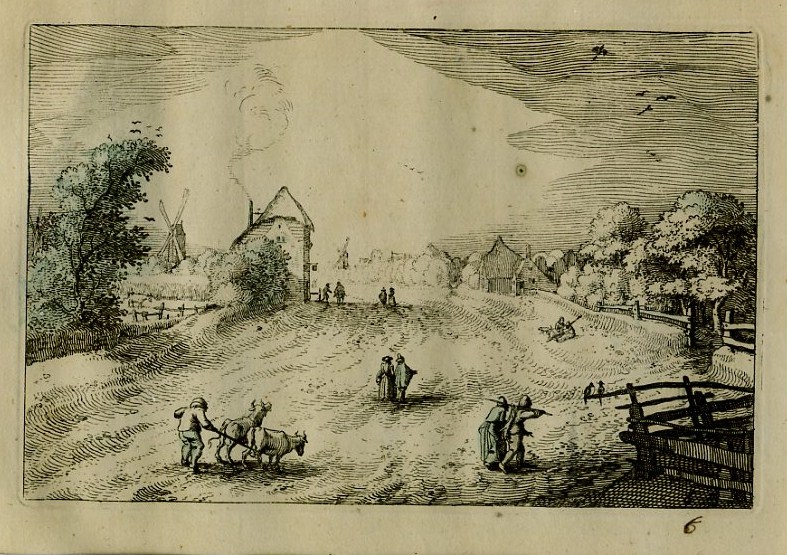
During the late sixteenth and early seventeenth centuries the fashion for landscape painting may have been driven by the rapid expansion in cities and the rise of commerce. City dwellers were more disconnected from the natural world and this led to the rise of 'Villa life' in Italy. The rich were purchasing country property on which to site their villas and they were after a beautiful view (as well as a refuge from episodes of plague in the city). For the first time in history, how aesthetically pleasing a tract of land was became of greater importance than its economic value as agricultural land. Villas were sited on hill tops with loggias on the  first floor to allow guests to wander around the outside (but still under cover of a roof) and admire the scenery. This change in culture such that admiring the aesthetic properties of the natural world became a more common activity allowed landscape painting to flourish. It, however, developed in different directions. In the Netherlands, the fashion was for mapping and  accurate topographical recordings of local scenery. In Southern Europe the fashion became more for idealised version of nature such as the Heroic landscapes of Nicholas Poussin and the Pastoral Landscapes of Claude Lorrain. 


Fig 3: Claes Jansz. Visscher : Plaisante Plaetsen 1608


Fig 4: Jacob van Ruisdael:
The Windmill st Wijk bij Duurstede c1670

Fig 5: Jacob van Ruisdael: View of Haarlem with
Bleaching Grounds c 1670


Fig 6: Nicolas Poussin: Landscape with Man Killed by Snake
1648

Fig 7: Nicolas Poussin: Landscape with Pyramus and Thisbe
1650 - 1651


Fig 8: Claude Lorrain: Landscape with Hagar
and the Angel 1646-47

Fig 9: Claude Lorrain: Landscape with the marriage of Isaac and Rebekah
1648


Comparing the above works by Dutch landscape artists with those by Lorrain and Poussin there are certain obvious differences. The two paintings by Van Ruisdael refer to specific (and real) places whereas Lorrain and Poussin's works are entitled 'Landscape with....' - they are imaginary and constructed. In fact with Poussin and Lorrain the construction of the landscapes is very similar in each picture here, with trees in the foreground and middle distance framing the 'action' in the foreground like a stage set. I will return to the construction of Lorrain's paintings in a later research point. In the Dutch paintings there are no such concessions to the construction of the compositions, they are apparently true to life. Given that the Netherlands are very flat with large tracts of open Landscape there was not much opportunity to construct pictures with framing devices in the foreground. 

The three genres above have different cultural functions. The Dutch paintings are the product of a burgeoning economy and massive expansion of the land through land reclamation. These pictures are part of the establishment of the new national identity. They proudly display the activities of commerce and land reclamation with the bleaching fields and windmills as a prominent feature. As topographical records, these paintings are like and extension of cartography. In fact, at this time in the Netherlands it would be common for maps to be displayed on walls, and these maps often had scenes from the areas they represented depicted round their perimeters. In their day, they were criticised by some as being only of interest to local inhabitants whereas the Lorrain and Poussin were lauded for their mastery.

In contrast, the Heroic and Pastoral landscapes are about escape from the city and commerce. Cities where depicted are in the far distance. These pictures tell stories and they are about escapism. Poussin's heroic landscapes are meant to create certain sensations in the viewer. They depict dramatic events and so are supposed to evoke fear or terror. They show people reacting to the apparent death of a character in the foreground and the ripples of that fear as it passes from the foreground to the middle distance. Despite Poussin's masterful painting and the fact that in 'Landscape with Pyramus and Thisbe' he incorporates a thunderstorm to set the scene, I find there is something peculiarly static about these images of action. Even the thunderstorm doesn't seem to do much to disturb the landscape. Maybe that is because these days with television and films we see much more terrifying moving images from everyday life on the news?

The pastoral scenes of Claude, reflect the continued popularity of poetry such as Sannazaro's 'Arcadia' (1504) which talk of the difference between rural and urban ways of living. As Andrews describes it ' Pastoral's enduring illusion of the natural grace and innocence of rural folk'. Again to my 21st century sensibilities there is something simplistic and a bit saccharin sweet about this approach. I feel like I should prefer the veracity of the Dutch painting. The construction of Claude's scenes by comparison seems formulaic. However, there is a great sense of tranquility about these paintings and I particularly like the landscapes in which the scenes are bathed in a golden evening light. They are restful. Claude's ability to depict the effects of the light on the landscape does come from studies produced outdoors which he would have used to inform the paintings.

I've touched on paintings of Landscape and issues of National Identity with the Dutch painters of the 17th century. Now I'm going to look at Constable's 'The Hay Wain' (Landscape Noon) 1821. This is a very familiar British icon evoking the green and pleasant nature of Southern England. It depicts a rural idyll but which is a real place not an imaginary landscape. It also depicts man in  harmony with nature in this beautiful and fertile land. It depicts real people at work, not gods or players in a drama.


Fig 10: John Constable: The Hay Wain 1820

This seems straightforward enough until you realise that at the time when Constable painted this, England was in the grips of agricultural depression. Life was very hard for agricultural labourers as there was little work. This resulted in riots. In constable's painting the labourers are part of the landscape - you cannot see their facial expressions as they work.  The artist is harking back to the East Anglia he remembers from childhood and how he wants it to be again. It's a bit like propaganda for the English countryside. I've learnt a lot from my reading - previously I only saw this picture as a 'chocolate-box' image of pretty countryside.

Reference Material Used:

Lanscape and Western Art.:Oxford History of Art.  Malcolm Andrews. Oxford University Press   1999. 


Monday, 19 August 2013

Weekly Report: Week Commencing 12th August 2013

In the last week I've completed writing up my holiday gallery visits and finished reading "Landscape and Western Art" by Malcolm Andrews- Oxford History of Art, Oxford University Press 1999 which will allow me to complete the first research point for part three. 

I've also started reading "JMW Turner" by Sam Smiles (Part of the Tate's British Artists Series) Tate Publishing 2000 -reprinted 2009

I've completed the first exercise of part three "A Sketchbook Walk" 

I've also been looking at other artists not directly relevant to the project including Daniel Zeller and John Franzen. I've made some drawings in my sketchbook inspired by these and by Ibrahim El Salahi.

These activities will constitute the next three entries in  my blog.


Gallery Visit - Ibrahim El-Salahi at Tate Modern

This was a retrospective of Ibrahim El-Salahi's work entitled ' A Visionary Modernist'. Once again, I had never heard of the artist before entering the exhibition. 

The first room contained some very large works on paper showing groups of flamenco dancers. The forms were simplified and reminded me a bit of art Deco posters. There was an impression of fluid movement there.

In El- Salahi's work there is a fusion of his westerns training (at the Slade School in London) with calligraphy and traditional islamic symbols such as the crescent which regularly appear in his work. His human forms are simplified and sometimes elongated. I was paeticularly drawn to his compositions which seemed to grow organically from the centre of the canvas. In fact the artist says that this is how he prefers to work - he starts with a small image at the centre and gradually expands the drawing outwards - adding extra sheets of paper as needed. This makes for some very bold compositions.

Visions of the Tomb

Funeral and the Crescent

Having completed the section of the course on mark making and tone I was very interested in El-Salahi's ink drawings. Some of these were monumentally large but on getting close up it was clear what a large variety of marks had been made and what great fluidity there was in this mark making.

Strangely, my greatest emotional response in this exhibition came from some of his smaller and less imposing works from the series 'The Tree'. Looking at these I had an intense feeling of nostalgia coupled with some melancholy. An odd reaction given that these are brightly coloured pieces of innocent trees. It took me a while to figure this out. Eventually I realised that these were based on a Sudanese woven  fabric and that this fabric reminded me very much of the colours and  fabrics from postcards that my mother used to send to me from South America when I was a child. How weird that this unassuming picture should bring out in me a sense of loss and loneliness. I know I was drawn to the composition again because of its organic growth from the centre of the page. Clearly my reaction did not reflect the artist's intention as he states it is about the artist's individual agency and role in society he talks about the tree as a complete spiritual individual with roots bound to the earth and branches extending skywards. 
I think one of the other aspects of these pictures which brought out nostalgia is the way the picture is constructed from sections of multiple lines in varying colours. This reminded me very much of doodling pictures I used to do when I was a teenager. My school exercise books were often covered in doodles constructed from repetition of lines one after the other and developing as they went across the page. It is strange how a work of are can inspire memories  and  communicate with a person unintentionally.


The Tree

The Tree


Sunday, 18 August 2013

Gallery Visit: Ellen Gallagher Retrospective at Tate Modern

Ellen Gallagher: AxME

I didn't know anything about Ellen Gallagher when I walked into this gallery so approached this exhibition without any pre-conceived ideas. This was a very extensive exhibition and somewhat overwhelming in scale but I found it very interesting and it was really helpful in terms of thinking about what drawing can be in terms of materiality. It would be foolish to try to describe the whole content of the exhibition so I'll just pick out a few pieces.

One of the rooms contained some very large pieces made in a grid arrangement Link to image of Pompbang 2003. the grid contains images of black women taken from magazine adverts for wigs and skin creams. Gallagher has modified the images by sticking wigs of pale yellow plasticine onto the pictures. This seems to communicate something about African American women and their identity. The adverts seem to be advertising products to make them look less African. Gallagher has taken this a step further by making them blond. In fact on one of the grid sections I noticed that one of the women's faces had been obliterated by a large white blob.

I wasn't surprised, therefore to learn that Gallagher has African-American (as well as Irish) heritage. 

The issue of race and identity is further raised in several other works in which Gallagher uses penmanship paper (Used by children to aid in practising handwriting) and repeats the motif of googly eyes and fat blubbery lips over and over again. These motifs are borrowed from the tradition of blacked up minstrels in stage and film. One example is Oh! Susannah Seen Here on the Moma website it is named after the song which originated from a slaves lament about families being torn apart but was appropriated by the gold rushers to apparently lose its racial overtone and become just about loss.From a distance this looks like a sort of abstract landscape but on closer inspection the marks are those symbols of racial stereotyping previously mentioned.

In one of the rooms there was a series of paintings painted entirely black. It would be impossible to reproduce the effects of these paintings in a photograph as they depend on the viewer moving around them to see the textured relief as it catches the light. Gallagher has cut bits of rubber in abstract forms and clustered them on the canvas to produce larger images such as a woman's head. They are then painted over with black enamel paint. This made me think about Gary Hume's 'Beautiful' which I had seen the day before as there is some parallel here in technique. Gallagher described these paintings as 'a kind of refusal. Even when reading them- if you stand in front of them they go blank and then if you stand to the side you see only a little'.

In another room I found the Morphia series. These works of collage, watercolour, pencil and ink on paper are suspended inside glass so that they can be viewed from both sides. The artist has worked on developing the images on each side of the paper so that both sides are equally important. The images are not always clear they include wig-like structures and other things that resemble sea creatures.

I really loved two large pieces entitled 'Puppy Chow' and Ok Corral although I still don't understand what the content is. I love the way that the artist has created the image. She has taken thin strips of paper cut from magazines and soaked them in indigo ink. The pieces are stuck together then recut again. She has created a beautiful mosaic-like structure from these pieces. The pieces seem to be more about the materials and their construction than about communicating an idea.

An Experiment of Unusual Opportunity has something disquieting about it. It was a very dark piece with various shapes represented which resembled sea creatures. When I learned whet it was about it really made me shudder. The Experiment refers to an unethical medical experiment in which hundreds of African American men with syphilis remained untreated despite penicillin being an established treatment - simply because the doctors needed autopsy material. The men were therefore allowed to die when their lives could have been saved. I can't say I really understand how the forms depicted represent the subject matter but it is certainly effective in creating disquiet. Maybe the forms are a development of her previous work 'Watery Ecstatic' (see below)

'Watery Ecstatic' is about a mythical underwater Black Atlantis populated by sea creatures descended from drowned slaves. Here I appreciated the number of different materials and techniques that the artist has used, I was particularly interested in the use of incisions through layers of paper to make a drawing. Link to Image here

Ellen Gallagher is certainly a very prolific artist who uses a wide variety of techniques and explores a number of themes and ideas. I found this a very rewarding experience and was pleased that I visited this exhibition. The title AxME is a play on the black American slang for Ask me and 'Acme Corporation' - the fictional company that Wylie Coyote orders all his Road Runner trapping devices from.


Gallery Visit: Keith Arnatt - Sausages and Food

I visited this room at Tate Britain accidentally while looking for something else but was very glad I had wandered in here. Although what I saw may not be directly relevant to 'Drawing 1' I've decided to include it here anyway as a reminder to myself to keep an open mind on gallery visits.

The thing that drew me in in the first place was 'Walking the Dog' (Yes, I know - animal obsession again but at least it got me in there).  There was a wall of black and white photographs, clearly from the attire of the people taken in the 1970s, all of people walking their dogs. All the photos are composed in a conventional style with the owners and their pets at the centre of the photo and looking directly at the camera. As well as the owners, all the dogs are also looking directly at the camera. There is something humorous about these pictures. I found myself looking closely to see how much the dogs and their poses resembled their owners. From the tall gangly guy with the Great Dane to the stocky bloke with the fat corgi which looks like it would have trouble standing up and the woman with the sheepskin collar and fluffy hair accompanied by the poofy poodle. These images really made me smile. The point of the work it seems was to say something about photographic conventions and the way people behave when a camera is pointed at them. Link to Images from this series on the Tate Website

The next series was entitles "Gardeners" and the photographs had a similar composition, but this time showed people in their gardens - proudly displaying their dominance over the landscape and their exertion of their personal taste in their little patches of land.

At the far end of the room was the series 'Pictures from a Rubbish Tip'. This was a colour series and the muted brownish tones from a distance made them look like paintings such as Dutch 17th century still lives or landscape paintings. On getting closer it becomes clear that these are pictures of rotting meat and other foodstuffs. I've already touched on my ambivalence when looking at decaying fruit in assignment one. Other artists such as Sam Taylor-Wood have also looked at this theme but it is still interesting and some of these pictures were quite beautiful. Link to Image from this Series

However the series 'Miss Grace's Lane' resonated with me even more for the following reason. A couple of months ago I was out walking my dog along a riverbank near our home. A friend was visiting so I didn't take my sketchbook with me but I was still looking around for potential sketch subjects. At that point I was doing part two of the course 'observation from nature' so I was concentrating on plants and stones and shells rather than the surrounding landscape. At one point I spied a beautiful vivid blue in the distance. It was a really intense and attractive colour and I thought, 'what a beautiful flower - I must find out what it is and come back and draw it.' As I approached, it became clear that it wasn't a flower but a fragment of plastic bag caught amongst the long grass.I felt a sense of deflation but then a question - why was I so disappointed as it was still a beautiful blue even if it was a pollutant in the natural environment? This started me off on a whole spiral of sidetrack of thoughts about what is aesthetically pleasing and the philosophy of aesthetics  - I deliberately didn't put this in my blog as I was already behind schedule. I also formed an intention to go back and make sketches of the rubbish brought up into the grass and undergrowth by the river in flood but have  still not done it. How strange then that by chance I should come across these images of Tesco bags and the like ensnared by the undergrowth in a beauty spot/ natural environment as a timely reminder.Link to Image from "Miss Grace's Lane"

The title 'Sausages and Food' apparently comes from Arnatt's quote that trying to classify him either as an artist or as a photographer was as false a distinction as that between sausages and food.

Gallery Visit: Patrick Caulfield and Gary Hume st Tate Britain

I have previously researched the work of Patrick Caulfield when looking at positive and negative space in part one of the course Link to Research Point: Patrick Caulfield. My Tutor also suggested that I Look at the work of Gary Hume and, although I had looked at some of his work online as well as reviews of his exhibitions I had not yet recorded this in my blog so I thought this 'two for the price of one' exhibition was an ideal opportunity.

I suspect that the two artists are exhibited alongside each other because there are some similarities in their approaches, namely that both artists use flat expanses of colour and outlining to produce Images without trying to build form by tonal gradations. 


Patrick Caulfield

Although I had researched this artists I had never seen any of his work in person. Seeing this exhibition really brought home to me the importance of the physical presence of the work in giving the full aesthetic experience. I had seen reproductions of many of the paintings in the exhibition on the internet and in books but they had so much more impact in person that I was left with the feeling that although the reproductions had provided me with the bare bones of information about the paintings it would have been be very wrong to make judgements about the paintings based on that information alone.

The first thing that struck me was that the size of the paintings was much larger than I had anticipated and the colours were much bolder than they seemed in reproduction. In the first room was Caulfield's portrait of Juan Gris whom he cited as  one of his major influences.Most of the other paintings do not have human beings in them - the artist concentrates mainly on interiors such as abandoned foyers and restaurants. I've chosen some of the works that I particularly liked to write about.

The first image I have chosen is 'Dining Recess' (1972 Acrylic on Canvas) Link To Image on the Art Council's Website. This large canvas had great impact despite being mainly filled with a flat grey paint. The focal point of the which is a 1970's spherical glass pendulum lamp is represented by a flat creamy white circle and is placed almost directly in the centre of the composition. Despite the fact that this is a light there is no representation of illumination - light or shadows in the dining recess. The illusion of depth (the recess itself) is created solely by the use of line- strong diagonals and verticals. Conveniently the interior decor of the recess includes lots of vertical lines which I interpret as pine cladding or something similar rather than stripes on wallpaper. The chair and tables are also very much of their era so the arrangement looks like something that might have been photographed and presented as a 'lifestyle choice' in something like Ideal homes magazine. The diagonal of the blue colour of the twilit window at the top of the recess provides a counterpoint to the the creamy pendulum light in breaking up the otherwise monotonous great. 

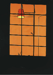
The next image I was drawn to was Window at Night (Oil on Canvas 1969) Click to link to image on Chritie's website. There is an orange glow to the interior behind the window. An illuminated hanging lampshade can be seen. The window frame and wall of the house are black silhouettes and there is the silhouette of just a few leaves of a houseplant in the bottom part of the window. The reason I like it is because of the way my imagination works when viewing this. It feels voyeuristic because, although there is no human presence in the picture, the fact that the lights are on (and the houseplant suggests this is a home) leads me to think there is someone at home and we are peering into their world without their awareness (although in fact we can see very little of it). In this way it reminds me of Dennis Hopper's NightHawks- those anonymous night-time customers in the diner illuminated but unaware that they are observed*. This could be a scene from a thriller in which the action is about to take place we are either the hapless witnesses about to see an argument or a brutal murder or I am a stalker hiding in the shadows waiting for the object of my obsession to appear in the window! There is something lonely about this painting.

*(Actually flicking back through the exhibition leaflet I find that Dennis Hopper is mentioned so it is probably the leaflet that put this in my mind rather than a direct association)

In his later work Interior with a Picture (Acrylic on Canves 1985-6) there are several different devices introduced . Firstly he uses a trompe L'oiel effect on the picture within the painting. He has painted the still life of the picture in a much more realistic style than the environment the picture is placed in. This is the artist making a point about the false distinctions bewteen what is real and what is artificial. In this painting he also plays with illumination and shadows. The picture on  the wall seems to be illuminated from above and to the right and its imposing frame casts a large geometric shadow down to the left. The thing that made me smile the most about this painting though, was the faithful representation of the patterned flock wallpaper as it took me back to my childhood in the seventies - it is very evocative. I remember one of my friends had burgundy flock wallpaper in her house while we had magnolia wood chip. She thought it was the very height of sophistication. Looking at it now it has the aesthetic of a very old fashioned pub or a downmarket tandoori restaurant. Caulfield's work often observes interior decor trends and in this way makes comments about taste and kitsch.


Gary Hume

The entrance to the Gary Hume Exhibition was a pair of pink gloss painted doors with large brown circles where windows might be and brown rectangles where the push plates on hospital doors would be. The over large 'windows' give an anthropomorphic effect making the pair of doors look a bit like a face. This harks back to Gary Hume's 'Hospital Doors' series produced in the eighties when Maggie Thatcher was running down the NHS.

I found this exhibition a bit less accessible in terms of intention than the Patrick Caulfield one. There didn't seem to be an obvious chronology or development to the work - the paintings seemed to be randomly selected examples and there wasn't an obvious pathway through it. 

The overall impression was of glossiness. The artist uses gloss household pain on aluminium for much of his work. This is another case where viewing the works in reproduction would not be particularly informative or give the intended experience as there so much of this work is about that glossy, high-shine surface which doesn't really translate into reproduction. 

Hume uses simplification and outlines like Caulfield but he doesn't use painted black lines. Instead he uses layers of the paint to build up an outline or scrape it back so that the outline is part of the texture of the surface rather than a painted line. It looks a bit like enamelling in jewellery. One striking example of this is Beautiful (2002). In reproduction this looks like a salmon-pink circle with a black abstract shape at the centre. Standing directly in front of the painting gives a similar impression. However, moving from side to side around the painting as the light catches the surface at different angles you can see that there is a portrait in the textured surface (in fact a portrait of Kate Moss with Michael Jackson's nose superimposed - is this a comment on whet is considered beautiful and society's obsession with celebrities?)

I left this exhibition with more questions than answers. Why does Angela Merkel's mouth look like a lemon in a sea of pale green? (And what does it have to do with a horse?). Why does Tony Blackburn look like a three- leafed clover or shamrock surrounded by a cap of black hair (If he were a four leafed clover would he have been luckier in his career?) Why does the person with the slumped and sagging body in Older have a leaf or wing shaped area growing out of the back of their head? Is this a cheerleader's arm obscuring the Moon? Why doesn't the moon continue to the left side of the arm? Is it a crescent ? Does this say something about American foreign policy towards islamic countries? Or is it just an abstract painting with a recognisable pompom? 

I quite liked the visual joke of the sculpture of  'The back of a Snowman' - no face so the viewer keeps circling it.  The glossiness and the characteristic simplification and expanses of flat colour were impressive. I can't however, say that after viewing this exhibition I'm really any clearer about the artist's intentions - he doesn't really elaborate or give a lot of clues. But maybe that's the point. Perhaps I'm supposed to ask questions and making the answers obvious would spoil the experience? I don't know.