Saturday, 21 September 2013

Exercise: Angular perspective

I was still suffering from anxiety about drawing in public when I did this exercise. I had intended to find a building to draw when I took my son to his piano lesson rather than driving home and back again. Unfortunately there were lots of people about putting up lights and decorations for a Festa so I drove round in circles for 10 minutes looking for a quiet spot and then drove home again feeling defeated.

So I'm afraid for this exercise I skulked indoors and drew a pile of books. I didn't embellish the drawing just tried to draw the basic shapes.


I went through the same procedure for this exercise as I had for the parallel perspective exercise. I drew what I thought was an accurate drawing and  then drew my estimated eye level in green (after placing my A4 sheet on a long sheet of cheap newsprint-type paper. All the vanishing points and the eye level were well off the side of the A4 paper. The photo of my construction lines is seen above in red. the original sketch lines are in pencil. My drawing of the books was somewhat more accurate than my drawings of the interiors but I still didn't feel I'd really got to grips with perspective . 

I've  downloaded a copy of 'Perspective Without Pain' by Philip Metzger onto my iPad - this has numerous exercises to work through to help with learning how to handle perspective. 

However, of greater concern was my unwillingness to step out in public. This was something that I needed to tackle or risk being unable to complete the course. 

I copied a somplified version of Sir Muirhead Bone's drawing of Rome into my sketchbook (with the aid some tracing paper). As instructed I continued the perspective lines to the vanishing point as instructed. Actually there were numerous vanishing points so this drawing is not as accurate as it appears. (or my ruler is broken!). This was interesting as this drawing appeared to me to demonstrate great use of perspective before I started to really analyse it.


Thursday, 19 September 2013

Exercise: Parallel Perspective

Perspective is difficult, there's no doubt about that. Or at least I find it so. I drew a simple line drawing of the view from out living room through the dining room to the stairs. I then estimated where my eye level was and used a ruler to connect receding parallel lines at this level. It showed how very inaccurate my first attempt had been. The original lines here are in pencil and the contracted ones are in red biro. The turn on the staircase was the biggest problem for me and even with the constructed lines it ended up looking as though the stairs were sloped. 


I had another try with the corridor upstairs and made similar errors. The original lines on this one are in pencil and the constructed perspective lines are in pen.


I was not too surprised to see that although I felt the drawing was fairly accurate initially, the lines were really quite far out when the corrected lines were superimposed.


Sunday, 15 September 2013

Weekly Report: Week Commencing 9th September

A very tough week of night shifts on top of a very quick turnaround of two days at home meant I lacked the energy and motivation to produce any coursework this week.

Sunday, 8 September 2013

Weekly Report: Week Commencing 2nd September

On Monday, Tuesday and Wednesday of this week I attended a three day intensive drawing workshop in Edinburgh. It was a great experience. I enjoyed meeting tutors face to face and interacting with other students as well as seeing their work. I did feel that my work progressed over the three days and I tried approaches that I had not yet come across so it was worthwhile. 

The course was quite tiring. I flew home from London on Thursday and then only had two days at home before I had to return to the UK for another week of night shifts. Consequently, I didn't get any of my actual coursework this week although I was working on drawing at the workshop.

Saturday, 7 September 2013

OCA 3 day Intensive Drawing Workshop

Monday, Tuesday and Wednesday of this week I was in Edinburgh participating in a 3 day intensive drawing workshop  run by the OCA. 

Day 1

On day 1 we started by creating an 11 metre long co-operative drawing based on small objects we had brought with us to draw. I was quite nervous and felt very exposed drawing on such a large scale. Initially I found trying to draw my object so large quite difficult. In order to relax myself, above the object I started to draw repetitive lines like I had been doing in my sketchbook as a sort of movement meditation. This worked very well. I had a greater sense of freedom and the relaxed movement of my arm was quite satisfying. I was also able to continue these lines laterally to create a link with the drawings of those working beside me, The lines I drew also echoed the wavy line of the composition drawn onto the paper. Around the picture of the plaster of paris hand I had brought with me I experiments with marks which could be made on a large scale with charcoal and a putty rubber.

In the afternoon we used what we had taken from the experience of the collaborative drawing to create an A1 sized drawing in charcoal. 


I chose to draw using an image of a ceremonial costume which one of the tutors had provided. I was attracted by the dramatic tonal planes of the mask, the oversized hands and the furry texture of the costume. I incorporated some of the repetitive line drawing into the mask like a sort of contour map of his head. I also used some of the bold erasure techniques I'd used on the larger piece to create the texture of his fur. Because I was still a bit nervous, my mark making contained a sort of nervous energy. It looks aggressive which I think suits the subject who is quite a frightening-looking character.

At the end of the day we all gathered round and looked at each others work. It was very interesting that given the same directions, stimuli and amount of time - how diverse the works on paper were. Some students had very delicate, soft and sensitive handling of materials whereas others were bold and confident in their mark making. I was particularly interested in one of the other student's work (Jude). Her inspiration had been a ball of string. As well as making marks inspired by the string, she had also used the string itself coated in charcoal to make marks. She had then noticed that the string made ridges in the charcoal and had used this ridged charcoal in her drawing.


Day 2

On day 2, the tutors had set up an enormous still life. We used viewfinders to select small areas of the still life to draw. In the morning we started by drawing several 10 minute sketches followed by several 5 minute sketches. The aim was to select interesting compositions which could then be developed into an abstraction. Below are a few examples. (N.B the stones are not part of the composition they are weights to stop the paper blowing away when photographing outdoors.)


I chose the composition with the wooden spoon to work with further. Our next task was to create a drawing by covering a sheet of A2 paper with charcoal and then rubbing away the charcoal to create tonal differences.


I found this way of working quite difficult but after playing around I found I could create a wide variety of marks by rolling the putty rubber over the charcoal surface. I could also create quite dramatic directional marks using rapid sweeps of the hard  rubber. When I had finished rubbing away I used compressed charcoal in the ares which had the darkest shadow. I was, however, a bit disappointed with the outcome of the piece as it wasn't as dynamic as the original sketch. This was partly because I wasn't able to create as many marks and textures as I did in the original sketch. Mainly, however it was because I had made an error in the composition. The head of the spoon was too big and also asymmetrical which meant I lost the bold diagonal which had attracted me in the first place.


On the afternoon of day two we were to create an A1 sized drawing based on the still life. The task was to try to avoid going back to tight representation but to pick out areas which interested us either from our sketches or from the set-up to result in moving towards abstraction.

I picked out an area which had some bold colours - purple (umbrella and strap) and yellow (rubber glove) juxtaposed with graphic black and white stripes (box). I therefore decided it would be appropriate to use some colour. Unfortunately, I didn't really think carefully enough about the composition before I started to draw on the A1 sheet. Consequently, despite using a viewfinder, I got distracted by details other than those which had attracted me. I also used oil pastels and found it hard to cover the large area quickly enough. After about an hour I had produced this: 


I really wasn't happy with it. By the time I got to the point of drawing the orange plastic cookie cutters in the centre I was feeling despondent and had lost concentration. Consequently they were drawn really inaccurately in terms of shape, size and position and really didn't work with the overall composition. Although I am not happy with this drawing I do feel on the plus side that the line and shading have created a feeling of depth drawing the eye in towards the centre. In the remaining 15 minutes (with the guidance of Emma) I decided to do a rapid drawing which concentrated on the areas which had interested me in the first place. Namely the yellow pendulous rubber glove, the bold central purple shape of the umbrella strap and the graphic black and white stripes on the cardboard box.


This is also A1 in size. I used masking tape to allow me to make rapid stripes in charcoal. I used gouache for the yellow and purple shapes. I used a purple coloured pencil to create the almost triangular areas of colour which represent areas of shading on the rubber glove. Although this was very rapidly executed, it was much closer in outcome to what my original intended composition had been. With hindsight, it would have been better to draw a few thumbnail sketches in my sketchbook before starting the A1 piece. At home I would have drawn thumbnails before starting - unfortunately, the combination of nerves and time pressure got the better of me on Tuesday afternoon. I went back to my digs feeling a bit deflated but hoping for a better day on Wednesday. 


Day 3

This day was devoted to the draped figure. In the morning we had one model and we started with some rapid A2 sized sketches using india ink and a cotton bud as a drawing tool. 
We started with some 10 minute poses:


 In the standing pose, the model is
pushing against the wall. Olivia had advised us to try drawing on narrow paper to try to help with getting the entire figure on the paper. Unfortunately I managed to lose both his arms and his feet on this one! I do think, however that I've managed to get his weight on the correct foot and I really like the diagonal crease that goes across the back of his cagoul.
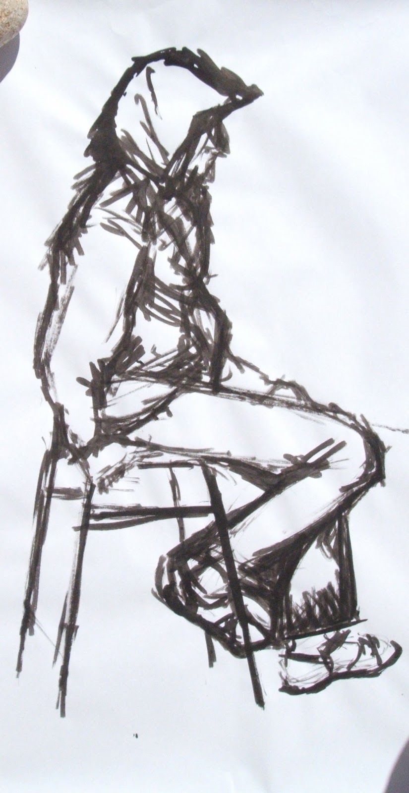
We then did a 50 minute seated pose:

(Apologies for the shadow of my cat in the lower right hand corner -
one of the hazards of outdoor photography which I hadn't
noticed until the images were on the computer)


I was a bit more relaxed by this point in the workshop and was finding it easier to see the shapes and find my way around the form. I am quite pleased with this one as I think you can clearly see the weight of the model's slumped/slouching posture. I think the proportions are generally OK. I really struggled with his right leg (the one in the foreground which is bent and with the foot on the bar of the stool). I had made his lower leg too long and his foot was too low. I erased it and redrew it and I think it works better now although his calf still looks chunky in comparison to his thigh.


In the afternoon we had two models which added a whole new dimension to the drawing as there was the relationship between the two models in space to consider. Having two models almost automatically seems to create a narrative to the drawing - it is intriguing to think what might be going on between these two people. 

In the first 15 minute pose both models were standing. They look as though they're about to walk past each other. I struggled with the male model's right arm but was pleased with the strong creases on the back of his hood and jacket. In the second 15 minute pose I went back to charcoal. I started by drawing the negative shape between the two models as I felt that this was the most important shape of the whole composition. I retrospect. I should probably have spent more time on the male model and kept the woman quite sketchy because he was closer to me than she was. I ran out of time. In reality, the female model wasn't as chubby as she seems in my drawing.

Finally we did a long pose lasting 1h 25minutes:


I think there is a sense of isolation and loneliness about this pose. The two models are in close proximity but not interacting in any way. The shadow between them is the only thing that links them. I concentrated so much on the figures that it was only after time was up that I realised I had not placed any shadows relating the stool and stepladders to the background so they look like they're levitating.


The three days were great and very tiring. I feel I made some progress, particularly with drawing the draped figure. I would like to thank Olivia, Emma and Jane for their constructive feedback and suggestions. After the workshop I feel an urge to work larger and more quickly than I have been doing until now. My aim for the future is that next time I have the opportunity to do some figure drawing I will try some very rapid gestural drawings.


Sunday, 1 September 2013

Check and Log : Landscape Drawing

Check and Log:

In what way did you simplify and select in your study? Were you able to focus on simple shapes and patterns amid all the visual information available to you?

In this study:


The first thing that heaped me to select was taking a view finder with me. Without this I think I would have been overwhelmed by the vast amount of visual information present. Viewing through the viewfinder also helped in terms of viewing the basic shapes of the composition relative to the edges of the paper. I have managed to simplify to quite a large extent in the background but feel that the foreground area is still a bit too busy and could have benefited from my being more selective. This is something I find very difficult. I do have a tendency to get distracted and overwhelmed when there is too much visual information. This needs more work. I specifically selected the overhanging tree on the left tend side in the foreground as a framing device but I think less detail on the right side riverbank would have made the composition stronger with a more direct line taking the eye towards the bridge not interrupted by shrubs and trees.

How did you create a sense of distance and form in your sketches? 

I tried to create a sense of distance and form by making the line work in the foreground much more detailed than in the more distant areas. I also used colour to try to create a sense of distance. Using brighter bolder and warmer colours in the foreground with bolder tonal differences. As I moved back in the space of the pictures the colours got lighter - more purply ad less bold. However, I think this probably needed to be taken further. I have tried to dull the colour by working into it with graphite and soluble graphite but this wasn't entirely successful. I think perhaps a more blue hue might have receded better. I also tried to emphasise the detail in the foreground by working into it with drawing pen. This isn't entirely successful as although it does emphasise the detail it stops rather abruptly in a sort of arbitrary division between the fore and middle ground. On balance I think my demonstration of aerial perspective  was more successful in the much simpler monochrome sketches for the 360 degree studies series.  I think they communicate a sense of depth better and I have also managed to be more selective here because they were very rapidly executed in charcoal.


How did you use light and shade? Was it Successful? 

I used light and shade to create form and substance in the objects in the composition. I also used it to help with the sense of depth. I tried to make the tonal value differences more exaggerated in the foreground and more subtle in the middle and background. The deepest areas of shadow are in the foreground. The tone gets lighter as we move back in space. It was almost successful but I think that the area that is the very furthest back should have been lighter in tone relative to the middle distance. It doesn't recede as well as I would have liked.

What additional preliminary work would have been helpful towards the larger study?

I think several more sketches of the same subject would have been useful - first of all more tonal studies trying to simplify and pare down the composition further. I also think that some rapid colour sketches would have been useful to try out the colours for showing the aerial perspective before committing to the larger study as the colours I have chosen for the background are not the best for showing aerial perspective but I was not confident to work back over them as I felt this would make the background relatively too dark.


Research Point: Claude Lorrain and Turner

Look at the work of Claude Lorrain and Turner. Write notes on how these artists divide their landscapes into foreground, middle ground and background.

I have already touched briefly on the organisation of the work of Claude Lorrain (Claude Gelee) into fore middle and background but will go in to more  detail about his work here.

Claude Lorrain was a French painter who moved to Rome in 1627 and has come known as the master of the Pastoral Landscape. Claude would have been in the habit of sketching from nature but this was to build up reference material. He would not have painted in plein air - he 'was convinced that taking nature as he found it seldom produced beauty. His pictures are a composition of various draughts which he had previously made from various beautiful scenes and prospects' according to Reynolds (1)

His paintings were always composed in the studio and often had a similar structure. He used framing devices such as trees in the foreground where the action and any figures were usually placed. The foreground was often dark and there was often a lack of any device linking foreground and middle ground. The eye instead being drawn to the middle ground by a warm light bathing the subject in this area. Moving further back in the paintings, aerial perspective was used with progressive greying and reduction of detail in subject in the background. Look at the three examples below:


Claude Lorrain: Landscape with Paris and Oenone

Claude Lorrain: Landscape with Merchants

Claude Lorrain: Landscape with Dancing Figures

The first thing that strikes me when compering these three scenes is how similar they are. All of the, have trees framing figures in the foreground. The foreground is relatively dark and the middle ground is illuminated by contrast (although not so markedly so in the painting at the top with Paris and Oenone). There is often a body of water in the middle ground but not a path or a river leading the eye upwards through the composition. The foregrounds and middle grounds are quite clearly delineated from one another - almost like a stage set with flat pieces of painted scenery protruding from the wings. The background in comparison is much paler in each case with greyer and bluer tones to eat. In each case Lorrain has not painted a real landscape but a constructed and idealised landscape. He has tried to improve on nature. He had very specific almost formulaic ideas about what constituted beauty in a landscape.

Now let's look at Turner and compare his compositions with those of Lorrain.  First look at the two paintings below:

Claude Lorrain: Seaport with the Embarkation of the Queen of Sheba 1648

J.M.W. Turner: Dido Building Carthage 1815

Turner has clearly referenced Claude's earlier work in Dido Building Carthage. The compositions are very similar. Both have buildings and figures in the foregrounds and buildings ad trees framing the middle distance. An expanse of water is in the centre of the frame in each piece with the rising sun illuminating the water surface and drawing the eye upwards. In fact Turner made sure that these two paintings would hang alongside each other at the National Gallery in London by stipulating this as a condition when he bequeathed his works to the nation in his will. (2). By choosing one of his earlier mature works to hang alongside that of Claude he is saying something about his claim to favourable comparison with the great landscape painters of the past. Exploration of the symbolism of these two paintings is beyond the scope of this research point so I will not be sidetracked by it here!

Turner, however, was not content to emulate the works of past masters, He was a prolific artist and throughout his career continued to explore his means of expression. His approach to composition, hence was not as formulaic as that of his predecessors especially in his later work. As time progresses the delineation between foreground, middle ground and background becomes less clearly defined. For example look at this sunset thought to have been painted between 1830 and 1835

J.M.W. Turner: Sunset ? 1830-1835


This painting is very much about colour and light and there is no artificial construction of the composition. It gives sensation with very view points of reference in terms of fore,middle and background.

In his later works, Turner's compositions were often more dynamic than the 1815 example seen above. In the example below, the title suggests that Turner is trying to convey the sensations of "Rain, Steam and Speed' to the viewer. The dynamic composition and blurring and indistinctness of the subject matter help to convey this. The strong diagonal of the train track recedes across the fore and middle ground into the distance. The speeding train look almost as though it could carry on out of the canvas running over the viewer. The viewer is this involved in the action rather than a distant observer.

J.M.W. Turner: Rain Steam and Speed- The Great Western Railway 1844

I mentioned Turner's "Snow Storm" in my  Research point : Landscape Series 1. Turner was certainly interested in representation of the sublime (see this Research Point: Depiction of Landscape 2). There was significant development in the compositions he used, however over time. Compare the following two images:


J.M.W. Turner: The Shipwreck 1805

J.M.W Turner: Snow Storm- Steam Boat off a Harbour's Mouth making
Signals in Shallow Water, and going by the Lead. The Author was in this
Storm in the Night the Ariel left Harwich 1842

Both paintings present a terrifying storm at sea - a spectacle of the sublime. However, in the first and earlier painting the observer is placed outside the action as a detached onlooker - safe and sound. In the second painting Turner emphasises his own placement within the scene in the title of the piece (he may or may not have been truly there). However, this along with the disorientating vortex of the composition serves to give the sensation that the painting's viewer is actually involved in the action. (3). Turner used the vortex as a compositional device in many of his late works.

References:

(1) Landscape and Western Art. Oxford History of Western Art. Malcolm Andrews. Oxford University Press 1999

(2) J.M.W. Turner (British Artists Series). Sam Smiles. Tate Publishing 2000 (reprinted 2009)

(3) Turner, Monet, Twombly: Later Paintings.  Jeremy Lewinson. Tate Publishing 2012