Sunday, 28 April 2013

Research Point : Tight and Rigorous vs Sketchy and Expressive II

Sketchy and Expressive: Frank Auerbach

Frank Auerbach is a good example of the fact that sketchy and expressive doesn't always mean rapid! Auerbach in his own way is just as rigorous in his execution as Celmins but his images have an altogether different quality. Below are links to some of his drawings. I am going to confine myself to his drawings in this research point rather than looking at his painting with his characteristic extremely thick paint application. My first impression on looking at some of his portraits (such as Jake 1990 - see link below) was that the form seems to emerge or that he somehow finds it from a series of scribbly seemingly random marks. This turns out to be not exactly true. 


Frank Auerbach was was born in Germany to Jewish parents in 1931. Just before his eighth birthday his parents sent him to England. They were both killed during the war rendering Auerbach an orphan. (1)

Auerbach was taught by David Bomberg at evening classes at Borough Polytechnic in London and I think that Bomberg's influence can still be seen in Auerbach's work. Bomberg in turn had been influenced by the philosophy of seeing espoused by Bishop Berkley i.e " human beings only learn to connect sight to their experience of the physical world by a fairly long experimentation with touch and the other senses. On the back of the retina we get a reverse image, so that the newborn infant will reach up for something that is down and down for something that's up. It's only by crawling across the floor, touching things, judging distances haptically , by grasp and contact that it will relate the sight to the physical world" (2)
Bomberg's aim in teaching was more about the quality of form or 'the spirit in the mass' than about producing aesthetically pleasing pictures. he is quoted as saying " you're more likely to get it right when you're least self conscious, when you have given up any hope of producing an acceptable image- because then you're permeated wordlessly by the influence of the thing you're painting "(2)

Auerbach went on to study at St Martin's School of art and then at the Royal College of Art. In 1954 he started renting a studio in North London where he has worked obsessively ever since. He is reputed to work 364 days a week and an average of 10 hours a day. He will often work for a whole day on a painting only to scrape all of the paint off to restart. He must use vast quantities of paint!. He also re-iterates the same subjects over and over again. Landscapes in the immediate vicinity of his studio and portraits of favoured models who are painted over and over again (EOW, JYM and Julia- his wife). If you click on the link to Frank Auerbach at Marlborough Fine Art it illustrates this with numerous drawings of the same view of 'next door'. In addition on the 'Head of EOW 1959-60' linked to above you will notice a patch of paper has been added to the drawing. This again is because of Auerbach's tendency to rework over and over again the same piece. When working with charcoal he rubs the surface back to a grey shade than starts to redraw and erase again on top. Consequently the paper can wear through leading to holes and needs to be patched. In Robert Hughes' Biography of Auerbach  this process is illustrated in a drawing in progress for Portrait of Sandra 1973-74. The portrait is the result of 41 sessions and a photograph was taken at the and of each session. Each time the portrait has been erased and redone and it alters radically. The author says that the final result doesn't look any more like the subject (Sandra Kitaj) than many of the others which were obliterated but ' it has a density that comes from exhausting most of the other alternatives'. Auerbach himself says,  "I can do something that looks like one of my drawings in half an hour- but I find it unsatisfactory; it never seems specific enough for me to be new enough. So I find myself going on....and as I go on I find the problem more and more impossible , and because, I suppose of my temperament I find myself behaving in an excessive way in order to solve the problem"(2)

Auerbach is certainly single-minded and has therefore frequently found himself out of step with fashion - this was certainly the case in the '60s when his paintings were in no way related to the superficiality and glitz of pop art.

In an interview last year Auerbach summed up his approach" The only way which I could, with luck make a tiny contribution to art was to just simply work as hard and as much as I possibly could. I was always aware that I was very,very slow and that if a painting came together, or seemed to me to be satisfactory and not in any sense manufactured it would always have happened unexpectedly, at any time without me being able to foresee when" (3)

The looking retrospectively at his work at the age of 81 " I'm not self- analytical , however looking at the paintings now, it seems to me, that one could say, although if I were a curator or art historian I would never have the cheek- " a more dynamic way of drawing was searched for nu Mr Auerbach  so he used a restricted palette so he could concentrate on that.' (3)

His drawing style is certainly dynamic in a way that belies the hours and hours of arduous repetition that goes in to it.

References:

(1)Hawksley, L : Frank Auerbach in 50 British Artists You Should Know. Prestel 2011
(2) Hughes, R : Frank Auerbach. Thames and Hudson 1990
(3)C, Lampert: Frank Auerbach in his own words. Telegraph 4th November 2012


Friday, 26 April 2013

Research Point: Tight and Rigorous vs Sketchy and Expressive

Find drawings by two artists who work in contrasting ways: From high, rigorous work to a more sketchy, expressive style and make notes in  your learning log:

Tight and Rigorous: Vija Celmins

Vija Celmins is an American Painter, sculptor and draughts woman. She was born in Latvia in 1939 just before the outbreak of war. She became a refugee in Germany and migrated to the USA with her family at the age of 9years.(1)

I first encountered the work of Vija Celmins when she was featured in the series 'Art 21: Art in the 21st Century'.(2) The artist was filmed painting on a large board which was painted almost uniformly black. She was using a tiny brush which looked like a toothpick and applying a tiny dot of white. She was painting a starscape from a small and slightly crumpled photograph. She talked about the fact that she will often paint over what she has achieved the day before so the image is painted on top of itself many times. That way she feels that picture attains a certain memory and density which pleases her. Watching her work in such a painstaking way with such a tiny brush and knowing that she was likely to repeat this over and over and over again on the same piece  of board before the painting was finished filled me with an overwhelming sense of fatigue.

I was reminded of her work when researching David Musgrave as he cited her work as one of his influences so I decided to find out a bit more about her. Below are links to a number of her works.

Drypoint Ocean Surface 1983

Untitled (Web 1) Mezzotint on Paper 2001

Night Sky No 19 Charcoal on Paper 1998

Web no 1 Charcoal on paper 1999

Desert 1975 Lithograph

To Fix the Image in Memory1977 - 1982

Her best known works are probably the starscapes and seascapes which cover the surface of the paper without giving the viewer a focal point or point of reference. I would like to see these in 'the flesh' as I have only seen photographs on the Internet. I think that not having a focal point might be a bit disorienting for the viewer much like the experience of being out at sea looking at a moving section of water without reference to the horizon makes you feel very small and a long way from home as well as inducing motion sickness. These images really do give a sense of the vastness of the ocean and the sky but at the same time are very closely observed and rendered in fine detail. 

Other natural forms which are rendered with sensitive attention to detail are her images of spiderwebs. They look so delicate that you feel like you could destroy them with a single touch and may, therefore say something about transience. 
In fact, Celmins does not work from life but from photographs and says that her work is about the tension between the illusion of depth and the flatness of the paper. In her catalogue for an exhibition at the Metropolitan Museum in New York in 2002 she says "The Edge and approaching the edge are important events in my work since the image is defined by it" "at the edges one breaks the illusion of continuous space and sees the making process and that the work is really a fiction"(3)

In some ways this tension between depths and flatness is common ground with the Abstract Expressionists who Celmins admired during her formative years. (The push-pull theory of Hans Hoffman)  However her work does not fall into this category. In fact she is very difficult to place in any 'movement'. She has gradually pared down her way of working. She said in an interview in 1993 " I wanted to purge myself of style. I had given up on colour. I had given up on gestures and strokes. All I had left to work with was the image, so I had to use the image to create a different kind of space'.(4)

Because of her very arduous way of working it can take Celmins up to a year to complete a painting. This means that her production of work has been relatively small. One of her more challenging conceptual pieces is "To Fix the Image in the Memory" which consists of 11 bronze "rocks" which were painted with acrylic paint and were produced between 1977 and 1982. The "rocks" were based on rocks which Celmins had found and were displayed alongside their originals. So accurate was the reproduction that it was difficult to distinguish which were the real rocks. This was meant to challenge the viewer. Celmins said " The point is not to fool the eye, but to open it up. This is an instigation to look, to open up your eyes and look and look more. It's a piece that says 'looking is one of the answers'". (3) This final quote resonates with me at the beginning of my studies as I'm spending quite a lot of time at the moment learning to look.

References:
(1) Johnson, C : Celmins, Vija. Grove Art Online via Oxford Art Online
(2) Art 21: Art in the 21st Century: Season 2, Time (PBS) 2003
(3) Enright, R: Tender Touches: Interview with Vija Celmins. Border Crossings , Aug 2003, Vol 22, Issue 3 p21-35
(4)The T.H Wilson Company. Celmins, Vija. Current Biography 2005.


Exercise: Stipples and Dots


I completed this exercise on 25th Feb 2013

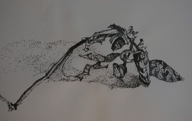
I chose a sprig of dried chillies from last year's harvest that I hadn't got round to stripping off and grinding up. I thought that the deep creases in the surfaces of the glossy dried surface would be interesting to try to capture.

The technique of building up tone using tiny dots created with a drawing pen was time consuming. Initially I found it quite relaxing and meditative with the silence only interrupted by the gentle tapping of my pen on the paper.  After about an hour, it started to become tedious. I kept taking breaks and coming back to it as I really didn't enjoy this painstaking work.

The final result, however does show some potential. I used two different types of marks one for the object itself and one for the areas of shadow to try to differentiate the two. 

The composition is not great. The sprig does not fill the paper well. This may be partly because I tried to start off straight away in stipples without mapping out the form in pencil first. I have cropped the photograph which improves the situation slightly but I think the composition lacks impact.  I am quite pleased with the folds and creases in the leaves and the chillies themselves though.

On the whole I don't think I have the patience required to use this technique on a regular basis. I'd prefer to work in a larger and bolder way.

Exercise: Getting Tone and Depth in Detail


I completed this on 25th February 2013

This exercise was quite time consuming but ultimately quite satisfying. I am happy with the way the subject fills the paper. I like the variation in the marks I have made in describing the difference in texture between the crinkly leaves and the smoother surface of the artichoke flower head.

Project: Detailed Observation. Exercise:Line Drawing Detail


I completed this exercise on 22nd Feb 2013.

I found this quite difficult as the temptation to use shading was almost overwhelming. 
The instructions were to try not to lift my pen from the paper. On the first drawing of the fennel I have to admit that I didn't really make much of an attempt at that. Especially when making a suggestion of the texture of the foliage I frequently lifted my pen. I used a variety of thicknesses of lines to suggest the difference between the deep clefts between the layers of the bulb, the ridging of the stalks and the feathery quality of the foliage. I tried to place the drawing on the paper to fill as much of the space as possible. I used fine-liner for the fennel.

I used india ink and dip pen for the savoy cabbage as I though the less controllable nature of this and variable line thickness would lend itself well to the knobbly texture of the cut leaves. I still did not manage not to lift my pen (using the necessity of dipping into the ink as an excuse).  However, each layer of leaf is formed by a single line. Unfortunately in going back and forth across the paper I forgot that the ink was wet and made a big black smear down by the stalk.

On the artichoke I went back to the fine-liner. I managed considerably better with the head of the artichoke at not lifting my pen by retracing back over areas I had already drawn. However, it is clear that when I went on to the ridged texture of the stalk I abandoned it in favour of individual lines.


Thursday, 25 April 2013

Check and Log : Exploring Coloured Media

Which of the media you have experimented with did you find the most expressive?

I found the water-soluble markers the most expressive as the quality of the marks they make could be varied so much by adding varying quantities of water and using a blending pen. This was followed in a close second place by the oil pastels. 

I think that coloured inks - especially if used with dip pens could also be expressive but I would need to improve my handling of them as I do find them quite difficult to use so far.

Make notes in your learning log on the pros and cons of each medium:

Coloured Pencils:

Pros:

-can be used for fine detail
-can be blended effectively by hatching different colours over each other
-can be used to build up deep vivid colour gradually
-can achieve subtle and smooth tonal gradations by slowly building up tone layer upon layer
-watercolour pencils can be used as above or can be used in washes or blended with water

Cons:
-require a lot of patience
-slow to work with therefore working on a large scale is time consuming
-slow work while meditative can also result in rather tight drawings lacking in spontaneity
-if using water with water-colour pencil need a stretched page or watercolour paper


Soft Pastels:

Pros:
-can be blended in various ways for gradation in colour and tone
-good for large and more expressive handling
-can be used on a variety of supports for different effects
-can cover a large area quickly therefore less patience required than with coloured pencils

Cons:
-too soft to allow fine detail and small scale work
-tend to crumble
-expensive given their tendency to be rapidly used and to crumble
-Easily smudged

Oil Pastels:

Pros:
- very versatile
-gan be used with other media in a resist technique
-can be built up gradually with hatching one colour over another
-textured grounds can be allowed to show through or can be applied thickly for blocks of bold colour
-can be blended with solvents and used like paint
-can be melted and applied thickly or in drips
-can be scraped back off the paper and incised into (sgraffito)

Cons:
-thick and sticky so not good for fine detail
-colours tend to be very bold and vibrant - not very subtle (although wider ranges are available)

Coloured Inks:

Pros:
-can be handled with a brush or a dip pen for variety of marks
-interesting marks made when dropped onto wet paper
-can be used for blended washes of colour
-can be used with wax or oil crayons for resist techniques
-can be worked together wet into wet or wet into dry
-bright luminous colours

Cons:
-Although I can make interesting marks with them I find the colours difficult to blend and use in representative work
-If using wet need thick watercolour paper or stretched paper to avoid buckling

Water Soluble Markers:

Pros:
-Very versatile
-Excellent range of colours available
-can be used without water for bold graphic work
-Can be used with water for blended effects - more like watercolour painting
-colours can be blended by hatching
-good for stippling

Cons:
-if multiple laters built up tends to take the surface off cartridge paper
- when used wet will buckle paper so need to know your intention before you start (watercolour or stretched paper for wet work)

Wax Crayons and Water-soluble (Neocolour) Crayons:

Pros:
-great bright colours
-really easy to handle for quick and loose sketching 
-Wax crayons can be used for resist techniques and sgraffito
-Neocolour crayons are watersoluble so can be blended on the paper or dipend into water for an even bolder line.

Cons: 
-careful not to confuse the two - Neocolour is no good for resist as will dissolve
-Not so good for subtle hatching and poor for stippling
- not good for fine detail.

Which medium do you think lends itself to very detailed work?

Coloured pencil appears to be the coloured medium of choice for detailed work - If working in monochrome than graphite pencils or fineliners would be suitable.


Research Point: Mastery of Detailed Drawing: Renaissance

Albrecht Durer 1471-1528


I chose this 15th to 16th century artist because his name keeps cropping up when I am searching the Internet for help with techniques. When I was struggling with hatching, his melancholia engraving (fig 1.) was an example I looked at. When I was struggling with drawing drapery for assignment one, and searched for artists' renditions of folded cloth, drawings attributed to Durer appeared.
Fig 1. Melencholia I: 1514
Copperplate Engraving


Albrecht Durer worked in many different media including chalk and charcoal. pen and ink, line and wash, silverpoint. He also worked in watercolour, woodcut printing, copperplate engraving as well as painting in oils and tempera.

Durer was German, from Nuremberg but his family may have originated in Hungary. He seems to have had a very academic approach to his art, looking for rules from mathematics to govern the construction of his work. He really pushed forward the boundaries of art during his time and is responsible for several innovations. Below is a schematic summary of his influences and production which I will expand upon in the text:


Durer's Father (another Albrecht Durer) was a Goldsmith and Albrecht Junior was expected to follow in his footsteps. He showed promise in drawing at an early age and at the age of thirteen produced a self portrait in silverpoint which is the earliest known self-portrait by a European master. Given that mirrors in those days were convex and therefore caused significant distortion this was more difficult than it would superficially appear. (Fig 2)


Fig. 2:Self Portrait Aged 13, 1484
Silverpoint on Prepared Paper
Artists were not traditionally trained in art schools at the time of Durer's adolescence. Practical skill ('Brauch') was highly prised but the concept of 'art for art's sake' wasn't really developed then. Artists were employed to produce works of art for specific purposes such as altarpieces or portraits. They were employed for their practical skill rather than for originality. Although famous artists were sought by rich patrons for their artistic ability, aesthetics were a secondary consideration to the other functions such as religious, political or social (demonstrating social standing and wealth). Albrecht Durer therefore was apprenticed to the Nuremberg Artist Michael Wolgemut at the age of 15. Here he gained experience in many of the techniques he used throughout his life. In particular he learnt woodcut printing for book illustrations. Wolgemut's workshop produced images which were new for the time in that they used hatching to represent textures and tonal variations. Previous woodcuts had been mainly bare outlines and were intended to be coloured by hand.

One of the most important events during the renaissance was the invention of the printing press and movable type. The invention is credited to Johannes Gutenberg around 1450. This innovation allowed the production of books and pamphlets in large numbers and at a fraction of the cost of hand copied books, meaning that books were no longer the preserve of the super-rich. The advent of the printing press is closely associated with the rise of humanist education in Europe as well as the reformation. The boom in printing initially was confined to Northern Europe so in Nuremberg, the young Durer would have been well placed to see this. The boom in books meant greater demand for book illustrations, which in turn meant that Durer's work would be seen by a much greater number of people than artists of the past.

After his apprenticeship, Durer travelled via Colmar to Basle and Strasbourg - all of which were centres of publishing. Several illustutaions at this time are thought to be by Durer but few can be verified. In 1493 he produced his first self-portrait after his apprenticeship. (Fig. 3)


Fig 3: Self Portrait, 1493
 Mixed Media on Vellum
The thistle- like flower he is holding is called 'husband's fidelity' and it is thought that it was a reference to his impending marriage.

Shortly after his nuptials Durer departed for Italy. He travelled to Italy twice during his lifetime and in particular studied the venetian painters of the time. On his first trip to Italy, his preoccupation with the human figure began and he was the first German artist to  paint a nude life drawing of a female figure. He also made many studies of draped figures. Another of his innovations at this time was the use of watercolours as a medium in its own right rather than as a preparation for oil painting. He painted numerous watercolours during this trip. (Fig 4)
Fig. 4: The Willow Mill
Pen and black ink, watercolour and gouache
Back in Nuremberg Durer continued to learn. He continued to draw  and paint in watercolours. In particular painstakingly detailed studies of natural forms and animals. (Fig 5,6,7)


Fig. 6: Large Piece of Turf, 1503
Watercolour and gouache heightened
with opaque white, mounted on cardboard

Fig. 5 :Wing of a Roller c 1500
Watercolour and gouache on parchment


Fig. 7: Hare, 1502
Watercolour and gouache
heightened with opaque white

Durer was also the first artist in Nuremberg to start using engraving to produce prints, but his first internationally acclaimed works of art were a series of woodcuts. He produced a book of woodcuts called 'Apocalypse'. One of the woodcuts is illustrated in figure 8.These dramatic woodcuts captured the imagination of the public because of rumours of the end of the world and the coming of the Antichrist associated with plagues and other phenomena such as eclipses and comets. He produced two further series of woodcuts based on the passion of Christ and on the life of the virgin. The apocalypse series was the most popular.

Fig 8:The Four Horsemen of the Apocalypse, 1498
Woodcut
This illustrates how advanced Durer's woodcut work was compared to the earlier craftsmen. This is a large, dramatic and very detailed image. The construction of form and tone is all done with variations in hatching marks. This would require extraordinary technical ability.
Around this time Durer also continued to paint portraits and further self portraits.

Durer had a continuing preoccupation with the theory of art. In particular, as well as his interest in the accurate portrayal of the human figure he also studied mathematics and geometry in order to acquire the necessary knowledge to apply when constructing perspective. He studied Euclid to improve his understanding of this. An example of a painting which shows that he was developing this interest is the 'Adoration of the Magi' in which spatial recession can be seen including all the elements of the painting from the architecture to the figures and landscape. (Fig. 9)


Fig 9: The Adoration of the Magi
Oil on Panel
Around 1500, Durer, influenced by the Venetian painter Jacopo De Barbari started his study of the proportions of the human figure in earnest. He read 'On architecture' by Vitruvius in his quest to be able to construct a perfect male and female figure using a compass and rulers. He used Vitrivius' work which said that the head takes up one eighth and the face one tenth of the total height and that the face is divided into three equal parts. However, Durer went much further. This culminated in the 1504 engraving of Adam and Eve Fig. 10 (Adam was made slightly taller than Eve by lengthening of the shins - so he didn't entirely stick to the convention). He also wrote a textbook on human proportion which was published posthumously but allowed his knowledge to be passed on. 

Fig.10 Adam and Eve
Engraving 1504

On Durer's second trip to Italy (which he may have undertaken to escape the Plague in Nuremberg), he particularly admired the work of Giovanni Bellini. He was also impressed by the elevated status which artists enjoyed in Italy.

Albrecht  Durer was engaged by the Holy Roman Emperor Maximilian I in 1512 this would have confirmed his place as The most important Nuremberg artist. It would also have enhanced the Emperor's reputation as a cultured and highly educated 'universal man' or 'renaissance man' as it would have shown him to be a discerning patron of the arts.  Durer produced marginal drawings for the emperor's prayerbook. He also participated in the designing of Triumphal Arch which is the largest woodcut of all time made from 192 separate blocks and measuring more than 10 square metres. (fig. 11)


Fig.11: Triumphal Arch for Emperor Maximilian I
Woodcut Impression 1515 3.41 x 2.92m

Around this time Durer produced what came to be called his 'master engravings'. The three engravings are : 'Saint Jerome in his Cell' (Fig. 12), 'Melencholia' (Fig. 1) and 'Knight, Death and the Devil' (Fig. 13). 

Fig.12: Saint Jerome in his Cell
Copperplate Engraving 1514
Particularly impressive in the image of Saint Jerome is the way Durer had depicted the light shining in through the window. Saint Jerome was a scholar and translator of the Bible. He was therefore though to represent the humanist ideal of the highly educated man. 

There is much more controversy over the interpretation of 'Knight, Death and the Devil' . Various groups have tried to appropriate it in particular the Nazis. to Quote Wilhelm Waetzold in 1936 ' Heroic souls love this engraving - just as Nietzsche did and just as Adolf Hitler does today. They love it because it is a picture of victory' . 

The more popular interpretation is that the knight represents a christian who turns his back on the devil and faces death with composure and self restraint (gripping the reins of his horse) as a result of being armed with his faith.

As well as being interested in the proportions of the human figure Durer also worked on the construction of the equine figure and may have been influenced in this by earlier work by Leonardo da Vinci.  This work clearly paid dividends in this engraving.


Fig. 13: Knight, Death and the Devil 1513
Copperplate Engraving
There is still more controversy over the interpretation of 'Melencholia' (Fig. 1). In particular what is the significance of the magic square and the geometric figures. The figure is also surrounded by tools perhaps representing creativity and mathematics. She may also represent the brooding nature of the artist who works alone. Theories and literature abound about this particular engraving. There is no doubt that it exhibits astounding technical mastery of copperplate engraving.

In Durer's time religion was a large part of everyday life and society in general. One thing that would have helped artists at the time to make a living was the belief that favour with god could be achieved by spending money on devotional images and altarpieces. Hence Durer produced many devotional images and several altarpieces during his career.  During the reformation this could have backfired as iconoclasts literally interpreted the Bible's prohibition of the creation of 'graven images'. However in 1525 Nuremberg embraced Lutheran values thereby adopting Luther's stance. This was that although he was suspicious of images of saints he said that he did not agree with the destruction of works of art as long as they were not worshipped in place of God. In fact he encouraged certain  images in particular saint Jerome for his scholarship- Durer had produced several images of Saint Jerome so his religious work was not out of step with the political/religious climate.

One of the more surprising drawings I found in my research was this pen drawing of a rhinoceros. It is even more surprising when it is revealed that Durer never actually saw a rhino. During a trip to the Netherlands he saw numerous curiosities brought back by travellers to the newly discovered Americas and the Indian Ocean. A rhino had been on a ship which docked in Lisbon and a German merchant there had sketched and described it. Durer was interested in the unusual and he made a drawing based on the sketch and description. (Fig. 14)


Fig.14 Rhinoceros


Another quite surprising image is this Nude self portrait (Fig. 15) which looks very modern in its execution and has caused art historians to make comparisons with the expressionist work of Egon Schiele. (Fig. 16)


Fig. 15: Nude Self Portrait 1500-1505
Pen and brush heightened with opaque white
on green prepared paper.
Fig. 16: Self Portrait Egon Schiele 1912


I have learnt a great deal about the renaissance during this research point. The work of Durer would not have previously been something I would have sought out in galleries as I tend to be drawn to texture, colour and therefore more contemporary works. Also as an atheist I have tended to be automatically dismissive of religious works of art. Now having researched a bit more of the history of this period I find it much more interesting and have greater respect for the ground-breaking artists of the day.

References:
(1)Wolf, N : 'Albrecht Durer 1471-1528 The Genius of the German Renaissance' Taschen 2007
(2) Strieder, P: Albrecht Durer - Biography. Grove Art Online via Oxford Art Online
(3) Belkin, K,L: Durer, Albrecht . The Oxford Companion to Western Art via Oxford art Online.
(4) Brotton, J : The Renaissance: A Very Short Introduction. Oxford University Press 2006 : Kindle Edition
(5) Johnson, G, A: Renaissance Art: A Very Short Introduction. Oxford University Press: Kindle Edition.

Playing Catch Up Again

Once again I've allowed my practical work to streak ahead of my blogging. This occurs largely because I really enjoy and get absorbed with the practical drawing aspect of the course. Typing and research points seem a bit too much like 'proper' work (as opposed to playing with crayons) and I therefore find it much more difficult to motivate myself to do them. 

The cause of the current big gap in blogging is being held up by a research point on Albrecht Durer. I got overwhelmed by the amount of information available and procrastinated so much that I ground to a halt.  I need to start applying the adage 'On time is better than perfect' and give myself a time-limit for the research points. 

I've got three days now before I go back to work so will make an effort to update my blog to my current place in the course.